

Watch a violin’s strings vibrate – wide in the middle, narrow at the ends, moving in smooth, mirrored waves. That shape is what inspired the name – violin plot.
Have you ever watched the strings of a violin vibrate, the sound rising and falling in smooth waves, and thought: “This looks a bit like my exam scores last semester”? Okay, maybe not exactly that. But there’s a reason violin plots carry that name. Their flowing, symmetrical shape doesn’t just look elegant – it tells a story about data in a way that’s richer than simple lines or boxes.
In this article, we’ll explore how it helps you see patterns, reveal distributions, and understand the full shape of your data.
What Is a Violin Plot?
A violin plot is a statistical chart that looks like a violin-shaped figure, wide where values are common and narrow where they’re rare. Inside, you usually see a box plot that keeps the summary statistics clear.
It combines two visualizations:
- A box plot, which shows the median and spread of your data.
- A density curve, which shows how the data is distributed.
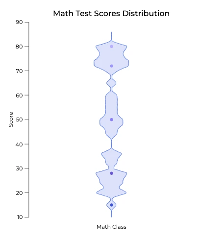
Let’s take a look at this quick example:
In a math class of 30 students:
- Most scores cluster between 70–80.
- Some students reach 90+, while a few drop below 50.
- A box plot would only show the median and quartiles.
- A violin plot reveals the bulge at 70–80, the bump at 90, and the taper at the low end – telling the whole story of the performance.
That’s the real strength of a violin plot: it shows where most scores are and how they spread, not just the average. It’s like reading the whole book instead of just the summary. So when is it worth turning the pages? That’s where that kind of plot really stands out!
When to Use a Violin Plot
They aren’t intended for every dataset, but they shine in certain real-world scenarios where patterns matter.
Common use cases:
- Comparing Test Scores Across Classes
Suppose three different classes take the same exam. Violin plots don’t let you just compare average performance, but also whether one class has consistent results, another has two groups (high and low performers), and another is more spread out.
- Tracking Exercise Habits
If you collect data on how many minutes students exercise per day, this plot type might show two clear peaks: one group doing short 20–30 minute workouts, and another group exercising for over an hour. Averages alone would hide that split.
- Daily Screen Time
Looking at how much time teenagers spend on their phones, you might find most clusters around 2–3 hours, with another group at 6–7 hours. A violin plot makes those groups visible in one clean shape.
- Survey Results with Polarized Opinions
Imagine asking students to rate the school cafeteria from 1 to 10. If half give it a 9 and the other half a 3, the violin will show two distinct bulges, highlighting a split in opinions that a simple average of “6” would completely miss.
So far, we’ve seen when violin plots are most useful: they uncover clusters, patterns, and splits that averages alone can’t show. But before you reach for one in every project, it’s worth asking:
Why not just use a box plot?
After all, both charts deal with distributions – but they tell slightly different stories. Let’s take a closer look at how violin plots stack up against box plots.
Box Plot vs. Violin Plot: What’s the Difference?
In data visualization, knowing how a box plot differs from a violin plot is key. Both charts are used to summarize distributions, but they serve slightly different purposes:
Box Plot (a.k.a. Whisker Plot)
- Shows the median, quartiles, and outliers of your dataset.
- Very effective for comparing categories quickly.
- Best when you only need a summary of the data.
Violin Plot
- Combines a box plot with a kernel density curve.
- Reveals the full distribution shape of the data.
- Makes it easy to spot clusters, multi‑modal distributions, and long tails.
Example with Exam Scores
- A box plot of two classes might show the same median.
- A violin plot, however, reveals that one class is bimodal – half the students score around 60, while the other half score around 90.
Rule of thumb:
- Use a box plot when you want a quick statistical summary.
- Use a violin plot when you need to see the distribution shape and uncover hidden patterns in your data.
Best Practices for Violin Plots
Violin plots are powerful, but only if you use them wisely. Here are some rules of thumb:
- Use them when the shape of the data matters.
If you just want to compare medians, a box plot or bar chart works best. If you need to show the exact data points, go with a dot plot or scatter plot.
- Limit the number of groups.
Too many violins side by side create visual noise. Stick to a few categories so that the patterns remain clear.
- Ensure consistent scaling.
If you’re comparing multiple violins, make sure they all use the same axis range. Otherwise, one distribution might look more “spread out” simply because of different scaling.
- Check your sample size.
With very few data points, the smooth density curve can create a misleading shape. In small datasets, a box plot or strip plot is often a better choice.
FAQ: Violin Plots
Q: What is a violin plot used for?
A: Violin plots are used to visualize the distribution, density, and variability of data, making them ideal for detecting clusters, outliers, and splits in datasets.
Q: How is a violin plot different from a box plot?
A: A box plot shows summary statistics (median, quartiles), while a violin plot adds a density curve to show the shape of the data.
Q: When should I avoid using them?
A: Avoid violin plots when you have small datasets (the density shape becomes misleading) or when you only need to compare medians quickly.
Q: What are the alternatives to violin plots?
A:
- Box plots → For summary stats.
- Scatter or strip plots → For individual data points.
- Bar charts → For simple categorical comparisons.
Understanding Patterns in Your Data
Violin plots aren’t just attractive visuals – they’re instruments of understanding. They not only reveal the center and spread of your data but also the patterns hidden within it: the peaks, clusters, and splits that numbers alone can’t capture.
When you want to go beyond averages and really see the shape of your data, violin plots are a perfect choice. Just remember: use them when patterns matter, keep them clean, and don’t be afraid to switch to a simpler chart if all you need is a quick comparison.