

Today we’re going to witness an epic showdown between two heavy weights –
Bar chart vs column chart.
Got a favorite?
Maybe one of the charts is closer to your heart because of work or play. And that’s okay.
But what if you could be getting better results by selecting another type of chart?
This article will take a look at both column charts and bar charts. We’ll look them up and down, and inside out to find out which one is still standing after the final bout.
So, let’s get started.
Bar Chart Vs Column Chart – What’s the Difference?
In the left corner, we have the mighty bar chart. On the right? The plucky challenger – the column chart.
Which chart is better? Which should you choose for your specific dataset?
Well, here’s the first rule of thumb:
For small datasets, (up to 10 points) choose a column chart.
Now, let’s take the gloves off for a minute and look at each individual contender.
What Is A Column Chart?
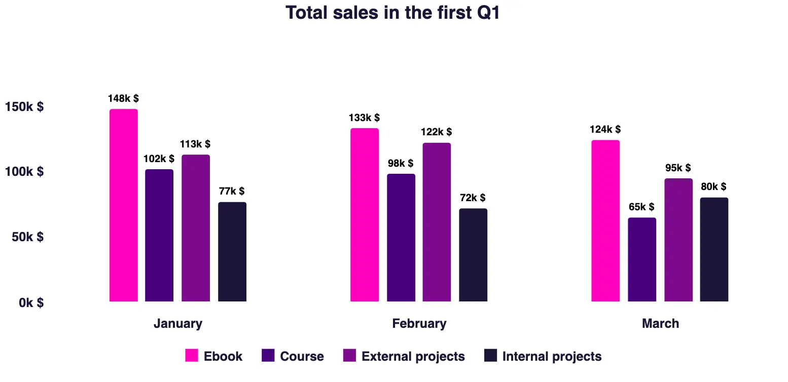
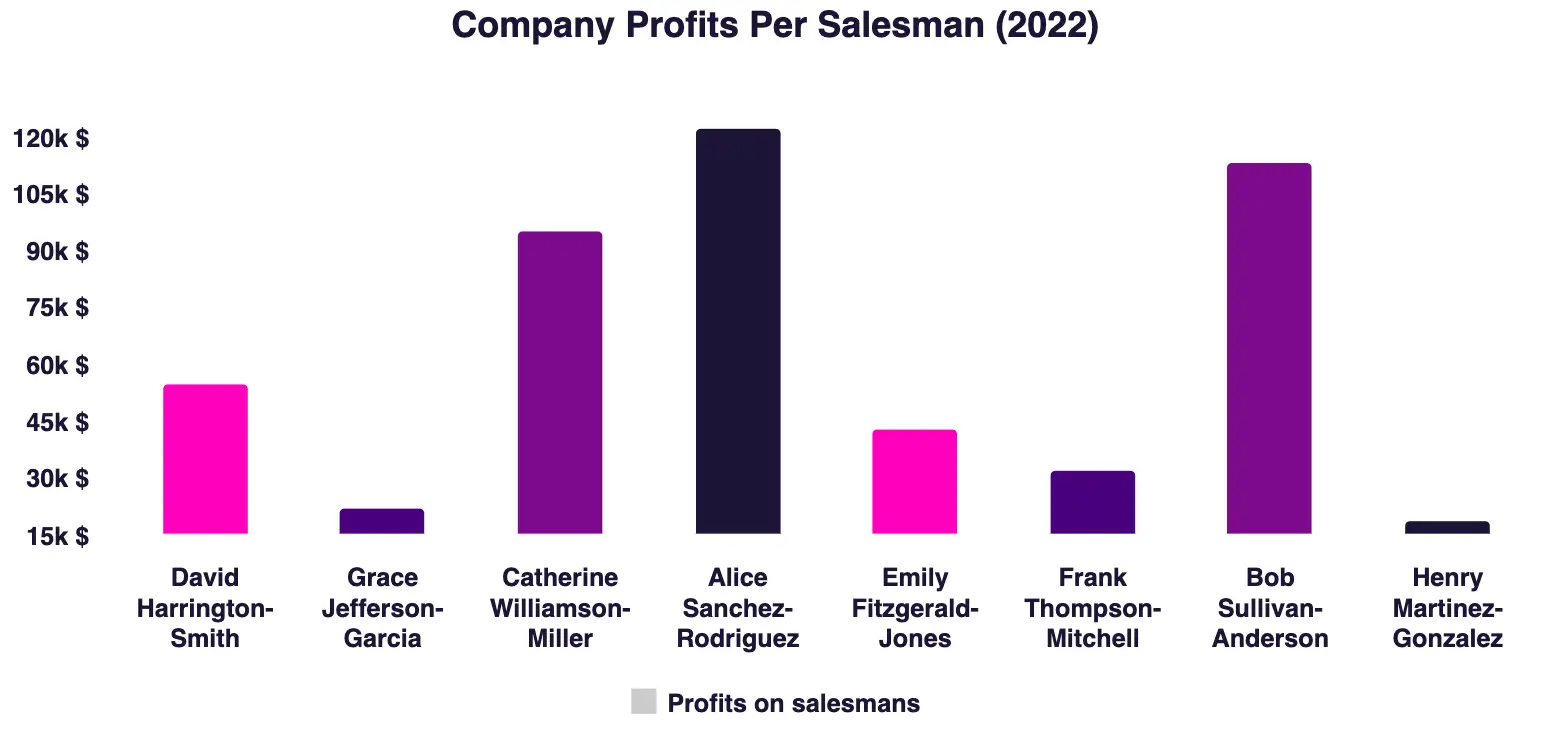
A column chart is a data visualization where each point is represented by a rectangle. The height of the rectangle is proportional to the point’s value. Column charts are sometimes called vertical bar charts. They work great when you have distinct categories, such as various currencies, months within a year, or any items you wish to contrast.
Here’s an example of a column chart:
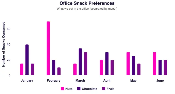
Dataviz geeks love to measure everything, here’s what we like to snack on in the office – demo
There are a several different types of column charts types:
- Clustered column charts – also known as the grouped column chart.
- Stacked column charts – also known as the segmented column chart.
We’ll take a closer look at both of them later.
What Is A Bar Chart
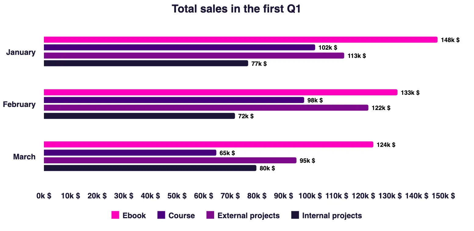
A bar chart is a data visualization where each point is represented by a rectangle. The height of the rectangle is proportional to the point’s value. Instead of a vertical orientation, the bar chart’s rectangles are horizontal. That’s why bar charts are sometimes called horizontal bar charts. They work great for categorical data like geographical regions or product categories.
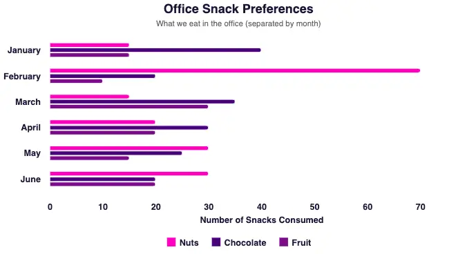
Horizontal alignment is also looking good, am I right? – demo
There are also several different types of bar charts including:
- Clustered bar charts – also known as the grouped bar chart.
- Stacked bar charts – also known as the segmented bar chart.
The same as with column charts, we’ll explore these variations a bit later.
Bar Chart Vs Column Chart – Which Is Better?
Ok, time to get straight to the heart of this charting rumble.
If you have more than 10 data points or the labels on your x-axis are long, you should go with a bar chart vs column charts. In other cases you should opt for a column chart.
Let’s take a look at the different situations where each chart might perform better.
- Race Chart = Bar Chart
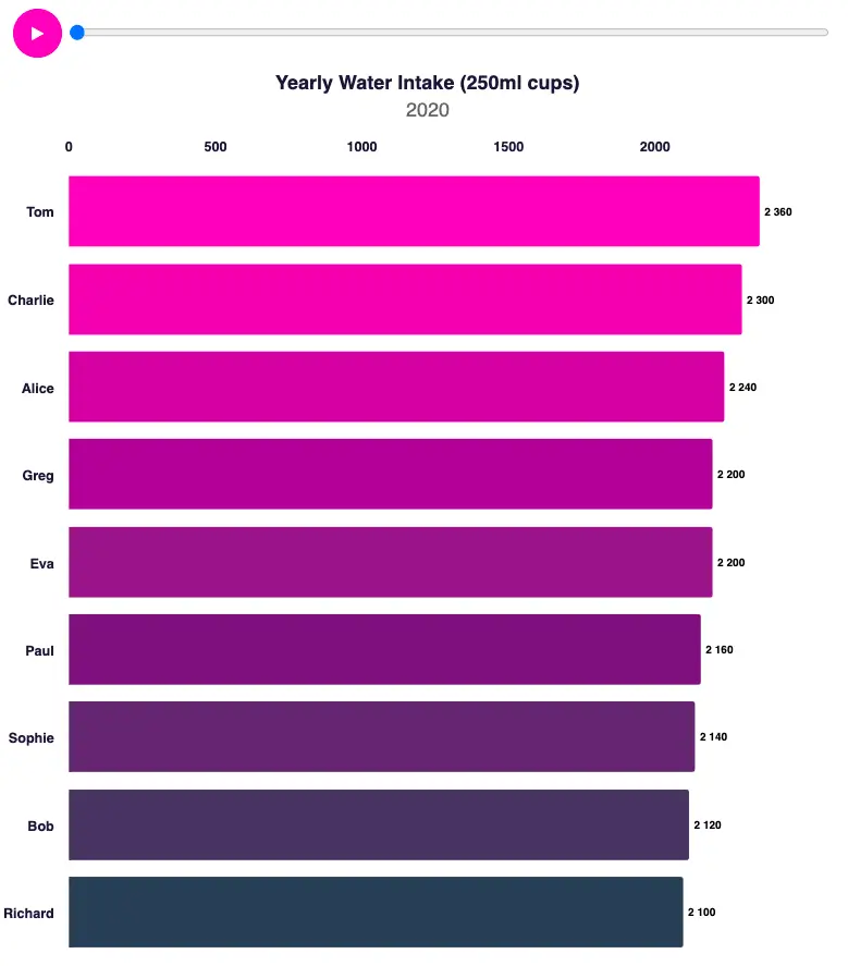
Did you know that we should drink at least 2190 250ml cups of water yearly? – demo
Above is a great example of a Race Chart, a dynamic visualization that shows changing rank over time using horizontal bars. Using a race chart can be particularly effective for visualizing a competition or leader board as the categories change in terms of rank.
Race charts are commonly used to visualize trends, fluctuations, or competitive dynamics in various fields such as sports, elections, business performance, and more. They offer a captivating way to display ever-evolving data.
- A Few Points = Column Chart
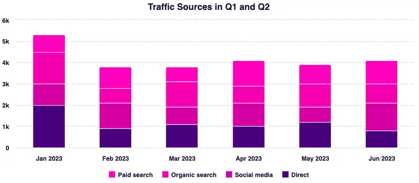
You might wonder why direct entries are so high… I wonder too – demo
A column chart is usually the perfect way to track how your data changes over time. You can easily compare different time periods and see which months generated the most traffic to your social media profile or your website for example.
- Long Labels = Bar Chart
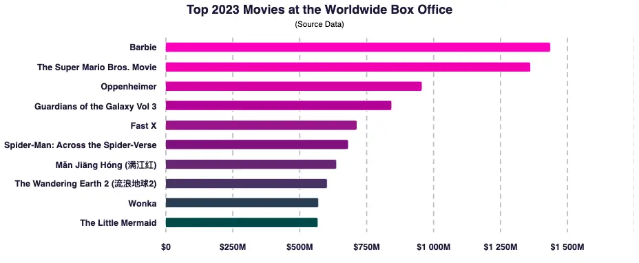
Barbie on top. Did you like the movie? – demo
In the bar chart above, it’s easy to spot the most successful movie and compare it with all the others. In this box office battle, it’s a better choice to use a bar chart vs a column chart. The names of the movies are quite long and would look squished if you decided to use a column chart.
Speaking of which, let’s move on to some more general tips for choosing chart types.
Bar Chart vs Column Chart: The Golden Rules
Did you notice anything about the examples? Well, I used different charts for different data sets and for specific use cases.
Here are the two golden rules for making the right call:
- For small datasets (up to 10 points), opt for a column chart. For larger datasets (more than 10 points), use a bar chart vs column charts.
Bar charts have better visibility in terms of bigger datasets.
What’s more, you can easily add a right-hand scrollbar for browsing more points. Of course, you could do the same with a column chart, but here the scrollbar would be on the bottom for left-to-right scrolling.
Sadly, scrolling left and right is not as intuitive, especially for categorical data, ruling out column charts for bigger datasets.
- Long axis labels means you should use a bar chart vs column charts. With column charts, you don’t have much space under each column. With longer labels, you would either need to make them shorter, rotate them, or cut them completely.
On the other hand, with a bar chart, you have much more space to the left of your bar data, so you can make the labels much longer here.
5 Types Of Bar Charts vs Column Charts
Clustered Column Charts (Grouped Column Charts)
With clustered column charts, also known as grouped column charts, you have a couple of series of data, which means that many columns are placed under a single category.
Clustered Column Chart – demo
Clustered Bar Charts (Grouped Bar Charts)
The same is true for clustered bar charts, also known as the grouped bar charts. You have several series and multiple bars under a single category.
Clustered Bar Chart – demo
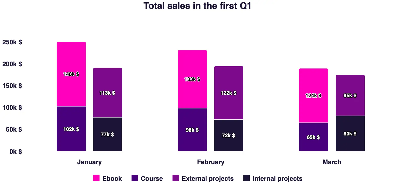
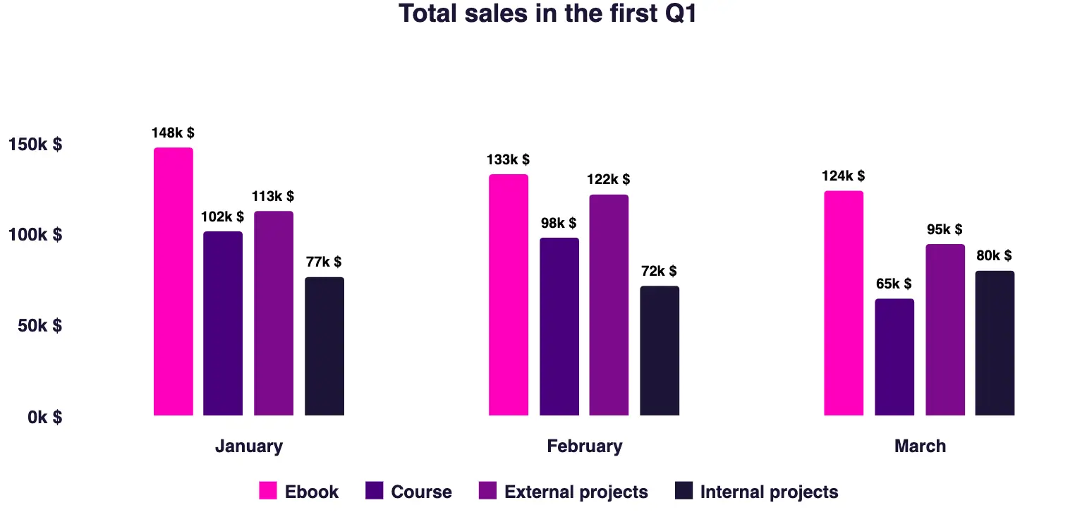
Stacked Column Charts (Segmented Column Charts)
With stacked column charts, also known as segmented column charts, each column is divided into segments or sections that represent different categories or components of the data.
The segments are stacked on top of each other to show the total value for each column, while also indicating the contribution of each category to the total.
Stacked Column Chart – demo
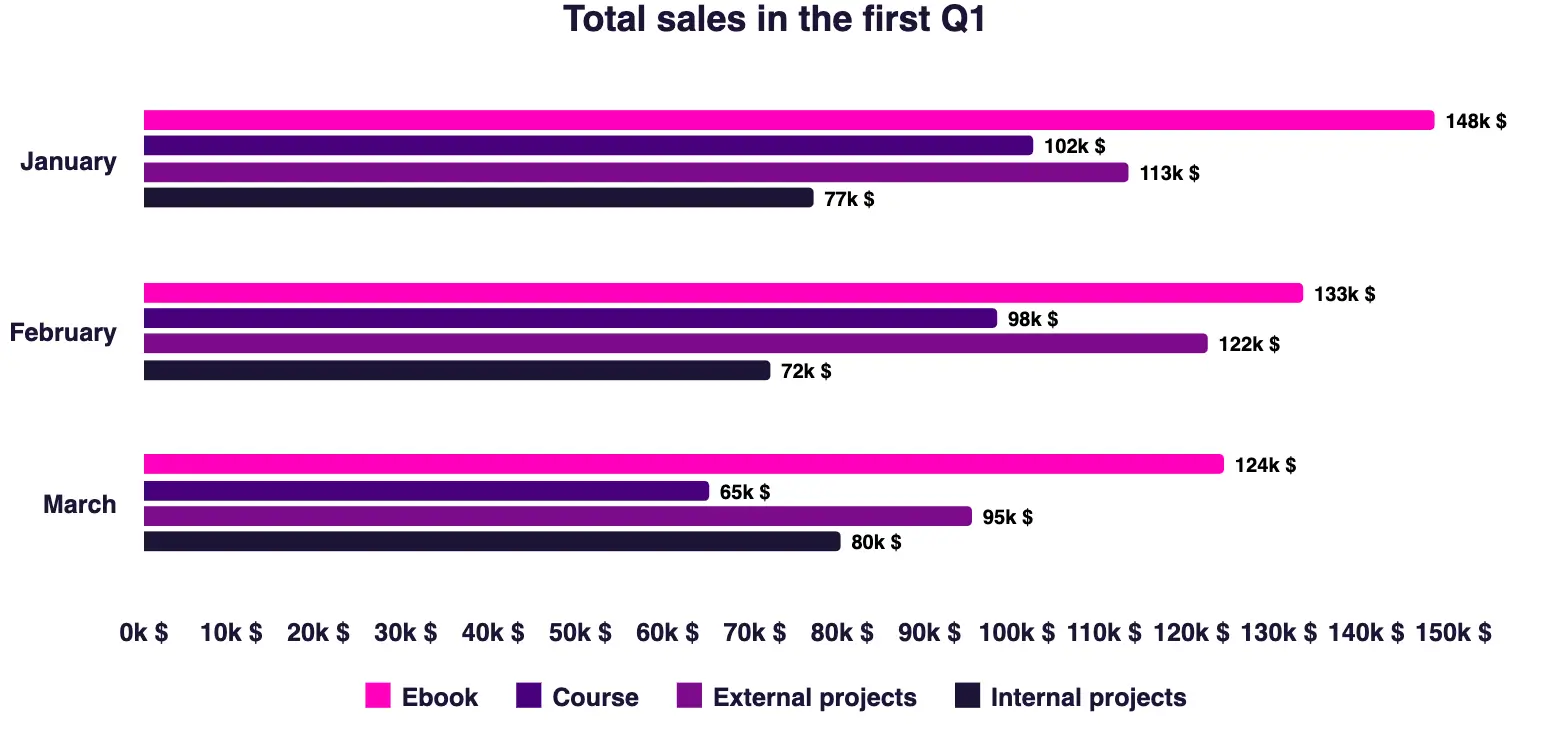
Stacked Bar Charts (Segmented Bar Charts)
You have another use case for stacked bar charts or segmented bar charts. In the chart below, each bar represents a month, and the length of the bar corresponds to the total sales for that particular month.
However, each bar is divided into segments representing the sales of each individual product. These bars are stacked on top of one another to show the total sales per month and the contribution of each product to that total. There are also two bars per category to divide the sales results into products and services.
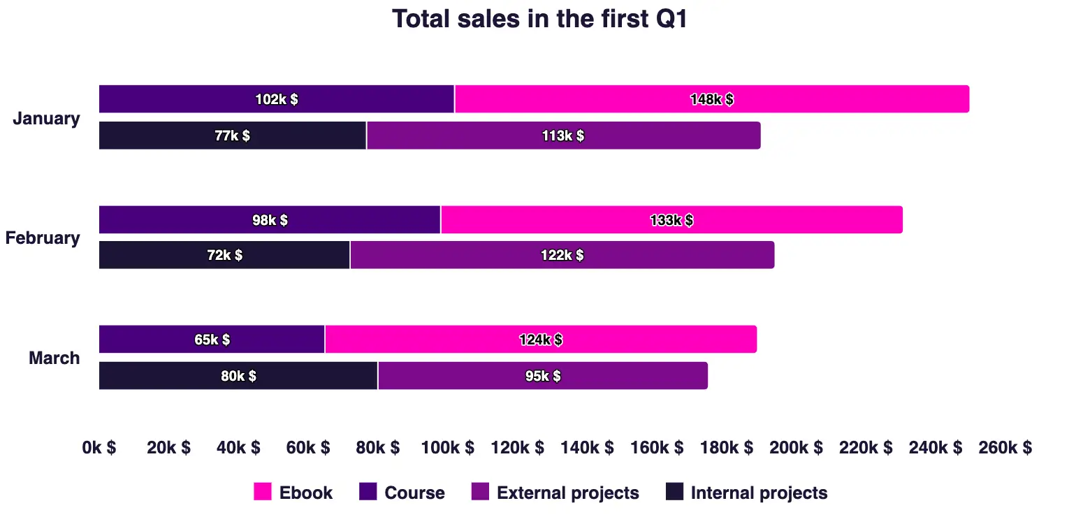
Stacked Bar Chart – demo
Non-Stacked Chart
On the other hand, here you can see what the charts from the points above look like without stacking.
Non-stacked column chart – demo
Non-stacked bar chart – demo
Basically, these are simple, grouped column and bar charts. The columns aren’t stacked on top of each other, which means you can’t see the total sales for each product or service quickly – you’d have to crunch the numbers ourselves. Also, this type of chart takes up more room and isn’t as easy to read at a glance, making it something of a loser in the World of Chartcraft.
7 Tips for Creating Bar Charts vs Column Charts
- Sort the data: You should put larger numbers on the left (column chart), or at the top (bar chart).
- Keep it (the scale) real: For the sake of readability, the y-axis should always start from a zero position.
- Consider adding data labels to the top of your columns: Then the reader doesn’t have to guess the real value of a point.
- Keep all the labels short: If it’s not possible, go with a bar chart.
- Limit your categories: Do this for improved readability.
- Use consistent colors: This will make it easier for your viewers to read the chart.
- Include a note on the data source: Credibility is key. You never wanna lose that.
PRO TIP: If you’re uncertain about whether a Bar Chart or a Column Chart is the right choice for your dataset, check out the Chart Chooser tool created by the Highcharts team. With a database of almost 50 charts, the Chart Chooser tool suggests which is the optimal chart type based on your particular data set.
Column Chart With Tips
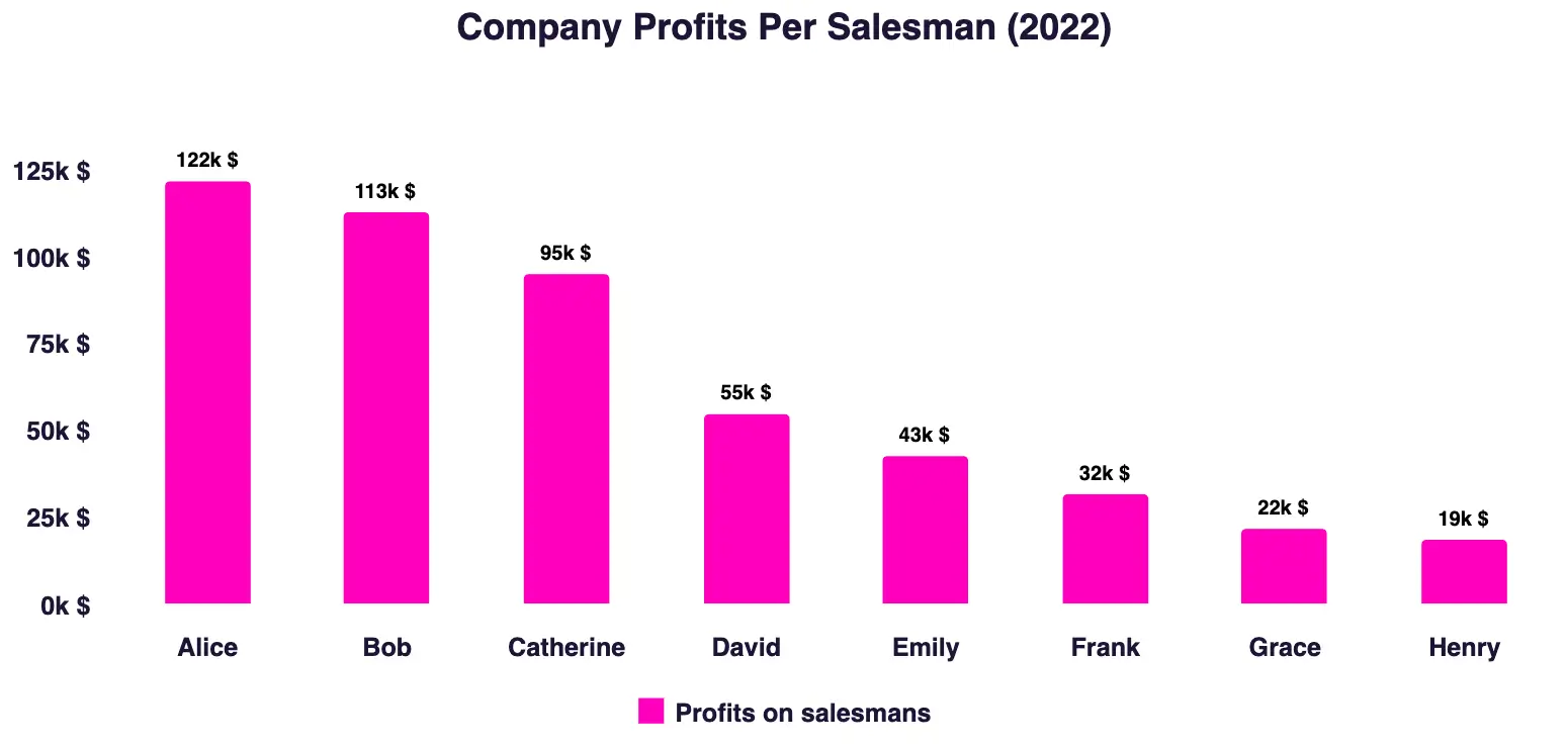
Here it’s clear Alice rocks! – demo
Column Chart Without Tips
Kinda messy, right? – demo
Overview
- Column and bar charts are the simplest type of charts. They are the go-to choice for 80% of chart users.
- You can use column and bar charts to present and compare data.
- There are two main types of column and bar charts:
- Grouped Charts -have many columns under a single x-axis label.
- Stacked Charts – each column is divided into segments that represent different components of the data.
- Column and bar charts are the best for:
- Ranking and Sorting (E.g., Any data from highest to lowest.)
- Race Charts (Which nation was the richest over the years?)
- Data Trends (How have sales changed over the years?)
- Comparing Multiple Data Sets (Clustered Charts) (How have sales of different products changed over the years?)
- Three tips for using bar charts vs column charts:
- Put larger numbers to the left (column chart), or at the top (bar chart).
- The scale must be real and the y-axis should always start from 0.
- Keep all labels as short as possible.
FAQ: Bar Chart vs Column Chart
1. What is the main difference between a bar chart and a column chart?
A bar chart uses horizontal bars, while a column chart uses vertical bars. Both show comparisons between categories, but orientation affects readability.
2. When should I use a bar chart?
Bar charts work best when you have more than 10 data points or long category labels. The horizontal layout gives more room for text and makes large datasets easier to scan.
3. When should I use a column chart?
Column charts are ideal for smaller datasets (up to 10 points) and for showing time-based data such as months, quarters, or years. They make comparisons between shorter categories more intuitive.
4. Can I use both bar and column charts for the same data?
Yes. Both charts can show the same dataset, but readability differs. For example, website traffic over 12 months may look cleaner in a column chart, while survey responses with long labels may be clearer in a bar chart.
5. What about stacked or grouped versions?
- Stacked charts show how parts add up to a total (e.g., sales by product segment).
- Grouped charts place categories side by side for comparison (e.g., sales in 2023 vs 2024).
6. Which chart is more common?
Column charts are slightly more common for time-based trends, while bar charts dominate when comparing rankings or long labels. Together, they make up most everyday business and data visualization use cases.
The Bottom Line
Who’s the winner of the brawl in bar chart vs column chart?
After reading the article the answer should be clear by now – it depends.
Remember that column and bar charts are extremely popular prizefighters for a good reason. Their true power is in their simplicity and intuitive readability.
Stacked versions of column and bar charts might work great for you when you want to show more than one point in one column at one x-axis coordinate.
So, if you’re working with a small dataset and short axis labels, a column chart is the best choice for you. On the other hand, when your dataset is big or the axis labels are long, the bar chart is your go-to chart.
Ultimately, in the chart of war, it’s never about which chart is better, but which chart is a better fit for your data set or use case.