

Welcome to the next chapter of our Data Vistory series.
In the 1880s, bicycles suddenly introduced something cities had never dealt with before: fast, human-powered movement at scale. Roads filled with riders, factories ramped up production, and competitions pushed human limits.
To make sense of it all, Victorians did what we still do today — they turned to data visualization. Maps, charts, and diagrams became tools for navigating speed, scale, and change.
The bicycle boom didn’t just reshape transportation. It helped make visual thinking part of everyday life.
The Evolution of the Bicycle
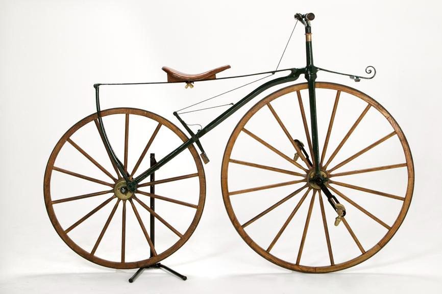
Early bicycles were mechanical experiments as much as vehicles. The boneshaker of the 1860s — wooden frame, iron wheels, no suspension — was brutal but revolutionary. The penny-farthing of the 1870s pushed speed through an enormous front wheel, trading safety for performance. Then, in 1885, the safety bicycle arrived: equal-sized wheels, chain drive, and vastly improved stability.
For the first time, people could compare machines visually.
Manufacturers, inventors, and enthusiasts began documenting improvements in speed, comfort, and reliability. Tables of measurements evolved into comparative diagrams — early ancestors of today’s performance charts. The story of the bicycle wasn’t just told through patents or prose; it was increasingly told through visual comparisons over time.
This kind of chart shows how bicycles evolved as a system. When riders took to the streets, the focus shifted from machines to movement.
How Cyclists Turned Roads into Data
By the late 19th century, bicycles were no longer curiosities — they were a system. Thousands of riders flooded roads never designed for speed, raising urgent questions:
Which routes were safest? Which hills were survivable? How far could you travel in a day?
The answer was maps.
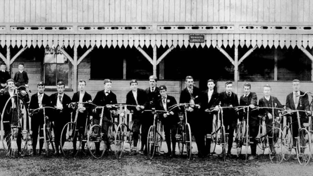
Cycling clubs across Europe and the U.S., most notably the Cyclists’ Touring Club (founded in 1878), began producing rider-made navigation graphics. These weren’t government surveys. They were practical, user-generated data visualizations.
One common artifact was the route strip map — a long, narrow diagram showing a journey mile by mile. Hills were exaggerated, gradients annotated, road surfaces labeled, and landmarks marked with obsessive care. These visuals prioritized decision-making over geographic precision.
Accuracy mattered less than usefulness. A hill drawn too steep was a warning, not an error.
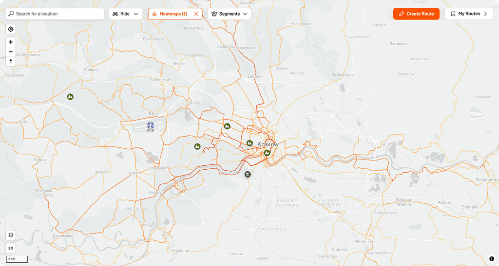
Some clubs aggregated ride logs into early flow-style route maps, where popular paths thickened as more cyclists reported them. These maps didn’t just show roads — they showed collective behavior.

Volume of bicycle trips from London to Brighton in the first half of the year.
If this sounds familiar, it should. Today’s Strava heatmaps follow the exact same principle: aggregate individual journeys → reveal patterns → guide future choices. The technology is modern. The visualization logic is pure Victorian cycling culture
Once movement was visualized, production had to be visualized too. As cycling exploded in popularity, manufacturing followed.
Data from Factory on a Chart
As cycling exploded in popularity, manufacturing followed. Bicycle production surged from tens of thousands in the 1880s to over a million units annually by the mid-1890s. Suddenly, intuition failed. Factory owners needed to understand scale.
This is where charts became indispensable.
Manufacturers tracked output over time, compared regions, and monitored the shift from penny-farthings to safety bikes. What began as accounting tables evolved into trend charts designed to persuade investors, planners, and partners.
Cities became data points. Manchester specialized in frames. Detroit in components. Coventry emerged as a bicycle powerhouse. Visualizing production geographically made industrial competition legible at a glance.
These charts weren’t just descriptive. They were strategic tools — early versions of the growth dashboards startups rely on today.
Mapping the Race
Cycling didn’t just enable transportation — it created sport. Competitive races like Paris–Roubaix turned public roads into testing grounds for human performance.
With competition came measurement.
Riders were timed. Records were compared. Improvements were tracked. Speed became something you could plot, not just feel. Newspapers printed tables of race results; enthusiasts sketched graphs showing how faster machines steadily replaced dangerous ones.
Even accidents became part of the data conversation. While exact injury counts were inconsistent, visual comparisons between bicycle types made patterns obvious: higher speed often meant higher risk — until design caught up.

Detailed parameters of the dominant race in a specific time period.
This marked a shift that defines modern data culture: performance is no longer anecdotal — it’s visualized, compared, and optimized.
From Paper Maps to Strava
By the early 20th century, bicycles faced competition from cars. But the visualization habits they helped popularize never disappeared.
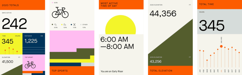
Today, cycling apps track speed, distance, heart rate, elevation, and routes in real time. Strava heatmaps, e-bike sales dashboards, and fitness analytics are direct descendants of Victorian strip maps and factory charts.
The tools evolved. The instinct didn’t.
Whenever humans move faster, farther, or in greater numbers than intuition can handle, we reach for visualization.
The Bottom Line
The Victorian bicycle boom wasn’t just a transportation revolution — it was a visualization one.
Cyclists mapped roads to reduce uncertainty.
Factories charted growth to manage scale.
Athletes graphed performance to push limits.
Long before dashboards and data science, ordinary people used visual thinking to understand a changing world. The bicycle didn’t just teach society how to move — it helped teach us how to see data in motion.
Pretty cool, right?
If you’re thinking about building similar visualizations — whether it’s route data, performance metrics, or user behavior — we can help you design charts that turn complex data into clear insights. Contact us to discuss your idea.
And if you enjoyed this Data Vistory chapter, check out Tulip Mania – The Dataviz Behind the Dutch Flower Bubble for another story of how visualizing numbers changed history.