
In this piece, I chatted with Andre Storto to unpack his PhD thesis on multilingualism—and how he’s using data visualization to make the topic come alive. His work transforms data from 593 student questionnaires into striking visualizations—think bubble charts and language constellations—that map how kids view and use multiple languages. Andre’s mission is to make the nuances of multilingualism, from cultural connections to passive language skills, vivid and accessible to everyone.
Andre Storto: So, this is one of the visuals you guys developed. This is the question: What does it mean to be multilingual? What we did was go over all 593 answers and categorize them into different topics or themes that repeated themselves throughout the answers. Yeah. We had some static categories here that just referred to the number of languages. Most students said something like, Well, to be multilingual means to speak more than two languages or to speak more than one, etc. The numbers you see below are the number of students who gave that answer. Yeah. So these are static categories. The categories in the middle are the ones we used for activities.
Andre Storto: For example, to be multilingual means to understand several cultures, to use different languages in different situations, to communicate with other people, etc. These were the categories they worked with. The task was for them to sort these categories and the undecided ones into smaller bubbles in a way that made sense—to group categories that were somehow related. Of course, we did our own categorization as researchers, but during the classroom interventions, we asked them to categorize these answers themselves. It was a challenge. Yeah, yeah. It’s not as easy as it seems.
Andre Storto: In the end, they compared their results to ours, and we showed them how we categorized the answers. For example, the family dimension is the one in pink—it includes answers like To speak, to have several mother tongues, to speak several languages with the family, etc. The yellow group relates to language learning, so all the answers in this category have to do with things like To be multilingual means you can learn more languages, it helps you learn other languages, etc. The purple group at the bottom has to do with cultures and communication, and so on. This activity allowed them to compare their categorizations with ours. This is a very complex visual, and you guys played a crucial role in developing it.
Andre Storto: Then, in the last part of the visual, there were prompts about the categories that the students had to answer. For example, Category Three: How many languages do you need to be considered multilingual? They chose one of these categories during the sessions and answered the prompt on a different mini-server we used. So, this was one of the visuals we worked with. And, now that you ask, I’m going to show you everything.
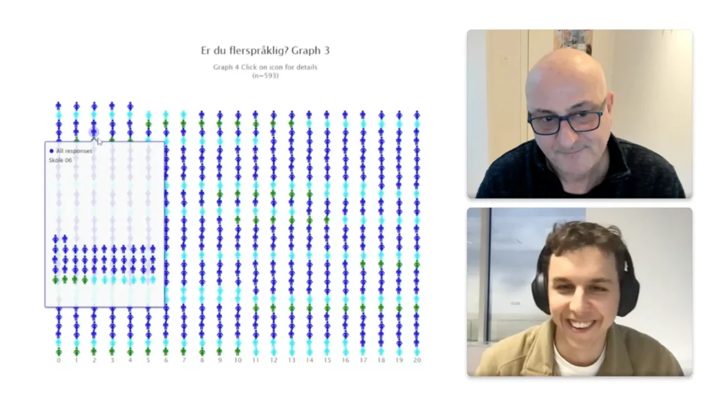
Andre Storto: This is the other set of visuals you guys developed. And this is the second prompt. Yeah, you can probably see it now. That’s the second prompt. We just asked them, Are you multilingual?
Dominik Chudy: That’s cool, American data.
Andre Storto: This one is in Norwegian, but basically… Yeah.
Andre Storto: Are you multilingual? We presented their answers from the whole dataset from the questionnaire using different visual formats—a pie chart, a bar graph—divided by gender. You also did something really cool here. If you click, you see all the respondents in the dataset—593 of them. We wanted to explore the idea in data visualization of Can you see yourself in the data? How do you represent all participants anonymously, but in a way that still includes everyone? If you hover over the categories, you can even see the different schools the data came from—School 5, School 6. This one is from School 6.
Andre Storto: School Three, etc. But you did a really nice job with School One.
Dominik Chudy: Yeah, definitely.
Andre Storto: So, in a way, everybody is represented here, but anonymously. During the intervention with the kids, we worked on different types of activities. I’m not going to go into detail here, but this is what we did with this dataset. Now, I’ll show you something we didn’t actually use with the students, but you guys helped us with—how to represent the individual language repertoire of the students. How do you visualize the languages they use in a way that’s both tangible and can be summarized into one cohesive visualization?
Andre Storto: Let me show you an example. This is the language constellation visualization, which is really interesting.
Dominik Chudy: Oh, that’s great! So with this data, you can see in what contexts students use different languages.
Andre Storto: Exactly. It’s also a way to represent the questionnaire data visually, as a cohesive ensemble. Here’s one example: a participant who listed Norwegian, English, Swedish, Spanish, Sign Language, and Danish in their repertoire.
In this case, Danish wasn’t used in any specific context, but we included it because the participants noted it as a language they know passively. Norwegian, however, is central, as it’s used in most contexts. When you hover over a language in the visualization, you can see its connections to other contexts—like family, friends, or holidays—and how it links to other languages. For example, Norwegian connects to Sign Language, Swedish, Spanish, and English through various contexts. The arrows highlight these connections.
Sign Language, for instance, is likely just a family language shared at home with Norwegian and English. This visualization offers an individualized perspective on the participants’ linguistic repertoire.
Andre Storto: Another example is a more conventional polar chart. This one aggregates the data for the entire group of students. Can you see it? Oh, hang on, let me share it again. There we go. This chart represents the languages students learn at school, focusing on contexts such as family, friends, and internet use.
For instance, in the Norwegian educational system, students start learning Norwegian and English in Year 1. By Year 8, they can choose a third language—typically Spanish, German, or French. The chart shows the contexts on the periphery, while the languages are highlighted in the center. Hovering over a language displays its specific connections.
Dominik Chudy: That’s fascinating! For example, English seems to dominate in online contexts.
Andre Storto: Yes, exactly! One of the interesting findings was that more students reported using English on the internet than Norwegian. For family use, Norwegian naturally dominates, while other languages are less commonly used at home. Many students use Spanish during holidays, though, even in the first year of learning it. The arrows are proportional to the percentage of respondents—so for instance, 51.4% of students said they watched films or listened to music in Spanish.
We also created another version of this visualization. Instead of placing the contexts on the periphery, we placed the languages there and organized the data by context. It’s just a different perspective on the same data.
Dominik Chudy: That’s so useful! English really stands out as a global language. I imagine it would be similar in Poland, where English and Polish would likely be the most prominent.
Andre Storto: Absolutely. If we conducted this study in Poland, I suspect English and Polish would dominate too. Additionally, it would be interesting to examine languages people understand passively, like Russian or other Slavic languages. Even if someone doesn’t actively use Russian, for instance, they might still recognize or understand it due to similarities with Polish.
This touches on an important aspect of multilingualism: Are people aware of the linguistic resources they possess? Many individuals don’t consider passive knowledge or dialects part of their multilingual repertoire. For example, in Norway, many people understand Swedish or Danish due to their similarity to Norwegian, but they may not view this as multilingualism.
Dominik Chudy: That’s an intriguing question. Some people might not consider themselves multilingual unless they actively speak and use the language. However, understanding and communicating—even at a basic level—can also be part of multilingualism.
Andre Storto: Exactly. Most people underestimate their linguistic capabilities. If you ask them how many languages they know, they might only mention the ones they actively speak, neglecting passive understanding or occasional use. This project aimed to challenge those perceptions.
Dominik Chudy: It’s such an interesting area of research. And how did the students respond to these charts and the categorization activities?
Andre Storto: They engaged with the data very well. Categorizing and interacting with the visuals was challenging but rewarding for them. We collected a lot of data on their interactions with the charts, though we haven’t analyzed everything yet—there’s always more data than time in academia!
Dominik Chudy: I completely understand! But this is all so useful for sharing knowledge. Thank you for taking the time to explain everything.
Andre Storto: It was my pleasure. Feel free to reach out if you have more questions or need anything else for the blog.
Dominik Chudy: Thank you again. We’ll make great use of this. See you next time!
Andre Storto: Take care! See you.