

A histogram and a bar chart are two types of charts that at first glance look very similar so perhaps that is why they are often confused in reports, dashboards, and data analyses. They both have bars, include X and Y axes, and commonly present data. This visual resemblance is the main reason why they are frequently misused. The problem is that choosing the wrong chart leads to incorrect conclusions. Choosing a histogram to compare categories can distort comparisons, whereas a bar chart may obscure the true distribution of the data. In this article, we explain the histogram vs bar chart distinction and show when and why each should be used.
What Is a Histogram?
A histogram shows how continuous numerical data are distributed. It divides values into intervals called bins and counts how many observations fall into each range. Analysts use histograms to examine distribution shape, skewness, and outliers, not to compare categories.

Check how daily coffee orders fluctuate in this easy-to-understand distribution analysis.
Histograms – a Detailed Explanation
A histogram shows continuous data, meaning numerical values that fall within a range, such as age, duration, height, weight, or test scores. On the X axis, it groups values into intervals called bins, while the Y axis displays frequency. Unlike a bar chart, a histogram has no gaps between bars because the data form continuous ranges. This structure reveals how values spread across the range. Histograms help identify distribution shape, skewness, concentrations, and outliers, which makes them essential in statistics and data analysis.
What Is a Bar Chart?
A bar chart is a visualization used to compare values across discrete categories. Each bar represents a separate category, and its height corresponds to a numerical value such as a count, total, or percentage. Bar charts are commonly used for rankings, comparisons, and business reporting.
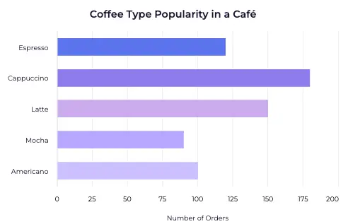
Dive into the coffee type leaderboard to see which of them is the most demanded.
Bar Charts – Detailed Explanation
A bar chart displays categorical data, which means data that divides into clearly separated categories such as sales by region, product types, subscription plans, or survey responses. Categories take either a nominal form, when no natural order exists, or an ordinal form, when a natural order exists. In a bar chart, the X axis lists categories, while the Y axis shows numerical values. The gaps between bars highlight that each category stands independently and does not form a continuous spectrum. Because of its simplicity and clarity, analysts and presenters use the bar chart widely in dashboards, reports, and business presentations.
Continuous vs Categorical Data – The Foundation of Chart Choice
The chart depends on the type of data. Continuous data can take any value within a given range, such as student height in a class. Categorical data falls into distinct groups, such as the number of students in classes A, B, and C.
The key principle is simple. The data determines the chart, not the other way around. Find out more about data types here.
Histogram vs Bar Chart – Key Differences
This comparison will help you understand the basic differences between a bar chart and a histogram, and also make it easier to decide which type of chart is the best choice for a given dataset.

When to Use a Histogram vs Bar Chart
When deciding between a histogram vs bar chart, use a histogram to explore the distribution of numerical data, detect outliers, and identify patterns within large datasets. Use a bar chart to compare distinct categories, highlight differences between groups, and present clear, straightforward comparisons. Both charts help you understand your data, but histograms reveal how values spread, while bar charts emphasize differences between items or groups.
Typical Use Cases
Histograms are commonly used in scientific research, data science, descriptive statistics, and quality control, where understanding data distribution is critical. Bar charts are most effective in business dashboards, sales reports, marketing analyses, and executive presentations, where clear and fast comparisons are essential.
Can You Use Both Simultaneously?
Yes, but only in specific scenarios. A common approach is to use a histogram in the analysis phase to understand the data distribution, and a bar chart in the presentation phase after the data has been aggregated into categories. It is important not to mix these two charts at the same stage of analysis, as they answer different analytical questions.
Advantages and Disadvantages of Histogram and Bar Chart
A histogram allows you to clearly see data distribution and identify outliers, but it is sensitive to how the data is grouped into bins and can be less intuitive for non-technical audiences. A bar chart, on the other hand, is clear and easy to interpret, making it ideal for presentations and comparisons, but it does not show data distribution and is not suitable for continuous data.
FAQ: Histogram vs Bar Chart
Why would I make a histogram instead of a bar chart?
You use a histogram to see how your data spreads, not to compare categories.
Can a histogram show categories?
No. A histogram shows continuous data and groups values into ranges.
Is a histogram a type of bar chart?
They may look visually similar but they serve different purposes.
What happens if I use a bar chart instead of a histogram?
You may lose important information about the data distribution and misinterpret the results.
Which chart is better for business presentations?
In most cases, a bar chart is more intuitive for business audiences.
Conclusion – How to Choose the Right Chart
Choosing between a histogram and a bar chart depends on data logic, not aesthetics. Use a histogram to analyze data distributions and a bar chart to compare categories. When you understand the difference between continuous and categorical data, choosing the right chart becomes straightforward. A well-chosen chart does more than improve visualization – it supports clearer insights and better data-driven decisions. See how we can help you achieve these results here.