
Imagine living in a city where daily life feels like a constant struggle – the streets are choked with traffic, the air is so polluted that a short walk becomes a lung endurance test, and the nearest park is an hour away by car. Many of us know this reality all too well. While moving elsewhere might seem tempting, work, family, or simply attachment to the place can keep us rooted. But what if, instead of escaping, we could actually make things better – by getting closer to the idea of a smart city?
What Is a Smart City?
The concept of a smart city – one that uses data and technology to make urban life more livable – offers that possibility. It not only helps us understand urban challenges but also addresses them in smarter, more efficient ways. This article shows how data and its visualization can become powerful tools for real change – even right outside your door.
Why Does a Smart City Matter?
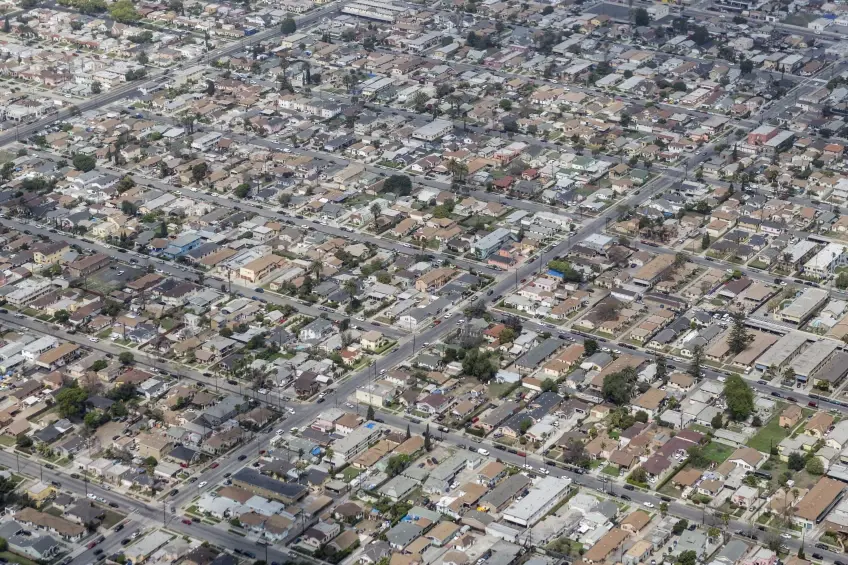
Urban congestion and a lack of green space are pain points in many major cities. Take Los Angeles, for example. Despite its global appeal, it’s infamous for traffic and chaotic development. While it stretches across a vast area, green spaces are surprisingly rare. Many residents have to drive long distances just to find a patch of grass.
Historically, cities developed organically – along rivers, trade routes, or near valuable resources. People built homes, roads, and infrastructure as they went, with little regard for long-term planning. As urbanization exploded, problems multiplied: overcrowding, noise, pollution, and limited access to nature.
The result? Tangible threats to both physical and mental health. Fewer trees mean more CO₂, poor sleep, and higher stress levels. The term “urban fatigue” is becoming more common to describe the exhaustion of living in poorly designed environments. That’s why data-driven, thoughtful urban planning is more important than ever.
The Role of IoT in Building a Smart City
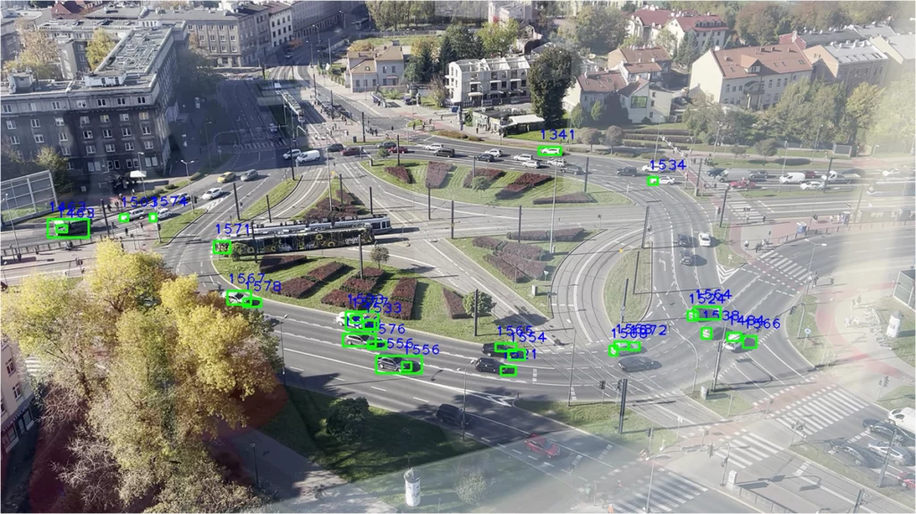
For a city to respond to challenges, it first needs to “see” what’s happening. This is where the Internet of Things (IoT) comes in. Sensors placed on intersections, streetlights, buses, or even trash bins collect real-time data. Smart systems then analyze the information to make instant decisions – adjusting traffic lights, dispatching services, or optimizing energy use.
In the U.S., networks of smart street lights already adapt to pedestrian and vehicle movement. Meanwhile, Japan uses IoT technology to monitor air quality and alert residents when it’s unsafe to go outside. Over in Germany, systems supported by the NIST Framework coordinate public and private transport to help avoid congestion. But none of this is possible without data – and the ability to understand it. If you want to find out more about IoT implementation, check out the article here.
How Data Visualization Helps Solve Smart City Challenges
Data visualization turns raw numbers into understandable, visual formats. Rather than staring at endless spreadsheets, we see patterns, anomalies, and trends – insights that drive better decisions.
In urban planning, dataviz can highlight:
- traffic flow changes throughout the day,
- pollution hotspots,
- neighborhoods lacking green areas,
- gaps in public transit coverage.
A well-crafted visualization can be incredibly persuasive. It catches the attention of officials, engages the media, and rallies communities around shared goals. It’s far more impactful than a static Excel table.
How to Create a Traffic Map in Your Neighborhood
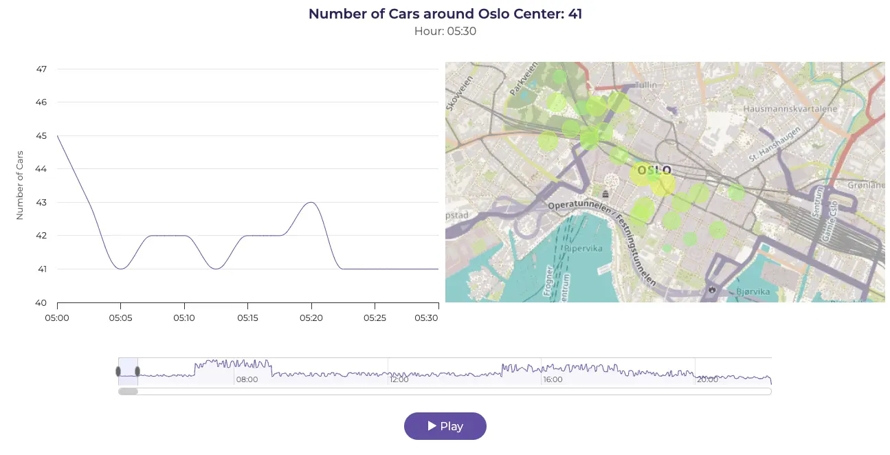
Advanced Insights into urban mobility – a comprehensive dashboard illustrates real-time traffic data around the Oslo City Center. Smart city technology provides crucial information for city development and looks cool too!
1. Find the Trouble Spot
Start by picking a street that regularly gets congested – maybe it’s the entrance to your neighborhood, a nightmare intersection, or just that one spot where you’re always stuck in traffic. Take a screenshot of the area in Google Maps – you’ll need it later.
2. Do Some “Field Research”
Spend a day or two (ideally during the week) counting cars with one or two friends. Every 10 minutes, jot down how many vehicles pass in each direction – from early morning to late evening (say, 6 AM to 10 PM). Split the shifts if you want – and yes, coffee is a must.
3. Move Your Data to the Computer
Pop everything into Excel, Google Sheets, or any other tool where you can easily organize it. If you want to get fancy, use exact timestamps – they’ll come in handy for your charts.
4. Time for the Chart
Here’s where the magic happens. Use Highcharts to create a graph that shows how traffic volume changes throughout the day. You can even throw in your Google Maps screenshot to make the visual more complete.
5. Share It With the World
Got your chart and map ready? Great. Turn it into a presentation, present it to your neighbors, print it, and take it to city hall. This kind of data has a lot more impact than just saying “it’s always jammed here.”
6. What’s Next?
Let’s say your chart shows traffic peaks at 9 AM and 5 PM. That’s something! Now it’s clear when congestion hits hardest – and you can suggest real solutions: maybe rerouting traffic, adding another lane, or even implementing smart traffic light systems.
Small effort, big potential. You don’t need to be an expert or have a city-sized budget – just some motivation, a bit of time, and the right tools.
Conclusion – Your Actions Matter
Smart cities aren’t just about futuristic tech. They’re also about everyday people who care enough to act. With simple tools like data visualization, you can directly influence your surroundings.
Instead of complaining about traffic, show where it’s worst. Instead of wishing for more green spaces – pinpoint where it’s needed.