
Beethoven, Tchaikovsky, Vivaldi – all great composers who created timeless music that speaks to our hearts. Just as they blended notes to create beautiful melodies, we face a similar challenge with data in our busy world. In a sea of numbers and information, the key is to find the most important insights. A well-designed dashboard acts like a musical score, organizing data to help us see what truly matters. It highlights crucial metrics, creating a symphony of information that allows us to understand and act on the data both quickly and effectively. But let me start by answering a question – what is a dashboard?
Keep That in Mind – Definition of a Dashboard
A dashboard is a collection of components that displays important information on one screen, making it easy to see everything in one place at a glance. It provides quick access to various visual elements that present detailed data, helping decision-makers analyze and explore information in one place.
Dashboards are widely used in business intelligence (BI), data analytics, and operations monitoring, providing a centralized view of critical metrics to support faster, data-driven decision-making.
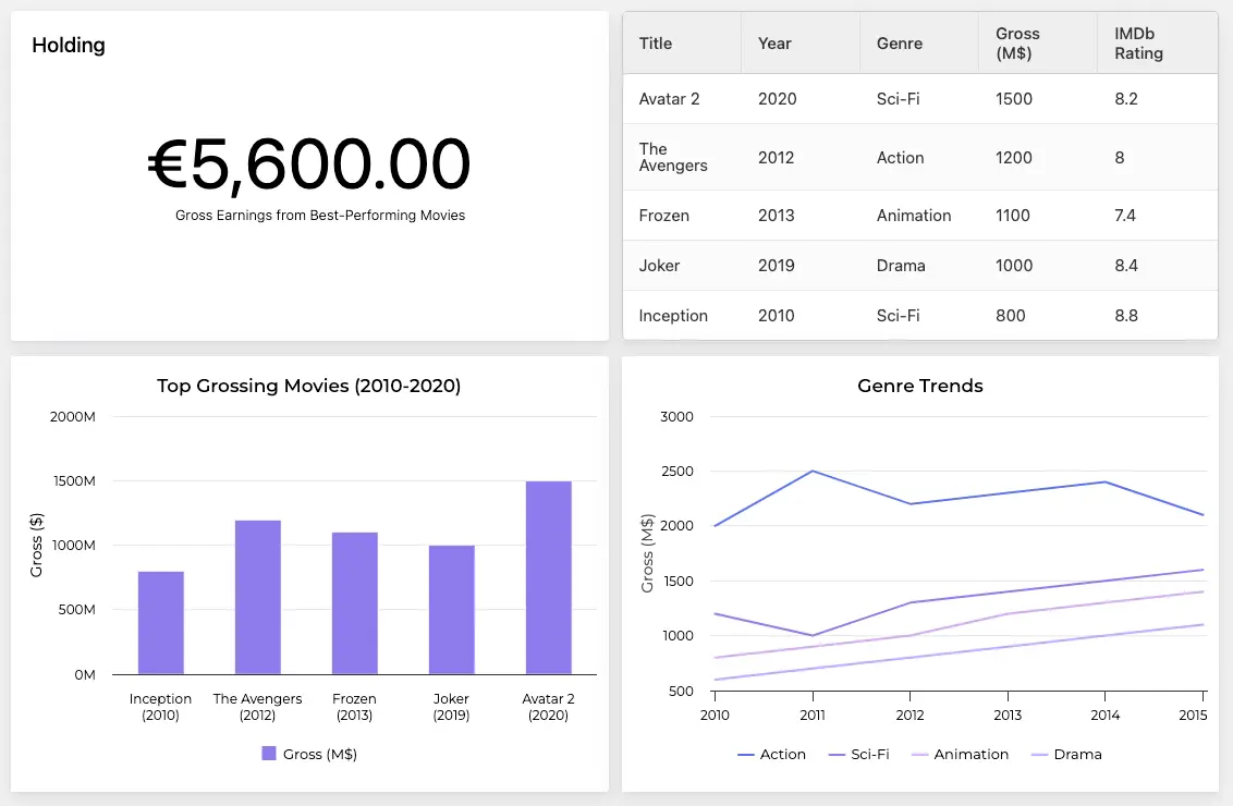
Beyond the box office: Take a deep dive into recent blockbuster movie stats and genre trends.
A well-designed dashboard should:
- Include up to 10 components, such as:
- charts,
- tables,
- filters,
- KPIs.
- Use up to five colors, for clarity and consistency:
- One primary color – for key elements (e.g., KPIs).
- One accent color – to highlight critical data points or trends.
- One to three neutral colors – for background elements, grid lines, and text (e.g., grays or light tones).
There’s this popular saying “less is more” and it applies here perfectly. If you want to have a clean dashboard you should limit your components and colors.
Why Do People Use Dashboards?
People get into dashboards for two main reasons:
- When they need to aggregate data from multiple sources into a single interface, and then see what they can actually do with it.
- When they need a visual way to explore patterns and anomalies in data – like a lightweight form of EDA (Exploratory Data Analysis).
- When they want to back up a decision they’ve already made with data.
One of the reasons is great, and the other might lead to a catastrophe.
No matter the reasons, the definition is rock-solid and it never changes.
Examples of Well-Designed Dashboards
So, now that you’ve discovered what a dashboard is and why people use it, can you think of any good dashboards you’ve seen? What did they have in common?
Take a look at some examples of well-designed dashboards and explore what makes them great.
Monitor the Health of Your Business Dashboard
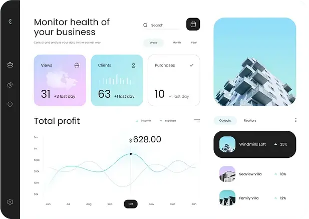
I really like the small components with light graphics. The three intuitive buttons for filtering the data make it easy to use. Plus, the chart fits nicely into the dashboard with its transparent background.
Sleep Tracker Dashboard
The colors are great here (apart from the dark background in the “Your score” field), and the layout of the dashboard is also good. It’s divided into two rows and one column, with each element focusing on a different topic.
E-commerce Sales Dashboard
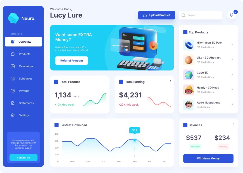
What I like most about this dashboard is its simplicity with only a few components. At first glance, you can easily see the most important information, like the top-selling product and the earnings trend.
Now, let’s unpack why these dashboards work so well.
Dashboard Creation Best Practices
All of the above Dashboards have three things in common:
- A Simple Layout: Easy to navigate, with a clear separation between sections covering different data sets.
- Only a Few Components: Less clutter makes it clearer and easier to use.
- Subtle Colors with Stronger Accents on Important Data: Using soft colors for the background and bold accents for key information helps draw attention to what matters most.
All right, theory is great but as Yogi Berra said “In theory, there is no difference between theory and practice. In practice there is.” Let’s unravel this difference.
Use Case: Creating a Dashboard for a Client
Imagine a Proptech client has approached me with a request to design a dashboard to fit their needs. To ensure I fully understand their requirements, I begin by asking a series of targeted questions to uncover the core problem and goals:
– What is the main objective of this dashboard?
– What data is available, and what are its limitations? Are the relationships within the data already known, or do they need to be explored first?
– Who will be using it, and how often?
– What actions should users take based on the dashboard insights?
– On which device will the dashboard primarily be accessed?
Client Feedback from a 5-Minute Discussion
After a brief conversation, the client provides the following insights:
– The dashboard should track energy consumption across their commercial properties.
– It will be used by the client themselves (CXO) and potentially their property manager and checked at the beginning of the month to review the proportions between renewable and non-renewable energy sources, as well as basic metrics like daily, monthly, and yearly energy usage.
– The goal is to either take no action or investigate spikes in non-renewable energy consumption, identify the cause, and potentially eliminate unnecessary costs.
– The dashboard will be accessed on a MacBook laptop during the report review sessions. Additionally, the client has also mentioned their broader business goals which involve renting properties across various European cities, aiming to optimize returns, which could influence future dashboard features.
Further Clarification
I ask an additional follow up question: How many properties are we talking about? The client reveals they currently manage 4 properties of two different types but plan to expand to 10 within a couple of years. This information is crucial as it impacts the dashboard’s design and scalability. It’s also important to understand if the data structure might evolve over time, allowing us to build a more adaptable dashboard.
Approach to Dashboard Creation
I like to adhere to a principle often associated with McKinsey (apologies if I’ve misstated this): deliver an initial result to the client within 24 hours. From there, you can iterate, refine, or pivot as needed. The key is to have a functional prototype ready quickly. With the insights gathered from the 5-minute talk, I can create a draft dashboard and improve it later.
Dashboard Components
Based on the client’s input, I identified the key elements to include:
– A stacked area chart illustrating monthly energy sources, clearly distinguishing between renewable (e.g., solar, wind) and non-renewable (e.g., fossil fuels) contributions, enabling the client to assess sustainability progress.
– A map displaying the properties; clicking on a property filters the charts to show data for that specific location.
– A bar chart showing the monthly breakdown of renewable energy shares.
– Three energy usage metrics: yearly, monthly and daily.
– A compliance indicator confirming whether the property meets energy and sustainability regulatory standards.
Layout Planning
Since the client will use the dashboard on a laptop, we don’t need to account for small screen resolutions. So here’s the proposed layout:
– A Map: Positioned on the left side, showing all properties with filterable interaction.
– An Area Chart: Placed at the bottom right, showing monthly energy source composition (renewable vs. non-renewable).
– A Bar Chart: Positioned above the area chart, displaying monthly renewable energy share.
– A Metrics Panel: Located on the right side, showing yearly, monthly, and daily energy usage.- A Compliance Indicator: Positioned at the top of the right panel for quick visibility.
Next Steps
With the layout sketched out and some time remaining before the meeting with the client, I took the time to develop a simple online demo. This interactive prototype will allow the client to click through and explore the dashboard providing valuable feedback for further iterations.
This process highlights the steps involved in creating a tailored dashboard, from gathering requirements to designing a functional prototype.
And here’s the layout of the actual interactive Proptech dashboard I made for the client:
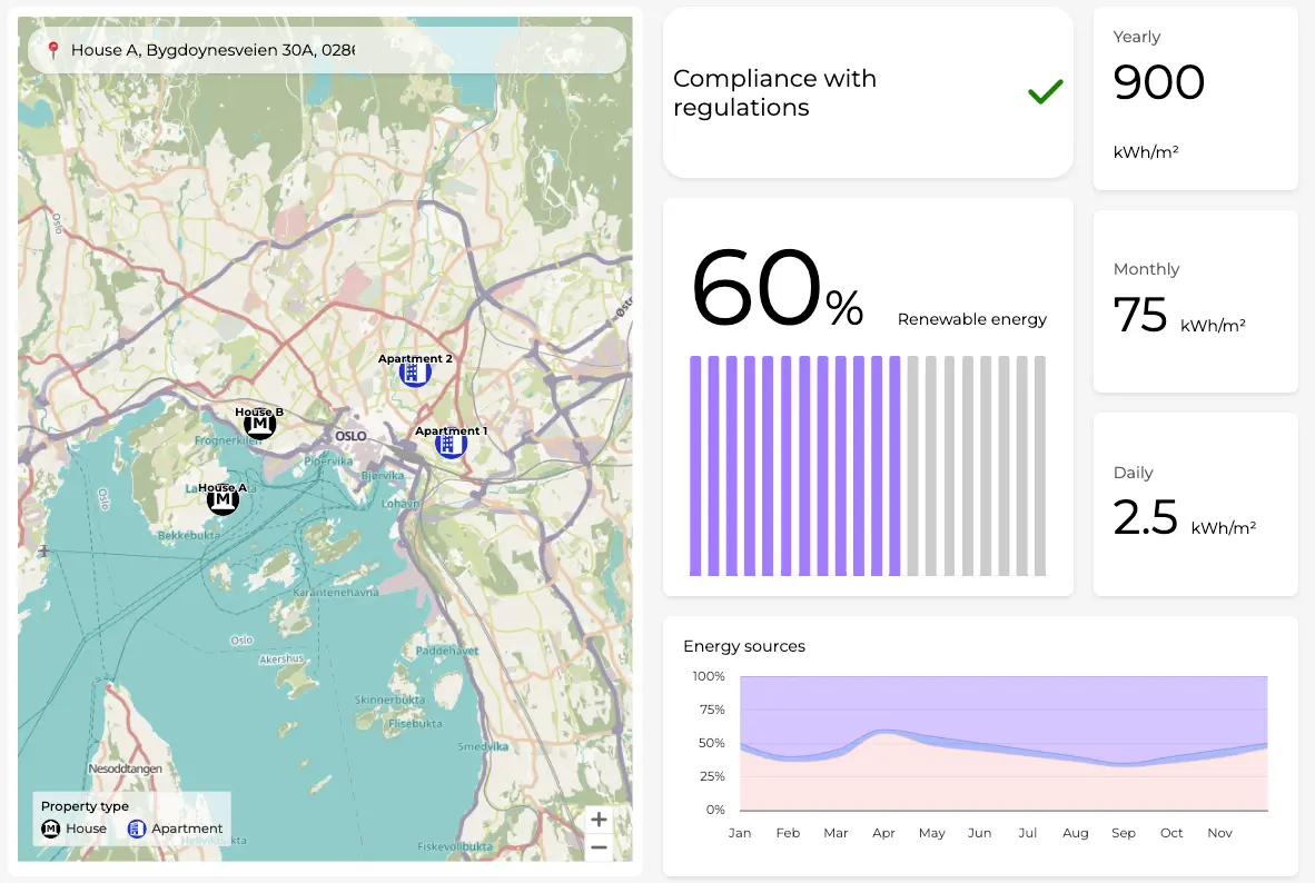
Green insights: Monitoring energy efficiency for smarter property management in the Proptech industry.
Summary – Make Conscious Decisions Using Dashboards
Remember that a dashboard is a tool that puts important data on one screen, like charts and numbers, so you can see everything at a glance. It’s designed to be clear, using up to 10 parts and a few colors – 1 main, 1 highlight, and 1-3 neutral ones – to keep things easy to understand.
People use dashboards to pull data from different places into one spot or to back up decisions they’ve already made.
When designing a dashboard, ask yourself a few key questions: What’s its main purpose? Who’s using it, and how often? What actions should it help people make? What device will it be viewed on? Answering these questions will ensure your dashboard meets its goal effectively.
Now that you understand dashboards, check out our other articles exploring the dashboard world, like financial dashboards, for more insights. If you need help designing a dashboard yourself, don’t hesitate to book a free consultation below.