

I have 12 colorful candies in 5 different colors. I want to share them with my friends but I don’t want to lose any of the colors I have (well, except for the blue ones. Who likes those?). Still, giving them out randomly sounds like a bad idea.
I’ll sort them by color into five groups. Each candy color represents a category, and organizing candies into such groups helps us understand which colors are the most common. In other words, which color can I share the most.
Now I can start off by distributing them to my friends, beginning with the group that has the most number of candies
Now you know an example of categorical data but as we’re professionals we’ll dive into more advanced definitions, examples, and tons of useful tips.
What is Categorical Data?
Categorical data is information that falls into specific groups or categories. Unlike numerical or time-based data, which are continuous and can be measured along a scale, categorical data consists of distinct, non-ordered categories. It is often used to represent qualitative features such as types of fruit or colors.
Examples of categorical data include:
- Product Categories: Different product types or categories.
- Survey Responses: The category can represent response options, making it easy to identify the distribution of opinions.
- Geographical Regions: A category may represent different regions or countries.
Such data is often presented using various types of charts. Here’s an example of categorical data on an x-axis.
Examples of Categorical Data on the xAxis
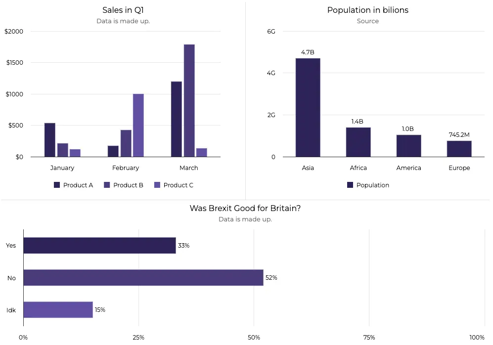
Categorical data can be presented in at least a dozen ways.
A comparison of sales of products, population on continents, and finally visualizing survey answers. All of these data samples are part of specific categories. That’s what makes them categorical.
PRO TIP: If your data falls into specific groups or categories then it’s definitely categorical data.
Now a number of questions arise. First up, how to use the data to its fullest?
How To Get The Best Out Of Categorical Data?
To get the best out of your categorical data you need to focus on two things:
- Choosing an appropriate chart type
- Readability, as it’s very easy to mess it up with categorical data
Let’s start with the first one.
Chart Types for Categorical Data
The best chart types for categorical data are those that can easily display the count of each category. Here are 3 groups of charts you should consider:
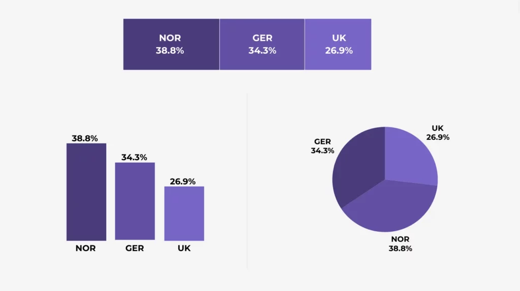
Bar and Column Charts for Categorical Data
Bar and column charts are visualizations in which each point is represented by a rectangle, the height of which is proportional to the point’s value. They differ in orientation, with the bar chart oriented horizontally and a column chart is vertical.
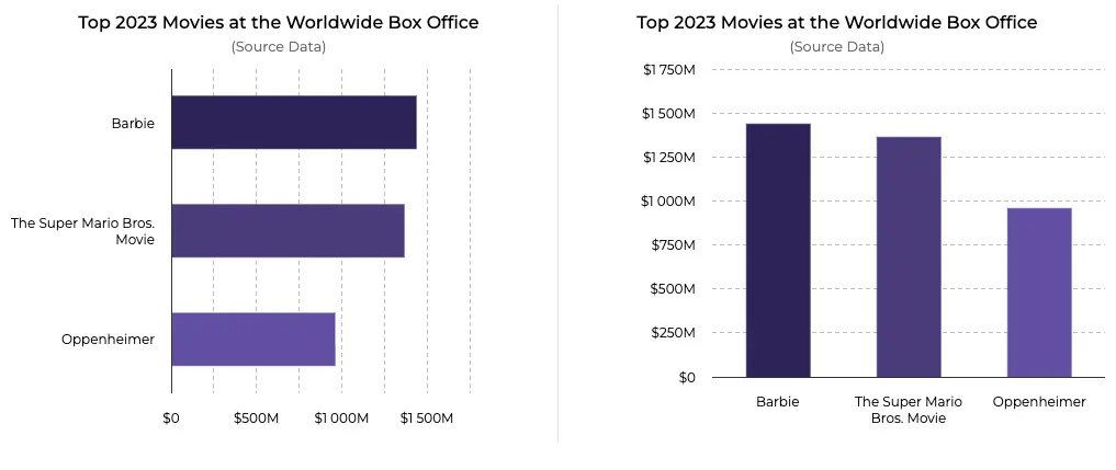
Barbie rocked the Global Box Office in 2023. (chart)
Bar and column charts are:
- Best for displaying the frequency or count of each category.
- They are the most popular types of charts, making them the easiest to understand
- Suitable for small and big amounts of categories. Column charts for fewer categories, bar charts for more. Read more in our article: Bar Chart vs Column Chart: Which is best for you?
They should probably be your first choice. However, under certain conditions, other types may be better, so it is important to know your options. Let’s take a look at them.
Pie and Donut Charts for Categorical Data
A pie chart is a visualization representing data in a circular form, with each point represented by a slice. A donut chart, on the other hand, is basically a pie chart with its center cut out to look like a donut. This modification also makes the chart look more modern.
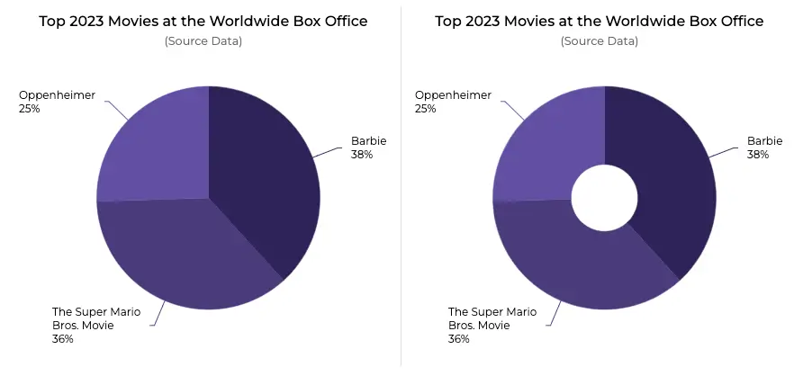
Which version do you prefer? (chart)
Pie and donut charts are:
- Ideal for showing the proportion of each category relative to the whole
- Work well when you have a small number of categories
- Perfect for mobile devices, as their shape is compact
Avoid using pie and donut charts for too many categories or when the differences in proportions are small.
Treemap Chart for Categorical Data
A treemap chart is a visualization composed of nested rectangles. Each rectangle represents a certain category, with the rectangles ordered in a hierarchy, or “tree”.
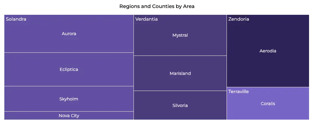
Did you know treemaps were created to visualize hierarchical file structures on computer disks? (chart)
A treemap chart is:
- Ideal for displaying hierarchical categorical data
- Useful for showing the relative proportions of categories within a hierarchy
- Perfect for dashboards and smaller screens as its shape is compact
However, it might not work well if your data has similar values. The reader might have a problem comparing two similar areas on the treemap.
2 Powerful Tips For Crystal Clear Visualization Of Your Categorical Data
Knowing the best chart types for categorical data, we only have one topic left to cover today. How can we keep chart readability as high as possible with this simple but demanding type of data?
1. Keep your labels clear
With categorical data, labels on the x-axis are often long and this decreases their clarity. It’s a no-brainer that the labels should always be clear and concise.
If they are too long, shorten them. If that’s not possible or it still doesn’t look good, consider changing your chart type, from a column chart to a bar chart for example. At first glance, readers should instinctively understand their meaning.
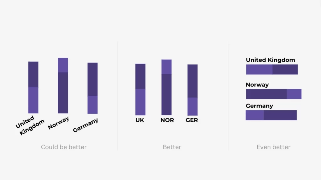
2. Make sure the label formatting across multiple charts is consistent
This is the key to ensuring the consistency of the appearance of the charts you give your reader: all of your labels should be formatted in the same way, for example always using the full names of countries.
You don’t want to give your readers a headache by having different formatting across multiple charts.
Overview
- Categorical data is information that falls into specific groups or categories
- It is often used to represent qualitative features such as types of fruit or colors.
- The best charts for categorical data are:
- Bar and column charts
- Pie and donut charts
- Treemap charts
- Always pay attention to the readability of your data, especially the labels. Keep them short and clear, if they have to be long, consider changing your chart type.
The Bottom Line
Remember that if your data falls into specific groups or categories then it’s certainly categorical data. It has plenty of uses, from product categories, survey responses to even colorful candies.
There are 3 groups of charts that are particularly effective for categorical data. Pie charts are the best for showing proportions relative to the whole, while treemap charts excel with hierarchical data. For other use cases, bar charts are sufficient.
Don’t forget about keeping chart readability as high as possible by ensuring that labels are not too long.
Finally, if bar charts are your choice, then I invite you to read our insightful article about bar charts: Bar Chart vs Column Chart: Which is best for you? Thanks for reading!