

The term “Gauge chart” is one that many people, myself included, often misread. Despite this common issue, people still often use this type of chart.
Perhaps you’re here to find out whether a gauge chart is a good fit for your data. Rest assured, you’ll find the answer here.
But what if you could be getting even better results after applying some custom tips for creating gauges?
This article will take you through all the necessary steps to determine whether a gauge chart suits your needs and, if so, how to use it like a pro.
Let’s get started.
What Is a Gauge Chart?
A gauge chart, also referred to as a dial chart, is a type of chart with a purpose of highlighting a single metric on a predefined range. It usually consists of a semicircle (often colored in zones representing milestones) and a dial pointing to the current metric value.
Examples of the best data for a gauge chart include:
- Occupancy Rate: A speedometer gauge shows the percentage of occupied rental units for a rapid assessment of occupancy levels.
- Subway Car Occupancy: A solid gauge displays the occupancy level of a subway car, helping passengers and operators monitor (over)crowding.
- Project Completion: A linear gauge tracks the progress of a project, like a property renovation timeline.
All these examples have one thing in common: they show a single important number compared to a specific goal or range. Here’s an example of utilizing a gauge chart for data that fits this common feature.
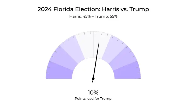
A gauge chart depicting the projected 2024 Florida election results between Harris and Trump in the U.S. presidential election.
This gauge chart shows the election results for Trump vs. Harris in Florida. The needle moves randomly simulating how votes might fluctuate over time.
Now you know what a gauge chart is, you might wonder when it is best to use one. Here is a schedule for today:
- I’ll start by showing you real use cases where gauge charts shine the brightest.
- Then, I’ll move on to general definitions of the different types of gauge charts.
- After that, I’ll share some pros and cons of gauge charts followed by 5 pro tips on how to use them.
First up, when can you use a gauge chart to its full potential?
When to Use a Gauge Chart
There are 4 main use cases when the gauge chart is the best fit. All of them are based on a very simple and small amount of data. Here’s the list.
Measuring Progress
Gauge charts are perfect for showing progress toward a goal. For example, they can display the percentage of a property renovation which has been completed or show how much of a patient’s treatment plan has been followed.
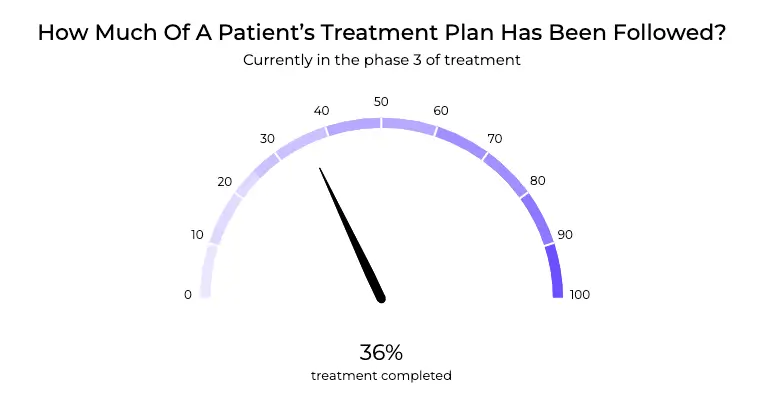
A gauge chart displaying how much of a patient’s treatment plan has been completed.
This chart tracks the progress of a patient’s treatment plan as a percentage. A single label, “Rehabilitation Phase,” highlights the current stage of the treatment. The chart visually transitions from minimal completion (red) to full completion (green).
KPI (Target Metrics)
Gauge charts are great for showing key performance indicators (KPIs) against specific targets. They can illustrate the average occupancy rate of rental properties or help track patient satisfaction scores.
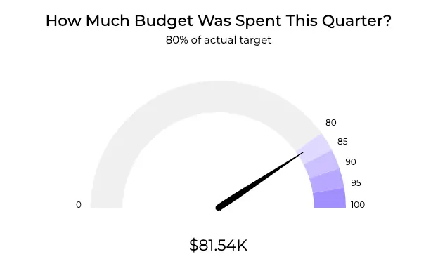
A gauge chart displaying that a little over 80% of the target budget has already been spent this quarter.
The chart above shows the actual budget spent for Q3 2024 by TechNova Solutions (made up). The company spent $81.54K out of the planned $102K, reflecting 80% of the allocated budget. It’s a hybrid of gauge and solid gauge chart types, which I will describe later.
Elections & Politics
Gauge charts can track key metrics in election campaigns or political analysis. For example, they can monitor voter turnout, track the number of ballots cast, or measure campaign performance across different regions.
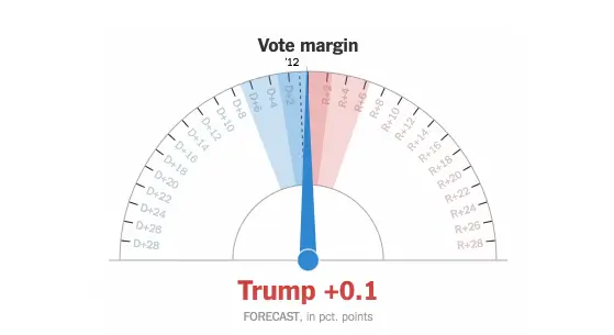
This gauge chart shows a clear visualization of the vote margin between Donald Trump and Hillary Clinton in the 2016 U.S. presidential election. It effectively highlights the difference in votes, showcasing the margin that determined the outcome of this historic election.
Sure, there are probably more of them but I’ve only listed the most important ones here to avoid confusion. Now let’s move on to some more general definitions of the different types of gauge charts.
Different Types of Gauge Charts
Gauge charts offer a variety of designs and formats to suit different data visualization needs. Below are some of the most popular types.
Speedometer
Speedometer gauge charts resemble traditional car speedometers. They are great for displaying metrics like the percentage of rental units occupied, helping property managers quickly assess occupancy levels.
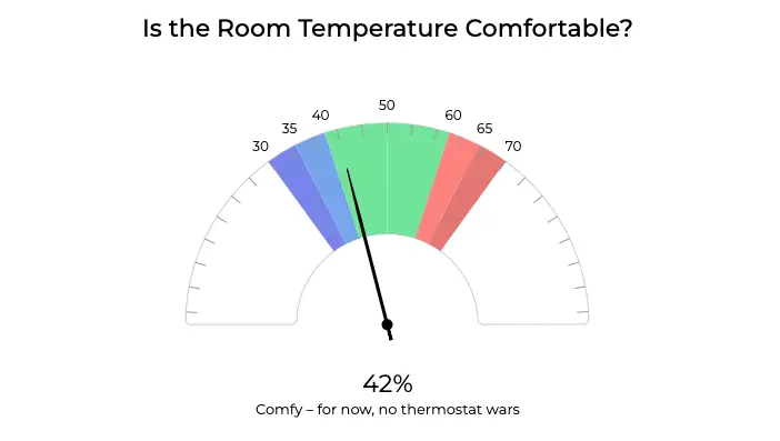
A gauge chart displaying room temperature comfort with blue indicating too chilly, green indicating just right, and red indicating too warm.
This chart tracks the room’s temperature comfort level as a percentage. The dial updates dynamically to reflect current conditions, with labels indicating comfort zones ranging from cool to warm. At 55% for example, it shows “Comfy – for now, no thermostat.”
Solid Gauge
Unlike a basic speedometer, which uses a moving needle, a solid gauge fills an arc to represent progress. This compact design is perfect for tracking metrics like completion rates or efficiency, with a clear visual display of percentage achieved.
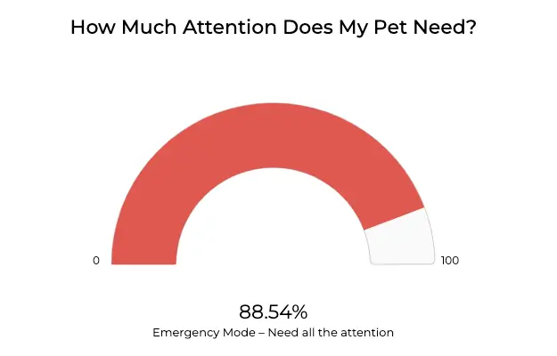
A gauge chart displaying the level of attention a pet needs, with low, moderate, and high ranges. Polish petsitter app Petsy uses a similar type of solid gauge.
This chart tracks your pet’s real-time attention demands as a percentage. Labels dynamically update every 2 seconds to match the current “mood,” ranging from relaxed to urgent.
Linear Scale
Linear scale gauge charts present data in a horizontal format. They can be useful for tracking the completion of a project, such as the timeline for a property renovation or the stages of a patient’s recovery.
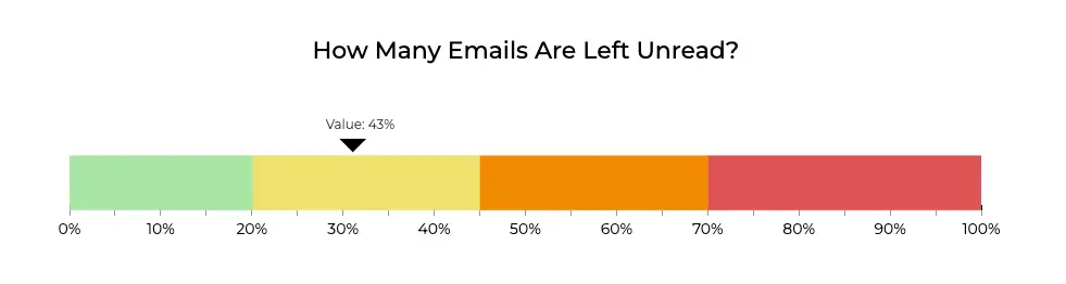
A gauge-linear scale chart displaying the percentage of unread emails.
This chart tracks the number of unread emails in real-time as a percentage of your total inbox. Labels dynamically update every second to display the exact count of unread messages.
The Pros of using a Gauge Chart
Does the gauge chart have any aces up its sleeve? Here’s a list:
Incredibly Easy to Create
Gauge charts are extremely easy to create because they require minimal data. Just a single value and a range.
Perfect for Setting Goals
They visually represent progress towards a target, making it easy to see how close you are to achieving your goal at a glance.
Ideal for Dashboard Integration
Gauge charts integrate seamlessly into dashboards and are very easy to synchronize with other charts. They offer a quick snapshot of critical metrics in a blink of an eye, something which is always the key to effective data visualization.
3 Cons of Using a Gauge Chart
Let’s make this short. You shouldn’t use gauge chart if:
The Metric Lacks a Clear Target
If there isn’t a specific goal or threshold to measure against, a gauge chart may not provide valuable insights.
You Need to Compare Multiple Values
For this, you’d need at least two gauge charts side by side. This takes up a lot of space, is not as intuitive as using one, and is generally a bad way to compare values using charts.
You Lack a Wider Context
Gauge charts work well when paired with a text that provides context, explaining why the gauge is set to a specific value or target. It’s not a standalone chart type—it needs context to be effective.
4 Pro Gauge Chart Tips
Make your data stand out by creating a pro gauge chart using the following practical tips.
Establish a Scale
Define the scale based on your metric. For example, if tracking sales performance, set the scale from $0 to $100,000, showing how much of the target has been achieved.
Add Thresholds
Use color-coded thresholds to indicate performance levels. For example, set green for 80-100% of the goal, yellow for 50-79%, and red for below 50%.
Choose the Right Gauge Type
Use a radial gauge for single values like “current sales” and a linear gauge for showing progress over time, such as “sales growth this quarter.”
Pick the Right Colors
Choose intuitive colors: green for achieved targets, orange for caution, and red for areas needing improvement. Make sure the colors are accessible for color-blind users. Read more about this in our dedicated article on choosing the best colors for your chart here.
Gauge Chart Overview
- A gauge or dial chart highlights a single metric within a defined range.
- Best Uses for Gauge Charts
- Occupancy Rate
- Subway Car Occupancy
- Project Completion
- Performance Metrics
- Advantages of Gauge Charts
- Easy to Understand: Shows a single, critical metric at a glance.
- Ideal for Goals: Visually represents progress toward a target.
- Perfect for Dashboards: Integrates seamlessly into dashboards for quick insights.
- Best Practices for Gauge Charts
- Define a Clear Scale: Set appropriate scale limits, such as 0–100%.
- Use Color-Coded Thresholds: Indicate performance levels with green, yellow, and red.
- Choose the Right Gauge Type: Use radial for single metrics and linear for tracking progress over time.
- Pick Accessible Colors: Ensure color choices are clear, even for color-blind users.
- When Not to Use Gauge Charts
- No Clear Target: Avoid gauge charts if there’s no specific goal to measure against.
- Comparing Multiple Values: Side-by-side gauges are visually cluttered and hard to compare.
- Lack of Context: Gauge charts work best when paired with context, as they focus on a single value.
Gauge Chart Bottom Line
Does the gauge chart fit your data? I hope that you found your answer here, and discovered new and useful tips to make your dataviz even better.
Remember to pick the right gauge type for your case, and consider using color-coded thresholds as they might add a lot to your chart. Try not to use gauges for scenarios in which you don’t have a goal you want to visualize.
Pick the right colors (you can follow our extensive how to article about that), and consider using other charts if the gauge doesn’t meet your needs. Bar charts and column charts are the most popular ones. Why don’t you give them a shot? My Bar Chart vs Column Chart article goes deeper into this topic and I encourage you to check it out.
And a small fun fact at the end: I’m not sure if you knew but gauge charts perfectly fit the definition of what a chart is that I described precisely in this piece: Graph vs Chart: What’s the Difference?