Organizations worldwide generate massive amounts of data every day. According to estimates, approximately 402.74 million terabytes of data are generated each day globally. Yet most leadership teams face the same paradox: drowning in data while starving for insight.
The problem isn’t volume. It’s speed and clarity. By the time data becomes actionable insight, the moment to act has often passed. Finance reports one number, operations reports another. Strategic decisions wait because teams can’t agree on what’s actually happening.
Data visualization changes this dynamic. Not by adding more analytics tools, but by transforming how quickly leaders see patterns, understand context, and align around action.
In this article, you’ll discover:
- What data visualization is and why it works
- How visualization transforms businesses
- A real-world example of a company that used visualization to transform its business
- Best practices for effective implementation
- Three approaches to building visualization capabilities in your organization
What Is Data Visualization
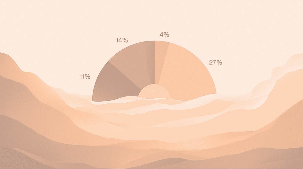
Data visualization transforms numbers into visual elements (charts, graphs, dashboards, maps) that make patterns instantly visible.
For example:
- Revenue becomes bar height
- Time becomes an x-axis, and regional performance becomes color intensity on a map
- What takes minutes to understand in a spreadsheet becomes obvious in seconds.
The reason? While you’ve likely heard the popular claim of “60,000 times faster,” MIT neuroscience studies provide more accurate measurements: people can process images in as little as 13 milliseconds, compared to 150-300 milliseconds needed to process a word in context. So, the human brain processes images 6-600 times faster than it processes text.
This isn’t about making data “pretty.” It’s about leveraging how our visual system naturally identifies patterns, outliers, and trends in ways that tables and numbers simply can’t match.
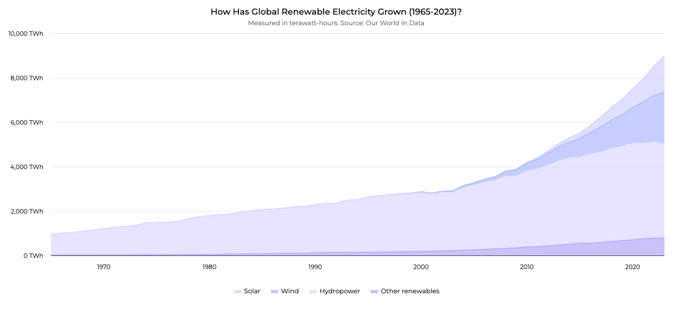
The growth of global renewable electricity production between 1965 and 2023 – source.
How Data Visualization Transforms Decision-Making
Effective visualization fundamentally changes how organizations operate. Instead of waiting days for reports, leaders see what’s happening now. Instead of debating what the numbers mean, teams align around what to do next. Instead of drowning in dashboards nobody uses, people get answers to the questions that actually matter.
Here’s how this plays out across three critical dimensions.
Speed: From Delayed Reactions to Real-Time Response
Here’s a common problem: Your risk team spots a concerning pattern in customer behavior. By the time they pull the data, clean it, build a presentation, and schedule a meeting, two weeks have passed. The pattern has either resolved on its own or escalated into a real problem.
Now picture this: That same pattern shows up on a dashboard the moment it crosses a threshold. Your risk team investigates immediately, drills into the specifics, and brings solutions to leadership while the issue is still manageable.
This difference is measurable. When organizations analyze data in real-time rather than monthly or quarterly, satisfaction with decision outcomes reaches 78-86%.
When you can see what’s happening as it happens, you respond when it matters most:
- Sales leaders spot pipeline shifts the day they occur
- Operations teams identify bottlenecks in real-time
- Finance tracks variance as transactions flow through systems
- Risk teams detect anomalies before they become crises
The difference isn’t just speed. It’s the ability to act when action still matters.
Independence: From IT Dependency to Self-Service Insights
In most organizations, only 23% of users can find information without IT support. The rest submit requests and wait. Meanwhile, corporate IT departments face an average BI project backlog of 143 days. A simple question that should take five minutes to answer takes days or weeks to answer.
Effective visualization flips this dynamic. Business users filter data, drill down into details, and independently explore anomalies. They test hypotheses in real-time rather than waiting for someone else to run the analysis.
The impact is clear: Organizations with self-service visualization see user independence jump from 23% to 48%. When people can answer their own questions, they ask better questions. They iterate faster. They learn what works instead of debating what might work.
Alignment: From Data Confusion to Shared Understanding
Ever sit in a meeting where finance reports one revenue number and sales reports another? Where marketing’s “qualified lead” means something completely different from what sales considers qualified? Where strategic decisions get postponed because nobody can agree on the baseline?
That’s what happens when data lives in silos, and every department builds its own version of truth. Teams spend hours reconciling spreadsheets instead of deciding what to do.
Visualization built on a single source of truth changes this immediately. Everyone sees the same picture. Inconsistencies surface right away rather than after weeks of manual reconciliation. Meetings shift from “what does the data say?” to “what should we do about it?”
Recent research by the University of Sheffield confirms this: effective visualization significantly improves users’ ability to interpret data and make better decisions. When everyone works from the exact visual representation of reality, decisions accelerate.
Key Data Visualization Benefits
Here’s what happens when organizations get visualization right.
1. Better Decisions Under Pressure
Research shows that 77% of organizations see visualisation as optimising their decision-making process. The reason is simple: visual data reveals patterns and anomalies that stay hidden in spreadsheets. When pressure mounts and decisions can’t wait, leaders who can see the full picture make more informed choices.
2. Time Becomes a Competitive Advantage
In competitive environments, speed is not just about reacting faster—it’s about seeing opportunities before others do. Visualization shortens the distance between signal and action by making changes, anomalies, and trends visible as they emerge.
Teams that work with real-time, shared visual views spend less time validating data and more time deciding what to do next. Over time, this compounds into a structural advantage: faster course correction, earlier intervention, and fewer decisions made too late to matter.
3. Analytics Investments Actually Pay Off
Advanced analytics only deliver value when insights lead to action. Bain & Company found that organizations with mature analytics capabilities are:
- 5× more likely to make decisions faster
- 3× more likely to execute decisions as intended
- 2× more likely to be top financial performers in their industries
Visualization plays a critical role in turning analytical output into decisions people trust and act on.
4. Teams Align Faster
Misalignment often stems from competing interpretations of the same data. Visualization built on shared dashboards reduces ambiguity and creates a common reference point. Research drawing on studies from Stanford University and the Wharton School shows that groups using visual representations are 21% more likely to reach consensus compared to teams relying on text-heavy or spreadsheet-based communication. Visual approaches have also been shown to shorten meetings by up to 24%, helping teams move from discussion to action faster.
5. IT Teams Get Their Time Back
As self-service visualization becomes more widespread, IT teams are no longer the primary bottleneck for routine analysis. Research shows that organizations adopting data visualization report 15% less pressure on IT teams, as business users increasingly handle ad hoc questions and exploratory analysis on their own.
This shift allows IT to focus on building scalable data infrastructure and governance, rather than responding to one-off reporting requests.
A Real-World Example: How Data Visualization Transformed Farm Management
The best way to understand these benefits is through a real example. Farmable, a Norwegian agtech startup, provides digital tools for farm management—from field mapping to fertilizer and harvest data analysis.
As their platform grew, farmers struggled to make quick decisions. Data on crop performance, weather patterns, and resource use existed across multiple systems, but interpreting it took too long when decisions needed to be made in the field.
The transformation came through tailored data visualizations:
- Intuitive dashboards consolidated field data, pesticide records, and harvest information in one view
- Resource usage patterns became immediately visible instead of being buried in separate reports
- Data organization improved, making audit and certification reports faster to generate
The result? Farmers made resource allocation decisions in real-time rather than after hours of data collection. The tools were used because they answered actual questions farmers had at the moment.
If you want to know how this transformation unfolded, read the complete case study.
Best Practices: How to Make Data Visualization Work
To achieve the benefits we’ve discussed, visualization needs to be implemented correctly. The difference between a dashboard that transforms decision-making and one that sits unused comes down to following a few critical practices.
Start With the Question, Not the Data
What is the most prominent mistake organizations make? Building visualizations around available data rather than actual decisions. Before choosing a chart type, ask:
- What question needs to be answered?
- What decision does this enable?
A sales leader doesn’t need dozens of metrics. They need to know if the pipeline is healthy and where to focus attention. When you start with the decision, the visualization practically designs itself.
Know Your Audience
A dashboard for C-suite executives needs to differ from one built for analysts. Executives have minutes, not hours, so they need high-level KPIs and clear action signals. Analysts need the ability to drill down and explore.
Consider the context, too: will people view this on a phone, a tablet, or a large screen? Each demands different design choices.
Choose the Right Chart Type
Every chart serves a specific purpose. The goal is not visual variety, but clarity.
For example:
- Comparisons across categories are best handled with bar or column charts, depending on label length and layout constraints, especially when the goal is to make differences easy to scan at a glance.
- Trends over time are most clearly shown with line or area charts, particularly when direction, momentum, or cumulative change matters, rather than individual data points.
- Understanding composition and hierarchy often benefits from stacked bars or treemaps, especially when screen space is limited and multiple categories need to be compared at once.
- Explaining change between two points in time is where waterfall charts excel, as they break down how individual increases and decreases contribute to the final outcome.
- Exploring relationships between variables works best with scatter plots or bubble charts, especially when multiple dimensions (such as value, size, and grouping) are involved.
The simplest chart that conveys your message is almost always right. Avoid 3D effects and complexity when simpler options work.
Use Color Strategically
Color highlights insights or creates confusion. Choosing the right palette requires understanding how different color schemes serve different data types. Follow these principles:
- Use muted palettes for most elements, bright accents for what matters most
- Test for color blindness accessibility—avoid red-green combinations unless clearly distinguishable
- For sequential data, use single-hue progressions (light to dark)
- For categorical data, limit palettes to 5-7 distinct colors
- Consider cultural context—red signals danger in Western business but represents prosperity in many Eastern cultures
If you want to dive deeper into color theory, palette types, and accessibility, read our complete guide on choosing the best colors for graphs.
Keep It Simple
Remove anything that doesn’t help understanding. Heavy gridlines, decorative fonts, 3D effects—they create mental friction that slows comprehension.
Apply the “squint test”: squint at your visualization (or step back and blur your vision slightly). If the most important elements aren’t still clear, your hierarchy is too weak.
Create Clear Visual Hierarchy
Guide viewers’ eyes through strategic use of size, position, and contrast. Place critical information top-left. Make key numbers larger than supporting elements. Use white space to separate sections.
Tell a Story, Not Just Show Data
Data becomes powerful when it communicates a narrative. Effective visualization has a beginning (context and baseline), middle (the key insight or change), and end (what this means and what to do about it).
Maintain Accuracy and Transparency
Charts can mislead as easily as they inform. That’s why:
- Always start bar charts at zero to provide accurate proportions
- Include methodology notes, data sources, and limitations.
- Report margins of error where relevant.
Test and Iterate
Show your visualization to someone for five seconds. Can they identify the main takeaway? If not, refine. Ask “so what?” about every chart—what decision does this enable?
Getting visualization right isn’t about blindly following rules. It’s about understanding principles and applying them to serve your specific audience and decisions.
How to Implement Data Visualization: Three Approaches
You now understand how visualization can transform your business and what makes it effective. The natural next question: where do you start?
Organizations typically choose one of three paths.
Build Internally
Many teams use libraries like Highcharts to build custom visualizations. The advantage? Complete control over design and functionality without vendor lock-in.
The trade-off is complexity. These libraries require specialized expertise. A basic chart might take hours, but complex interactive dashboards with proper error handling and accessibility can take weeks. Your developers spend time solving visualization problems instead of building core features.
Use Off-the-Shelf BI Platforms
Tools like Tableau, Power BI, and Looker offer faster time-to-value with templates, drag-and-drop interfaces, and built-in data connections. Non-technical users can build basic dashboards without code.
However, the constraints appear quickly. Templates rarely match specific needs perfectly. Advanced customization requires expertise similar to coding. Licensing costs scale with users, sometimes dramatically.
Partner with Data Visualisation Experts
The third approach is custom solutions built by teams who specialize in visualization. You get production-ready implementations without building internal expertise or accepting platform limitations.
Of course, the common concern is cost. Custom work sounds expensive compared to a platform subscription or using internal resources. But when you factor in the actual time your developers spend learning libraries, debugging edge cases, and maintaining solutions—plus the opportunity cost of delayed implementation—the math often favors specialists. You get working solutions in days or weeks, not months, and your team stays focused on what drives your business forward.
Which Path Makes Sense?
- Build internally when visualization is core to your product, you have dedicated frontend talent, and you need maximum control.
- Use platforms when you need standard reports quickly, your team is trained on these tools, and the requirements fit within the platform capabilities.
- Partner with specialists when you need custom solutions fast, when visualization quality directly impacts business outcomes, or when internal teams should focus on domain expertise.
Ready to Move Your Data to Better Decisions?
The pattern is consistent across industries: companies that implement visualization well see measurable improvements in decision speed, team alignment, and outcomes. They spend less time hunting for information and more time acting on it.
But implementation matters. The difference between visualization that transforms decision-making and dashboards that sit unused comes down to starting with the right questions, understanding your audience, following proven design principles, and choosing the right approach for your needs.
At Black Label, we specialize in turning complex data into clear, actionable insights. As core contributors to Highcharts, we’ve helped build one of the world’s leading charting libraries. That expertise translates into custom visualization solutions for organizations that need results fast—from agtech startups to enterprise analytics teams.
Want to explore how visualization could address your specific challenges? Contact us to discuss your needs.