

Imagine stacking Lego bricks one by one: a few green ones add height, a flat red one adds depth, and then finally you step back and see the tower’s full shape and size. That’s exactly how a waterfall chart works.
Instead of hiding behind just one number like “profit” or “final score,” a waterfall chart shows the journey to get to that number. Each bar is a step, adding or subtracting, until the final total comes into view.
So what is a waterfall chart, when should you use it, and how do you avoid common mistakes? Let’s dive in.
What Is a Waterfall Chart?
A waterfall chart (or bridge chart) is a visualization that explains how an initial value changes step by step through gains and losses until it reaches a final outcome. Each bar represents a contribution – positive or negative – making it easy to see not just the total, but how you got there.
You’ll usually see:
- A starting bar (e.g., revenue at the beginning of the year)
- Green bars for increases (sales, savings, growth)
- Red bars for decreases (costs, losses, churn)
- A final total bar that sums it all up
Quick example:
- Starting revenue: $1,000,000
- New clients add $300,000
- Cancellations remove $100,000
- Costs subtract $150,000
- Final revenue: $1,050,000
Instead of just “Revenue grew 5%,” the waterfall shows how and why it changed.
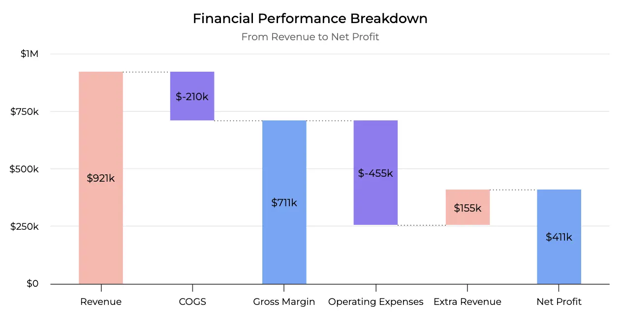
The end-of-year financial performance breakdown of a company visualized: track their business journey from total revenue to their final net profit.
But what are the exact use cases? Let’s see.
Origins of Waterfall Charts
Waterfall Charts first appeared in the 1980s, popularized by consulting firms such as McKinsey & Company. They were designed as a way to explain financial performance to executives who wanted more than just initial and final values – they needed to see what contributed to the change.
Over time, the chart made its way into widely used tools like Microsoft Excel and Power BI, eventually becoming a standard visualization in business dashboards. With the growth of SaaS, startups, and data‑driven reporting, waterfall charts are now seen across industries – from finance and sales to marketing and operations – anywhere leaders ask: “What happened between these two numbers?”
When to Use a Waterfall Chart?
Waterfall charts are most common in finance and business, where leaders need to understand how different factors contribute to results.
They’re designed to answer questions like: What drove this change? Which elements helped, and which ones pulled us down?
Common use cases:
- Financial Statements: Breaking down revenue, costs, and expenses to show how profit is formed
- Sales Performance: Tracking how wins, losses, and churn add up to the final sales number
- Budget Variance: Explaining where actual spending diverged from the plan
- KPI Analysis: Showing which factors increased or decreased metrics like traffic, churn, or conversions
- Project Tracking (non‑financial): Mapping out how milestones, delays, and adjustments affect overall progress
These charts are especially popular in boardroom presentations and dashboards because they answer the CEO’s favorite question: “What happened between A and B?”
But why can’t we just use a bar chart for all these cases? At first glance, bar charts might seem just as good as waterfall charts. They’re simpler, easier to create, and familiar to almost everyone…
Waterfall Chart vs. Bar Chart
At first glance, a waterfall chart looks like a bar chart stretched across steps. But the purpose is different.
- Bar charts show totals for categories or time periods. They’re useful for quick comparisons – e.g., Q1 vs. Q2 revenue.
- Waterfall charts explain the composition of change. They connect the start and end values, showing exactly what was added or subtracted along the way.
Example:
- A bar chart shows profit = $200K.
- A waterfall chart shows profit started at $0, gained $500K from sales, lost $200K from costs, dropped $100K from churn, and ended at $200K.
In other words:
- Bar chart → “What is the value?”
- Waterfall chart → “How did we get to this value?”
If the goal is simply comparison, use a bar chart. If the goal is explanation, use a waterfall chart.
Waterfall Chart vs. Column Chart
Column charts are excellent for showing discrete values side by side – like revenue by department or sales by region. They emphasize comparisons across categories.
But column charts stop there. They don’t connect one value to the next. A waterfall chart adds that missing link: it shows how individual contributions move you from the start to the finish.
Use column charts when the focus is on category comparison.
Use waterfall charts when the focus is on progression between values.
Waterfall Chart vs. Line Chart
Line charts are best for tracking trends over time – for example, revenue growth month by month or daily website traffic. They emphasize the pattern of movement.
But line charts don’t show the reasons behind the pattern. A dip in March or a spike in June is visible, but not explained. Waterfall charts provide that explanation by breaking down the drivers of change.
Use line charts when the story is a trend and direction.
Use waterfall charts when the story is cause and effect.
Design Best Practices
Because those types of charts track step‑by‑step changes, small design mistakes can make them confusing. To keep them clear:
- Use Consistent Colors
Green for increases, red for decreases, and a neutral color for totals. This keeps the direction instantly recognizable.
- Label Every Bar
Adding numbers to each step prevents guesswork and makes the contribution of each factor unambiguous.
- Emphasize Totals
Make the starting and ending bars visually distinct so they stand out from intermediate steps.
- Avoid Over‑segmentation
Too many small steps clutter the view and hide the main drivers. Group minor factors into a single category if needed.
- Order Steps Logically
Arrange contributions by time, process sequence, or category relevance so the flow of change is easy to follow.
Common Pitfalls in Waterfall Charts
Even though they look simple, they can be misleading if designed poorly. Watch out for these mistakes:
- Mixing Colors
Using inconsistent colors for increases and decreases makes it hard to read direction at a glance.
- Overloaded Steps
Showing every tiny factor creates noise and buries the key insights. Always group minor items.
- Missing Totals
If the start or end bars are not visually emphasized, the audience loses the big picture.
- Inconsistent Scales
Changing axis ranges across charts creates misleading impressions about the size of contributions.
- Overuse of Waterfalls
Not every dataset needs one. If a bar or line chart communicates more clearly, use that instead.
FAQ
Q: What is a waterfall chart used for?
A: To explain how individual increases and decreases add up to a final result, most often in finance, business performance, and variance analysis.
Q: What’s the difference between a bar chart and a waterfall chart?
A: A bar chart shows totals at fixed points. A waterfall chart connects those points and explains the step‑by‑step changes between them.
Q: Where are waterfall charts most useful?
A: Financial reporting, sales tracking, budget variance analysis, KPI breakdowns, and progress tracking in projects.
Q: When should I avoid waterfall charts?
A: Avoid them if your dataset has too many small steps, if the breakdown doesn’t add insight, or if a simple total comparison answers the question.
Summary – Understanding the Flow from the First to Last Bar
A waterfall chart is more than a bar chart with extra steps – it’s a breakdown of cause and effect. It shows exactly where gains and losses happened, giving executives and analysts the context behind the totals.
Use it when you need to explain change, keep the steps focused, and highlight the contributions that truly matter. Because in the end, what people want to see isn’t just the result – it’s the explanation behind it.