


It’s time to compare these two big concepts – Graph vs Chart.
Do you have a favorite?
That’s fine, we don’t favor either one.
Are you using these terms interchangeably? And more importantly, is that correct?
No worries, we’re about to dive deep into the comparison of graph vs chart.
So, let’s jump right in!
Graph vs Chart: What’s the Difference?
According to research from my personal 2023 archives, many people do not. Roughly 75% of people use the word “chart” instead of “graph”. It’s pretty common in the mainstream media that when you’re looking at some data visualization content, it’s often labeled as a chart. But is that correct?
I promise I’ll give you an answer to this question, but let me first start with some basic definitions of the two.
PRO TIP: Are you studying a technical field? Yes? Then probably graphs are your thing.
What is a Graph?
A graph’s goal is to show the relationship between two data sets or more but it is also used to present a variety of functions such as the parabolic function. Graphs mainly utilize points and lines, primarily being used in mathematics and physics to solve various technical problems.
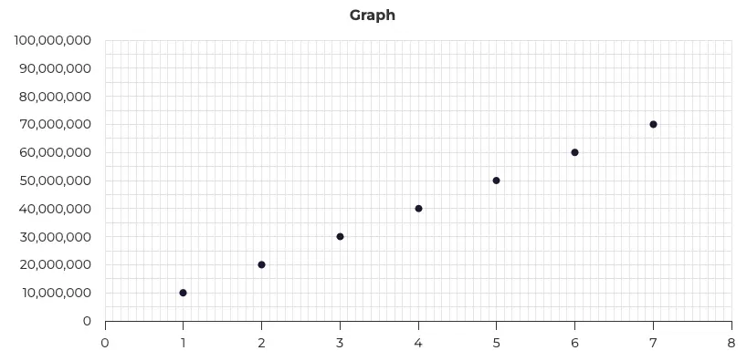
A basic scatter graph with an ascending dataset.
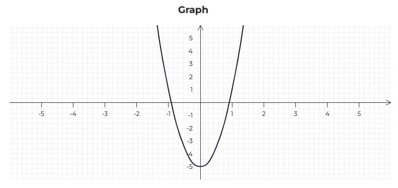
Here, on the other hand, we have a parabolic function presented with a line graph.
Graphs are particularly valuable for:
- Complex data: Thanks to multiple axes and grid lines, graphs enable the display of complicated calculations and data.
- Scientific and mathematical contexts: Graphs are widespread in scientific and mathematical worlds as a fundamental visualizing tool.
Now let’s get into the details a bit…
Graphs with Complex Data
Graphs are aimed at a narrow audience, namely a scientific and technical one. That’s why simplicity in graphs is not as important as it is with charts which are meant for a broader audience.
Depending on the data, you can use various types of graphs such as: line graph, scatter graph, or column graph.
Graphs in Science and Math
I’m sure you remember graphs from school. First drawing line functions, and next squared functions to find the zero of the function.
While using graphs you want to show what the numbers look like, how functions move or to spot trends across the data.
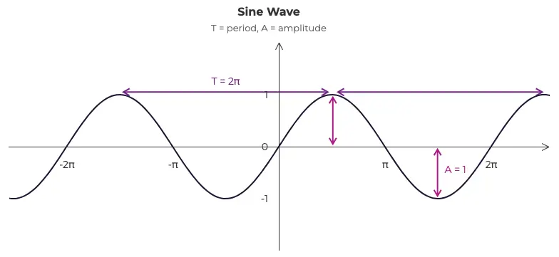
A sine wave graph showcasing the period and amplitude.
What is a Chart?
A chart can take a large variety of forms. It uses a multiplicity of graphical elements like bars, pies, or maps to present information clearly. The fundamental objective of charts is to make the data simple to read. It makes the key information that’s hidden in tons of data accessible to a broader audience.
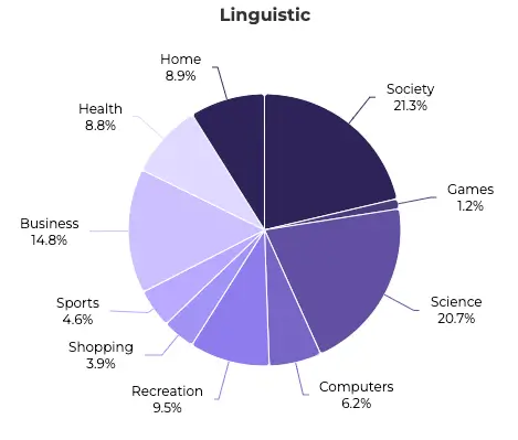
A pie chart showing statistics about news articles for 10 different categories. Thanks for the research guys!
Charts are commonly used in:
- Media: Providing visual representations of complex information, makes it easier for audiences to grasp key concepts and trends quickly.
Business: As companies gather tons of data, there’s a huge need to visualize them clearly in their business reports. Charts are the best tool for that.
Charts in the Media
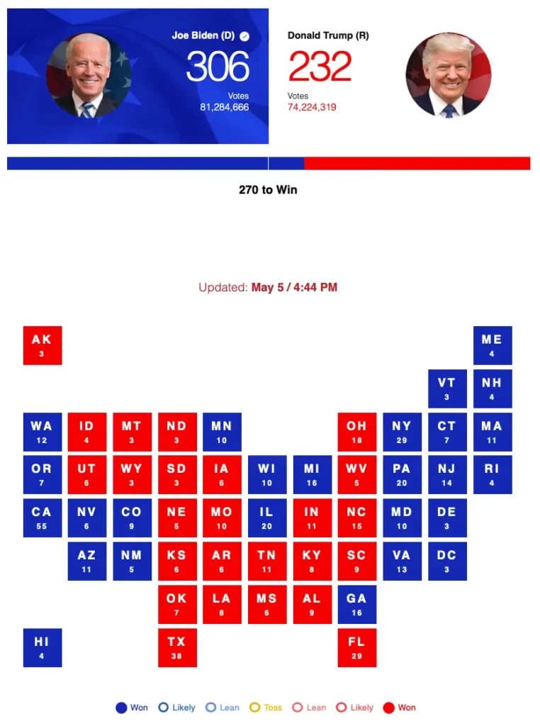
Charts in the media sound so obvious and I’m sure that you’ve seen dozens of charts on TV or in papers or magazines. Here’s one you might recognize:
Biden vs Trump Map
Charts in Business
Reports, calculations, and tons of analysis. Those words might sound a bit boring and corporate but you can change them to something round and fun: charts.


Graph vs Chart – Key differences
There are 4 key differences between Graphs vs Charts:
- Data Complexity: Graphs are designed for complex data representation and in-depth analysis. Charts, in contrast, simplify data for ease of comprehension.
- Usage: Graphs find their primary application in scientific, mathematical, and research domains, whereas charts are commonly used in business, media, and data presentation contexts.
- Visual Elements: Graphs mainly utilize points, lines, and shapes, making them suitable for precise data representation. Charts, on the other hand, mostly use bars, pies, and maps, offering a visually appealing and straightforward approach.
- Audience Engagement: Charts often aim to engage and inform a broader audience through simplified data, whereas graphs are meant for specialized audiences requiring intricate data interpretation.
Those differences boil down to one thing, which is…
Pro Tip: Graphs are technical and complex while charts are simple and they’re meant for a broader audience.
When To Choose a Graph vs Chart
A graph’s goal is to show the relationship between data sets, regardless of how large they are or how complicated their relationships are. They’re for scientific circles. Charts, however, are created to make the data simple to read and are aimed at broader audiences.
In order to decide whether you should use a graph or a chart, consider the nature of your data and your specific communication goals:
Choose Graphs When:
- Dealing with intricate data that requires in-depth analysis.
- Addressing audiences with a strong analytical background.
- Working within scientific, mathematical, or research domains.
Choose Charts When:
- Aiming for simplified, visually appealing data representation.
- Targeting a broader audience for quick comprehension.
- Focusing on business, media, or reporting applications.
Overview
- Graphs are best for complex data, scientific contexts, and specialized audiences, mainly using points and lines.
- Charts simplify data, are visually appealing, and suit business and broader audiences, with elements like bars, pies or maps.
- The key differences lie in data complexity, usage, visual elements, and audience engagement.
- Choosing between them depends on data type and communication goals, whether for in-depth analysis or quick comprehension.
The Bottom Line
Back at the start, I promised to answer a question about whether data visualization content presented in the mainstream media that is labeled as charts is an accurate name for those graphics. After reading this article, the answer should be unmistakably clear: YES.
Remember that graphs are intended for complex data, or scientific contexts. Charts, on the other hand, suit business and broader audiences (like TV or newspapers), finding a way to simplify the data.
Graphs mainly use points and lines while charts mostly use columns, pies or maps. There are a few differences between those two but they are pretty huge.
In most cases, you will probably go with a chart. If you want to find out more about them, take a look at my Bar Chart vs Column Chart article where I’ve compared the two most popular chart types.


