
The better your prompt, the better your results. But to write a good prompt, you need to know what you’re asking for. That means understanding some basic terms around AI chart creation and data visualization – like chart types, common features, and a few helpful tips you can give your LLM. Without this, your AI chart results probably won’t turn out so well.
In this article, I’ll show you how to write prompts that help you get to the main message that is hiding in your data.
We’re gonna use this chart as our starting point:
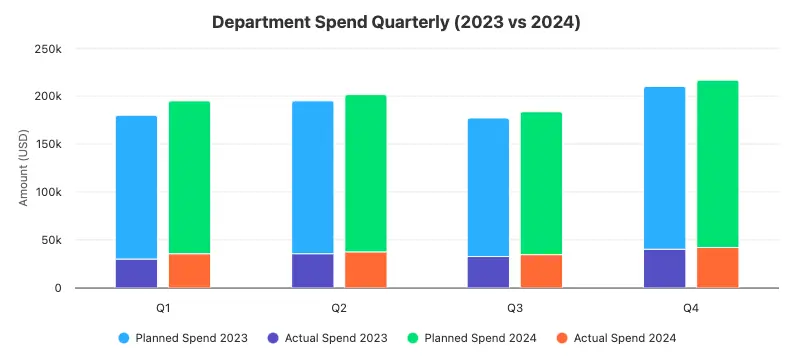
A bar chart comparing Department Spend Quarterly (2023 vs 2024) – the chart visualizes planned and actual values compared across quarters.
To this:
Department Spend Quarterly – 2024 spending compared against 2023 to highlight year-over-year changes.
Let’s start from the beginning.
What kind of data do we have?
First, you need to ask yourself: What kind of data do I have? Once you know that, you can figure out what the chart should show, and explain to the LLM what type of data it’s working with. That helps the LLM pick the right kind of chart for the job.
You should know that in general, there are two types of data: categorical and continuous
- Categorical is information sorted into specific groups, like colors or types of fruit. These groups are separate and have no order.
- Continuous data, on the other hand, represents numerical values that can be measured and can take on an infinite number of values within a given range.
Here is a quick example to understand the difference:
Fruit information can be shown as categorical data by describing its type, such as bananas or apples. Or it can be shown as continuous data by giving its price, like $0.75, $1.00, or $0.90.
Okay, so is your data continuous or categorical?
Based on your answer, we might aim for different AI chart types.
Let’s say you have continuous data showing the financial results of your department for the last year. That’s continuous data – measurable numbers that change over time.
Now ask yourself: what’s the best way to show how this data behaves? Since it’s time-based, it might seem like a line chart is the obvious choice, but let’s be honest – we’re not tracking day-to-day fluctuations.
In sales or revenue, we count numbers sequentially and usually compare them month to month. For that kind of comparison, a column chart might actually be the best fit.
Start Prompting: Your First AI Chart Result
Let’s start with a basic prompt:
“Please create a column chart that will show my department spending for the last year. It should be the actual amount spent and the planned amount to be spent. The data is divided into quarters. I want to compare data from 2023 and 2024. Please use dummy data for now.”

Okay here we go.
Department Spend Quarterly – 2023 vs 2024 planned and actual values compared across quarters.
Great, we have our first result.
But why are the points stacked on top of each other? We don’t really know what the planned spend was versus the actual spend. To see that we need to unstack the points. But then we’ll get four points for a category. That’s a lot…
Luckily, there’s a solution to this issue. Usually, the simplest AI charts are the best ones, but in this case, we can twist the result a bit and change it to a bullet chart type. Why?
Because bullet charts are perfect for comparing planned vs. actual values. They’re like bar charts, but more compact and informative. Instead of stacking or spreading dots everywhere, we use a main bar for the actual value and a marker for the target.
A bullet chart is better than a column chart or bar chart for comparing planned versus actual values in AI data visualization.
That means just two visual elements per category – clean, easy to read, no need to match colors or decode point clusters.
But wait: couldn’t we get rid of the second visual and show only one per category?
Let’s see… but before we proceed and form a new prompt, let me share some of the best prompting practices when creating charts.
Best AI Chart Prompting Practices
I love to call it my book of rules and regulations when playing with AI, but to be honest, it’s just a short list that I basically follow every time I write a prompt for an AI chart.
1. Don’t Jump Straight Into “Make This”
Instead of asking:
“Create a pie chart of market share.”
Ask:
“What are the pros and cons of using a pie chart vs a stacked bar chart for comparing market share?”
AI is surprisingly good at self-reflection. Ask it to weigh options before creating – it’s a better brainstorm partner than just a code monkey.
2. Explain Fully – What You Want & How You Want It Presented
Say as much as you can about the result you want to get. Every detail matters. Say precisely what you want, how you want it to be presented.
3. Feed the AI What You Like
Visual prompting is super underrated. Include an example chart or even describe what you loved about one.
“Here’s a chart I liked — simple layout, muted colors, stacked bars with soft transitions. Make something with the same feel using this new data.”
4. Chop Complex Prompts Into Parts
Example flow:
- Step 1: Analyze my data and recommend the best chart type for it.
- Step 2: Create a basic config of this chart type, use dummy data for now, make the axis labels visible.
- Step 3: Add my data there, use a color series with a good level of contrast for accessibility, and add a descriptive title with a maximum of 4 words.
Big prompts often fail. If you separate the tasks into smaller ones you have higher chances of successful results.
Applying Best Practices (Better AI Chart Results)
Let’s get back to our LLM and, with the brand new data visualization knowledge and a couple of tips, let’s form a prompt asking our LLM to replace the column chart with a bullet chart.
As we already established that we want to opt for a bullet chart, I’m not going to ask for the pros or cons of this solution. Since the prompt is not going to be very long, I’ll do it in one prompt.
“Please transform the column chart to a bullet chart. The chart should show my department’s spending for last year. The data is divided into quarters. I want to compare data from 2023 and 2024. Please use dummy data for now.
In the attachment, I’m sending the chart I like. Please keep the chart minimalist and use this palette of colors. Remember to add suffixes to the yAxis labels and display the number of ticks that will make the chart readable. Probably 10 ticks on the yAxis will be enough.”
Okay, here we go.
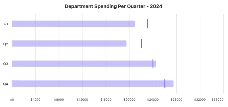
Department Spending Per Quarter – 2024, visualized with a quarterly breakdown.
Great, it looks much better.
Now let’s add one more twist.
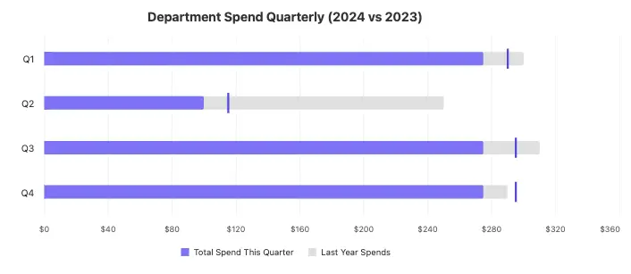
Now we only have data for 2024. But at the beginning, we wanted to compare 2023 and 2024, right? Let’s write one more prompt where we show the LLM a simple trick: how to add some extra context from last year by including a fake gray series in the background.
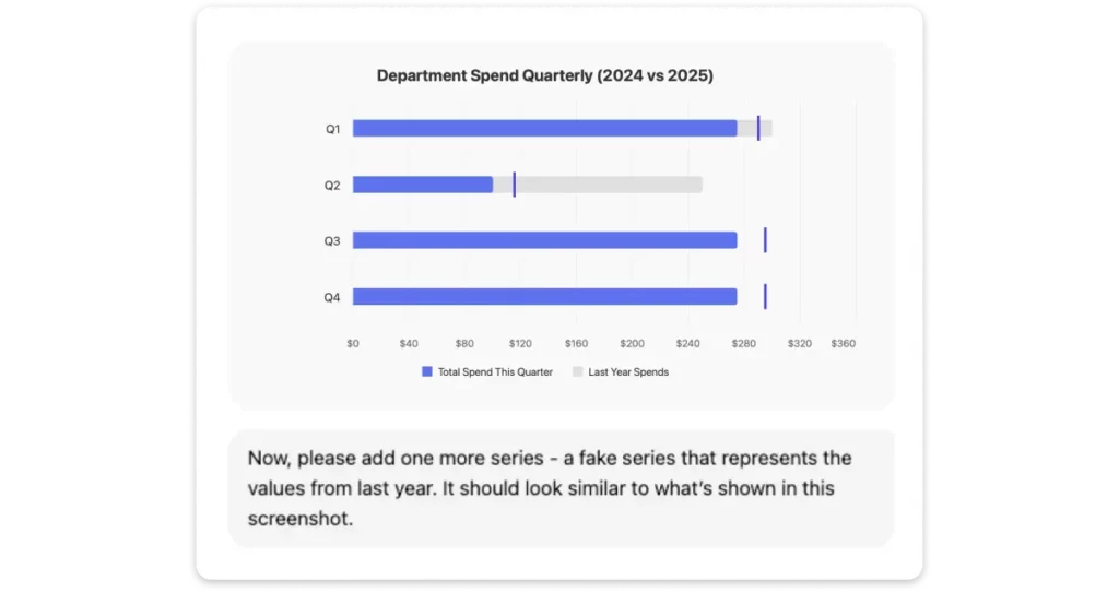
And here’s the result:
Department Spend Quarterly – 2024 spending compared against 2023 to highlight year-over-year changes.
Perfect. Now we can see precisely what the actual spend per quarter is. We have a vertical line showing the planned spend and the actual spend in this quarter last year.
Bonus Styling Tips
1. Think About the Medium
- Where will this be shown? On a slide, social media, website, or report PDF?
- Adjust scale accordingly – elements must remain readable at the expected display size.
- Keep margins around the chart to avoid edge crowding in different formats.
2. Typography: Choose Legibility Over Style
- Font size (minimums):
- Axis labels: min. 12–14 px
- Chart title: 18–24 px
- Captions/notes: 10–12 px (avoid going below 10 px)
- Font style:
- Use clean, sans-serif fonts like for example Inter, Roboto, Helvetica, or Open Sans.
- Avoid decorative fonts or mixed font families.
- Hierarchy: Make titles and key numbers bigger/bolder to draw attention.
3. Color: Be Intentional
- Use color to emphasize meaning, not decorate.
- Web-safe colors:
- Stick to high-contrast combinations (e.g., navy + white, dark gray + light blue).
- Avoid pure red/green as the only way to differentiate (color blindness).
4. Spacing & Layout
- Follow a grid system: align text, chart areas, and legends on consistent vertical/horizontal lines.
- Avoid cramming:
- Keep at least 8–12 px between text and chart elements.
- Ensure there’s breathing room around titles and legends.
- Use padding between bars/lines/labels – too close = overwhelming, too far = disconnected.
5. Keep Visual Hierarchy and Focus
- Use size, color, or placement to highlight the key takeaway.
- De-emphasize less important data using lighter shades or smaller elements.
- Label data directly where possible instead of relying only on legends.
6. General Aesthetic Tips
- Keep it clean: remove gridlines, ticks, and labels that don’t add value.
- Group related items visually (e.g., using background blocks, boxes, or aligned positioning).
- Limit use of effects: avoid heavy drop shadows, 3D effects, or gradients unless used sparingly and purposefully.
7. Getting Help (like from ChatGPT)
When asking for support:
- Share the core message you want to convey.
- Include a sample dataset or describe your variables.
- Mention where the chart will appear (slide, web, social, report).
- Tell whether you’re aiming for aesthetics, clarity, or speed of interpretation – each may suggest a different visual solution.
FAQ: AI Chart
1. What is an AI chart?
An AI chart is a visualization created with artificial intelligence based on your prompt, instead of manual coding or design.
2. Can AI replace humans in charting?
No, AI can draft charts quickly, but humans are needed for accuracy, storytelling, and design choices.
3. What’s the difference between AI and human-made charts?
AI charts are fast but generic. Human charts focus on context and clarity. The best results combine both.
4. Which chart types can AI create?
Most tools generate bar, line, pie, scatter, or column charts. With clear prompts, AI can also create bullet charts, heatmaps, and more.
5. How do I get better results?
Be specific: tell the AI your data type, the chart you want, what message to highlight, and any style preferences.
6. Why doesn’t my AI chart look right?
Usually, it’s the wrong chart type, stacked values, or unclear labels. Try refining the prompt or switching chart types.
7. Are AI charts good for business presentations?
Yes, if reviewed and polished. Use AI for speed, then refine for clarity and professionalism.
Bottom Line
Getting great AI charts from your LLM starts with knowing what you’re asking for. If you understand your data, choose the right chart type, and give clear, specific prompts – you’ll get results that actually help you see the story in your numbers.
AI won’t do your thinking for you, but if you guide it with the right context and a few smart tricks, it can turn your data into something truly useful – and even beautiful.