

IoT’s popularity is exploding nowadays. We’ve grown accustomed to using more and more “smart” solutions, devices, and sensors. IoT data visualization surrounds us, everywhere. The Internet of Things (IoT) has become a part of industry and our private lives and is growing rapidly by the minute. According to a Statista report, the number of globally connected IoT devices is projected to rise to 30.9 billion by the end of 2025.
Growing data that pops up everywhere is a bit overwhelming for all of us, so the biggest challenge is intuitively organizing the IoT data collection.
What is IoT Data Visualization?
The Internet of Things (IoT) is a concept where everyday objects — from household appliances to vehicles and wearable devices — are equipped with technologies that allow them to connect to the Internet and exchange data. Through sensors and software, these objects can collect information about their condition, surroundings, and users to transmit it to other devices or cloud-based systems.
This enables automatic decision-making, remote control, and real-time process optimization. IoT aims to simplify daily life, enhance operational efficiency, and improve safety and comfort for users across various domains, from homes and transportation to industry.
IoT data visualization is a step beyond traditional visual tools, allowing for greater impact through smarter organization. With features like data filtering, search functionality, and grouping elements into clear dashboard sections, it tackles many of the common challenges tied to working with IoT-generated information.
This is accomplished using well-known elements such as:
- maps,
- tables,
- infographics,
- charts,
- KPIs.
However, it is not the recipe for everything. In one of the next chapters, we’ll consider different solutions that allow users to interact with IoT devices very effectively.
Discover Four IoT Data Sources
The main difference between general data visualization and IoT data visualization lies in the data source. In the IoT domain, many data points update continuously and come from various sensors, servers, or other devices. We categorize these data sources into four main groups:
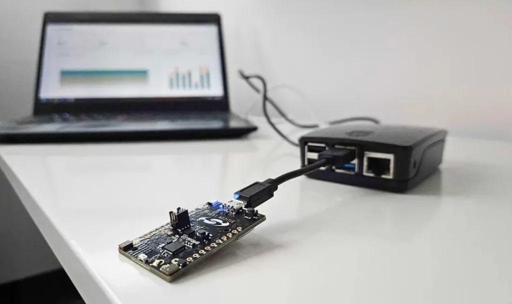
- Sensors and Devices: IoT sensors and devices collect a wide range of data, including temperature, pressure, humidity, speed, and location. They are embedded in many everyday products that we use regularly across various environments. In one of our projects, we integrated our software with IoT-enabled smart locks (FutureHome, Danalock, Saltolock) and climate control systems (Millheat, Sensibo), enabling seamless remote monitoring and control.
- Network Data: Data related to connectivity, signal strength, the current health status of the cluster, data transfer speeds, and network performance is generated by IoT networks. By IoT data visualization the end-user can find bottlenecks and problems in the network.
- Cloud platforms: In IoT solutions, cloud platforms serve as a central hub for storing, processing, and analyzing data. When combined with visualization tools, they provide users with real-time insights and enable effective data monitoring and decision-making.
- Data Streams: Real-time IoT data streams are often delivered, and monitoring this data as it appears. For example, live dashboards can display current states, alert users to anomalies, and facilitate instant decision-making.
These four main IoT data sources play a big role in how we approach data visualization. Since IoT data is so varied and often real-time, it requires clear and efficient ways to present the information.
How Can We Visualize IoT Data?
Visualizing IoT data presents a challenge because it involves more than just displaying charts. In many cases, it combines multiple elements — components, indicators, and even tables. Each visual element needs to be clear, intuitive, and fast. Yes, speed matters — real-time data requires real-time performance. In this section, I’ll highlight the most important and practical elements that can help you make sense of IoT data.
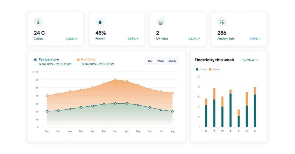
UX Components
Custom components (like buttons or toggles) that allow end-users to interact with devices.
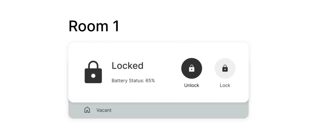
We can also use some indicators, icons, or pictorials that visualize the current status of the device (for example: lock is open or closed, battery status, temperature).
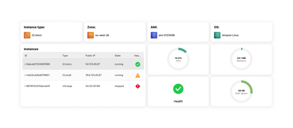
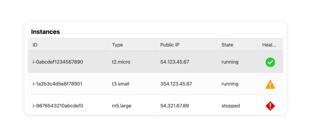
DataGrid
Show data in tables with options to sort and filter by device status, or custom name. The real-time data can visualize the current state of devices.
Dashboards
Dashboards provide a consolidated view of different components (data grids, UX components, charts, or key performance indicators (KPIs) and IoT metrics) through interactive visualizations. It allows users to monitor data in real-time, analyze trends, and make better decisions.
Challenges and Risks in IoT Data Visualization
Visualizing IoT data presents challenges and factors to consider. Despite offering valuable insights, it requires addressing obstacles to ensure that data is understandable and well-interpreted. I listed the most important and sensitive elements that have a big impact on the final implementation and impression.
Managing Massive Data
Sensors, devices, and data streams produce a lot of data that you need to process and manage. While demanding, proper hardware and software varchitecture, optimized algorithms, and analysis. Different sources of IoT data collection cause additional problems: compatibility, different formats, or structure. Some parts of data can be completely insignificant from the user’s perspective and cause hallucinations (misleading information presented as a fact). It is challenging to find the most important data and visualize it in a user-friendly way.
Ensuring High Performance
Performance is a key, always and everywhere. Knowing that the big data is in the background, the IoT data visualization should be efficient, and fast and can’t take into account any delays. Making conclusions or decisions that are based on data sources, trends, and observations of anomalies can not be limited by hardware or software.
Security Challenges
IoT data collection is also part of industries, financial institutions, or healthcare. It means that data contains sensitive information inside. The IoT data visualization should include the proper level of access to the data and be aligned to a proper role in the hierarchy of the company.
Contextual Understanding
Contextual understanding should help users correctly interpret data and prevent bias or misinterpretation. The IoT data visualizations should provide context for the data. For example, the dashboard should be divided into sections and titled.
IoT Data Visualization Use Cases
IoT data visualizations are everywhere, we use more and more devices, sensors, etc. It is a part of our lives and industries, financial institutions, or healthcare. Let me introduce the most popular industrial use cases below:
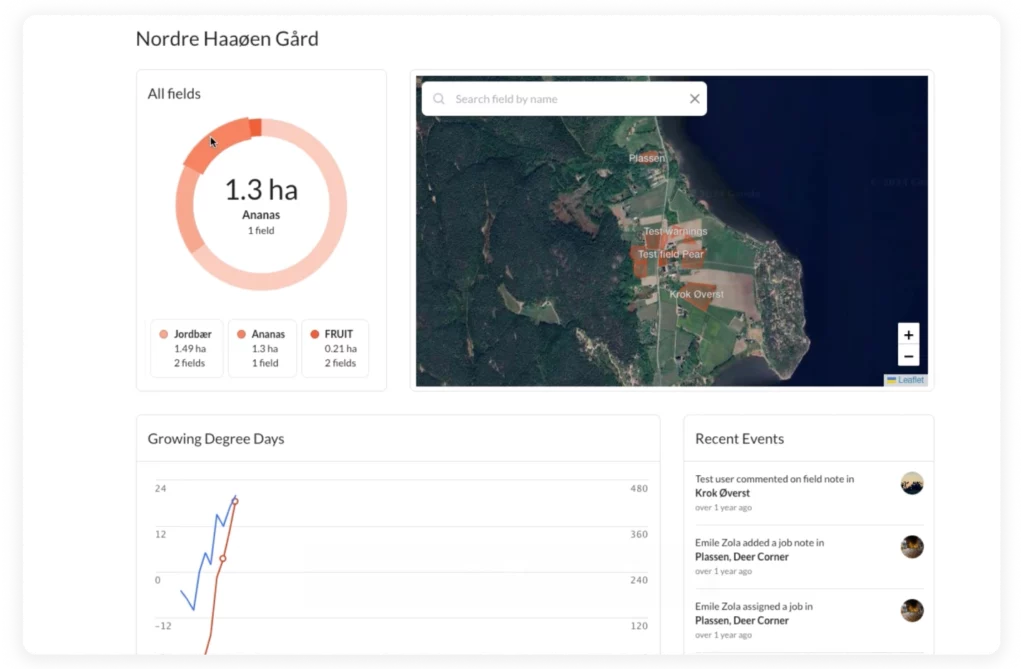
Agriculture (Agtech)
IoT data collection can be useful for preparing reports to governments. For instance, tracked machines that sow grain can be visualized on a map. A similar case that we cooperated with was Farmable which is helping fruit farmers across Europe better predict seasonal and yearly crop yields with IoT data visualization.
Proptech
Visualizing data from smart devices or sensors can help homeowners, office building managers, Property leasing agencies, and municipal offices monitor energy usage (and optimize it), lock management, prepare custom solutions to manage the systems, as well as automate ESG reporting.
Healthcare
This is a new trend that is emerging in the mass media or announcements from big tech. Companies like Apple strongly promote tracking patient health, spotting abnormalities, and providing options for remote monitoring. Devices generate data that can be analyzed by medical personnel.
Smart Cities
The visualization allows city administrators to analyze data from sensors and devices spread throughout urban infrastructure. As a result, planning (new investments), improving (waste management), or optimizing (public transport).
Industrial IoT & Manufacturing
IoT data visualization helps manufacturers monitor production processes, locate bottlenecks, and maximize productivity. Transforming sensor data into clear visuals helps identify inefficiencies, predict maintenance needs, and enhance decision-making.
Brick & Mortar Retailers
Retailers can use IoT data visualization to improve the overall shopping experience by analyzing consumer behavior, optimizing product placement, and improving inventory management.
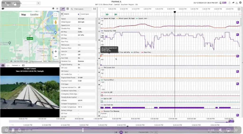
Logistics & Transportation
IoT data visualization enhances operational efficiency, improves route planning, optimizes fleet management, and reduces maintenance costs for Logistics and Transportation companies (like Wi-Tronix). By tracking vehicles, shipments, and cargo conditions, companies can predict delays, prevent issues before they arise, and improve customer satisfaction.
The Benefits of IoT Data Visualization
- Better Decision-making – Clear charts and interactive dashboards enable quick identification of key metrics and real-time responses to changing conditions.
- Pattern & Trend Detection – IoT data analysis helps predict machine failures, optimize operations, and implement preventive maintenance, reducing downtime and costs.
- Real-time Monitoring – Visualization systems in industries such as logistics, manufacturing, and healthcare help detect irregularities and enable swift action, for example, in smart cities, traffic visualization helps optimize traffic lights, reducing congestion and emissions.
- Increased User Engagement – Interactive visualizations make data more accessible, improving collaboration between teams and enhancing communication within organizations.
- Easier Interpretation for Non-technical Users – intuitive visualizations help managers, clients, and other stakeholders understand complex information, supporting informed decision-making.
- Forecasting & Recommendations – the use of AI and machine learning in IoT data visualization enables businesses to predict demand fluctuations, optimize energy consumption, and enhance system security.
- Competitive Advantage – efficient data management allows companies to better control operations, minimize risks, and improve overall efficiency.
By leveraging these benefits, organizations can fully harness the power of IoT, boosting efficiency, saving resources, and making smarter decisions.
Summary – What Future Awaits IoT Dataviz?
IoT data visualization transforms raw information into valuable insights that help users make decisions and optimize processes. Advanced tools and technologies—such as dashboards, interactive charts, and maps—allow users to present IoT device data clearly, understandably, and in an easy-to-analyze format. This approach improves operational efficiency and enables better monitoring, management, and forecasting across industries like manufacturing, healthcare, transportation, and energy management.
Looking towards the future, integrating advanced visualization tools with the growing number of IoT devices will enable even more precise monitoring and forecasting of various phenomena in real time. Transforming data into valuable, visual information will allow for faster and more accurate decision-making. As IoT technologies continue to evolve, the role of data visualization in turning large datasets into intuitive and actionable insights will become increasingly important, providing organizations with a competitive edge and allowing them to fully leverage the potential of the Internet of Things. At Black Label, data visualization is our specialty. Don’t hesitate to schedule a free consultation and find out how we can improve your product with a top-notch IoT data visualization interface or app.