
Did you know the “Da” in Da Vinci is short for Dataviz? Well, perhaps not because I just made it up. If you have any knowledge of Romance languages, you probably know “Da” actually means “of ” or “from”. But it is definitely true that the original Renaissance man had a huge impact on data visualization in art and science.
Case in point – have you ever tried parachuting? It’s not too much of a leap to say that Leo was the guy who made it possible, and what got him there were his technical drawings which visualized the theoretical application of physics in a whole new way. So let’s jump right in and see how it all began with the origin of the parachute.
“And that, son, is how you fall.“

Leonardo da Vinci was born on 15 April 1452 near the Tuscan hill town of Vinci (get it now, he’s “from” Vinci), 20 miles outside of Florence aka Firenze. As far as we know, he was in his thirties when he began experimenting with visualizing the application of physics in engineering and developing his first contraptions.
It was during this period that he came up with the idea for the first parachute. Sadly, there’s no specific historical account of his Eureka moment with the parachute. However, it is believed that Leonardo’s initial inspiration for inventing the parachute came from observing nature. He was known to study birds and their flight patterns closely. Once upon a time he said:
Nature is the source of all true knowledge. She has her own logic, her own laws, she has no effect without cause nor invention without necessity [Leonardo Da Vinci]
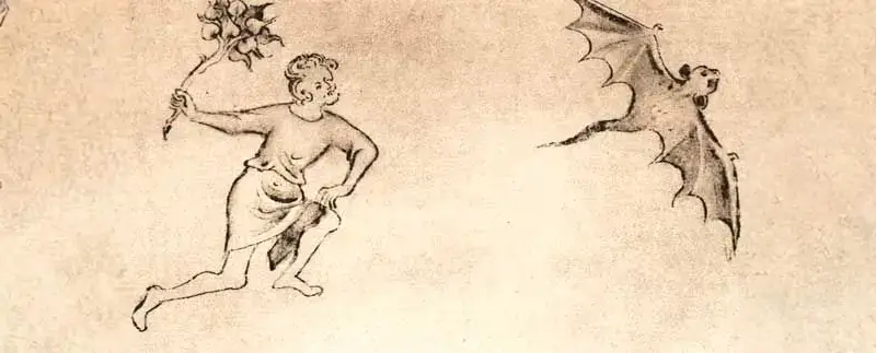
Eventually, he moved on to bats whose long wings immediately grabbed his attention. He noticed that their elongated wing-like structure could create enough air resistance to slow down the fall of a person or object. Observation is one thing, but methodical scientific examination is something else altogether.
With this in mind, Leo boldly went looking for a bat cave. He decided to go there during the day when all the bats would be asleep. Having caught one, he was able to study it up close and discover exactly how its wings were built. His research confirmed his initial assumptions and eventually he was ready to design the first parachute.
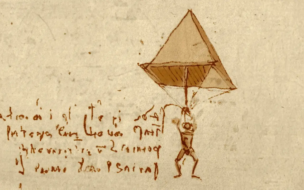
Below is a technical drawing of his new invention: note the dual pyramid structure, which might not look like a modern parachute at first glance, but the underlying principle and proportions are the same. Precision and clarity were very much Leonardo’s strong suits. Future generations valiantly followed his work in terms of putting a high priority on readability and elegance into their engineering drawings and technical visualizations.
Despite being a well-rounded Renaissance man, Leo was decidedly no bat-man, so once his initial sketches were complete, he returned his flying rodent friend to his cave and was ready to say goodbye forever… when he saw a few bats in flight and drew inspiration for his very next project…
It’s a bird… It’s a plane… It’s… just a Gliding Insectivore
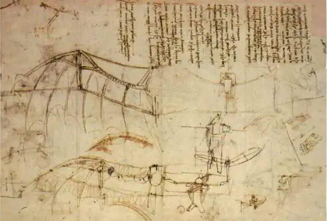
Leonardo’s next bat revelation was leaps ahead of his parachute epiphany. Sure, falling slowly is cool and all, but what if you could fly instead of just falling… And thus the very first hang glider was born, an invention that focused even more on advanced aerodynamics than the parachute.
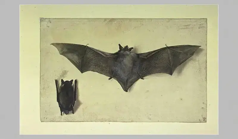
As we already know, Leonardo was a guy that liked to observe nature and apply his discoveries, so with the hang glider it was no different. This time, he didn’t even have to leave his bat cave. As you can see in the pictures below, the structure of a hang glider is reminiscent of a bat with its wings expanded to their full extent.
The wingspan outlined in the first hang glider sketches was considerably larger than that of the human body, and the same is true for bats. Using natural wind currents and upward thermals, Leo’s invention gives gliders the feeling of flying (they are really just falling slowly) and the pilot can steer by putting more weight on one side of the hang glider. The invention was indeed incredible and way ahead of its time and his technical drawings for the contraption are as iconic as DC’s Dark Knight.
As exciting as the designs were for both the parachute and the hang glider, Leo was unable to build a functional prototype for either during his lifetime. However, by creating different types of diagrams, drawings and technical sketches, many of which are now etched in our imaginations, he also presented step-by-step explanations of how his inventions should look and work, which made it easier for others to understand and eventually replicate his ideas.
Later on Leo shifted his attention from flying bats to the fine arts. Much of his early studies on nature and physics would inform his later artistic masterpieces. However, his impact on the emerging field and science of data visualization would not be noticed until a century after his death, when Christoph Scheiner picked up where Leo left off and began to take infographics to the masses.
Scheiner’s Sun and the First Scientific Infographic
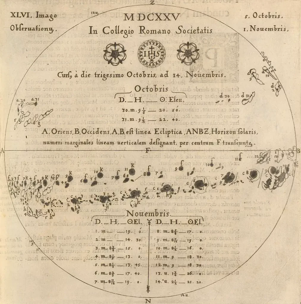
Christoph Scheiner was born in 1573 (or 1575, it’s a matter of debate) in Swabia (now Germany). He was a Jesuit priest, physicist, and astronomer. More than 100 years after Leonardo’s death, he picked up the gauntlet and began creating scientific drawings inspired by his observations of the heavens and the earth.
His Da Vinci inspired sketches eventually evolved into what is widely thought to be the first infographic – presenting the rotation of the sun (below). His scientific infographic was published in the Rosa Ursina sive Sol, a scientific book about sunspots and torches.
Christoph’s highly scientific infographic presents the progression of sunspots with well-drawn illustrations and diagrams and overlaid descriptions, dates and statistics. This infographic was another huge step in the evolution of data visualization and a milestone in dataviz history.
From Flying Bats to Battle Maps
You might not have associated Da Vinci with dataviz at the beginning of this article, and I’m pretty sure you’d never heard about Herr Scheiner either. But, as you can see, both of these towering figures of science, math and art left their mark on the emerging field of data visualization.
In my next Data Vistory article. I’ll focus on another dataviz whiz kid – Charles Joseph Minard. Born 200 years after Christoph Scheiner, Minard was a French engineer who was widely considered as “a cartographic pioneer.”
He created dozens of diagrams and maps about road traffic and pavement maintenance. While Minard’s work may sound mundane, he was the guy who created the Sankey-like diagram of Napoleon’s Russian campaign, considered by many to be the best infographic ever created.
I hope you enjoyed this first installment of Data Vistory. Feel free to contact me via LinkedIn to let me know what you think about this article or to suggest dataviz history topics you’d like me to cover. Thanks!
-Dominik Da Cracovie
References: