

Welcome to the next episode of our historical dataviz series. Today we’ll talk about the great Napoleon Bonaparte and his pal Charles Joseph Minard. This installment is action packed so make sure you’re sitting comfortably and let’s jump right in.
Napoleon Bonaparte was a pioneer of the new military era. Charles Minard was also a pioneer but his innovation wasn’t on the battlefield but instead was in the field of cartography, diagrams, and ultimately data visualization.
While charts and diagrams are both visual storytelling tools, they have slightly different roles to play in the data battle. Charts are more technical and use scales, axes and numbers to tell visual stories and express trends. Diagrams on the other hand are the relationship superstars – they skip numbers and use arrows and symbols to show how things connect and flow. Charles rocked both of these fields, as you’ll see below.
Now, before we get started, let me share a joke with you.
– Why did Napoleon always carry a pencil?
– In case he wanted to draw up a new battle plan!
I imagine he must have had quite a few pencils on hand considering the number of battles he fought in his life. Now that you know the lay of the land, let’s begin our merveilleux journey by tracing Charles’ back to Dijon (it’s always smart to start with the mustard!).
An (Extra)ordinary Engineer
Charles Joseph Minard was born on 27 March 1781 in Dijon in the parish of Saint Michel. He was a highly intelligent kid who learned to read and write at the age of four. In 1803 he completed civil engineering studies at École nationale des ponts et chaussées (a top level educational diploma) and became an engineer.
The first diagram of his that we know about is from 1825 and it shows the pavement maintenance in Paris. I’m not sure if Charles personally chose to work on this, but it appears he did, only to later abandon his diagram creation for 15 years. Perhaps he got sidetracked by the sidewalks…
Eventually in the 1840s he made a huge comeback with his data visualizations. He lost himself completely in statistical graphics with fame and glory following swiftly thereafter. Below are his most popular works from his career starting with the Parisian pavement maintenance piece.
Looking for a team of great dataviz engineers like Charles? Then you should definitely check out our Services page to learn more about what we can do for you.
Charles’ Selected Diagrams & Data Visualizations
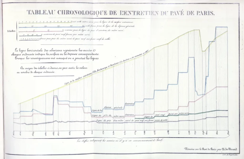
The yellow line shows the paved area, and the blue line represents maintenance spending. It’s interesting to note a significant decrease during the French Revolution in both.
I guess that some folks were using these paved areas as a source of cobblestones to throw at the bourgeoisie authorities, and the authorities in turn thought better of giving them a fresh supply of free ammo. It’s also likely that due to the rebellion, those in power didn’t have enough money to invest in something as basic as pavements.
Railroad Passengers Across Various Routes (1844)
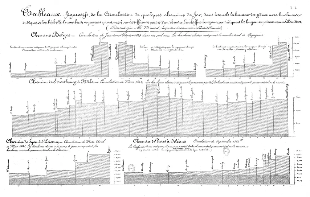
As we already know, Charles was a civil engineer. He worked on various infrastructure projects such as canals, dams, and bridges. In the 1840s, he made his comeback in the world of diagrams when he turned his focus to studying passenger and freight movements. He drew a bar for each railway segment, depicting the segment’s length and the number of passengers it carried.
Charles’ research led to the conclusion that the distances between stops should be shortened. Would the communication systems we depend on nowadays perhaps look different without this conclusion?
Don’t forget to take a close look at the image above. It’s a lithograph by Charles that shows passenger counts across various railway routes. The darker hatching indicates the number of passengers traveling the entire length of the line. As proud as he was of his charting breakthrough, Charles never hesitated to develop new dataviz innovations. Speaking of which, have you ever heard of flow maps?
Road Traffic between Dijon and Mulhouse (1845)
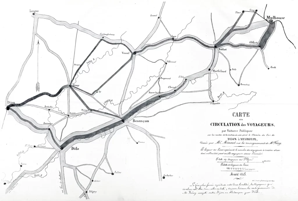
The first revolutionary Flow Map flowed directly out of Monsieur Minard’s beautiful mind. The map shows traffic on the roads in the area between his hometown of Dijon and Mulhouse. Two hundred copies were sent to various stakeholders leading to debates among lawmakers and engineers about how to improve communication between these two cities.
The impact of Charles’ works was steadily growing and in the following decades he created dozens of flow maps like the one above. But between countless astonishing charts and diagrams Charles created, one of them stands out for being especially polished and ended up having a huge impact on the field of data visualization.
Sankey-like Diagram of Napoleon’s Russian Campaign
The following diagram or rather “work of chart,” if I can be so bold, is what truly made Charles a “cartographic pioneer.” This is considered by many to be the best statistical graphic dataviz drawing ever drafted.
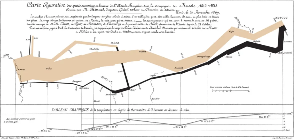
Drawn initially in 1869, this combination of a data map and a time-series portrays a sequence of devastating losses suffered in Napoleon’s ill-fated Russian Campaign of 1812. Beginning on the left on the Polish-Russian border near the Niemen River, the thick tan flow-line shows the size of the Grand Army (422,000 at the start) as it invaded Russia in June 1812.
The width of this band indicates the size of the army at various points on the map. By September the army reached Moscow, which had already been deserted, with only 100,000 men. The path of Napoleon’s retreat from Moscow is depicted by the darker, lower band, which is linked to a temperature scale with corresponding dates at the bottom of the chart. It was a bitterly cold winter, and many soldiers froze during the march out of Russia. As the graphic shows, the crossing of the Berezina River was a disaster, and the army finally trudged back into Poland with only 10,000 men remaining.
Charles’ chart tells a rich, coherent story with its multivariate data, one far more enlightening than just a single number bouncing across an x-axis. Numerous variables are plotted: the size of the army, its location on a two-dimensional surface, direction of the army’s movement, and the temperature on various dates during the retreat from Moscow.
After diving into this diagram you’ve been fully immersed in the most significant (mis)adventure of Napoleon’s storied military career. But how did him and his army end up there in the first place? Let’s take a few steps back and get you up to speed and explore his connections to data visualization history (ahem, maps…).
Emperor Napoleon Bonaparte
Napoleon Bonaparte was born on August 15th, 1769 on the island of Corsica. What’s interesting is that this was the very year that the Corsican Republic was conquered by France. Before being conquered, Corsica had been its own sovereign republic. Perhaps related to his Corsican roots, Napoleon never liked the French Monarchy very much. He actively supported the French revolution in 1789 while serving in the French army. He even tried to promote revolutionary ideas in Corsica as well.
His rise in the military was rapid and highly eventful. He was a fast learner starting out as a second lieutenant in the French army. He initially served in the artillery regiment of La Fère in 1785. Over time he rose through the ranks thanks to his military mind and leadership skills. Throughout the French Revolution and later battles he became a general and eventually the Emperor of the French.
I can no longer obey; I have tasted command and I cannot give it up.
But what was the secret to Napoleon’s battlefield successes? Did it involve some form of mystical sorcery? According to some Prussian villagers, that might have been the case. But with the benefit of hindsight, I think his enormous success can be attributed mainly to maps…
Napoleon’s Mastery of Maps
Maps were crucial for battles in the 18th century. They enabled commanders to effectively plan a battle by effectively reading the terrain on a map. Maps provided essential details including elevation, bodies of water, forests and road networks. This information was essential for battle strategists.
Did you know that commanders used maps to mark reference points for all of their officers? These points served as gathering points for receiving new orders and making communication better and faster. Points were chosen carefully based on the terrain and good road connections. A good road was also the perfect place to set up a supply line. Maps made it easier to choose the best supply routes, ensuring security and fast courier movement.
But who created the maps that Napoleon used? Sadly there’s not one main figure that stands out. There were different groups of mapmakers involved, although none gained as much fame as the one and only, Charles Minard (bet you didn’t see that coming). Cartographers were vital in these times because it was their duty to create high-quality maps that reflected reality well.
Napoleon knew all too well how to take full advantage of the maps good cartographers created. Let’s explore exactly how he used maps to his advantage in one of his greatest victories…
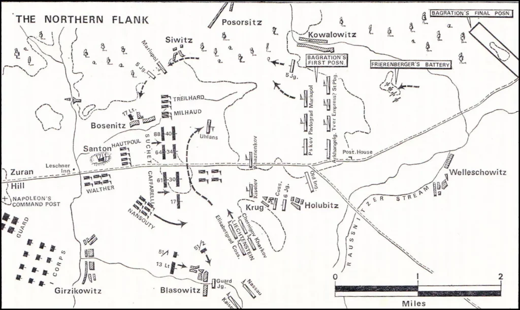
The Battle of Austerlitz
This was a truly epic battle and hugely significant in the history of Europe. Napoleon fought against the combined forces of the Russian and Austrian empires, and won! The battle took place on December 2nd, 1805, during the War of the Third Coalition, which was basically a conflict between Bonaparte and the rest of Europe. Sounds tough, doesn’t it? But with the power of maps, anything is possible. Let’s take a look at how the battle unfolded.
The Course of the Battle
All of the battles transpired to the west of Slavkov (formerly Austerlitz) in the Austrian Empire (now Czech Republic). The terrain was very diverse with the north being dominated by hills and the southern part of the battlefield mostly being flat. The central point of action was a low hill with gentle slopes.
Reconnaissance was a big thing for Napoleon. He and his team had studied the battlefield and surrounding area well, getting hold of the right maps and all the information they needed to plan the battle well.
Thanks to the detailed maps, Napoleon could understand the battlefield landscape thoroughly. This helped him identify key terrain features that could be advantageous to him during the battle, which turned out to be decisive.
The Secret to his Victory
The main strategy behind Napoleon’s plan was to fool his opponents. Napoleon deliberately weakened his central forces creating the appearance of vulnerability to lure the enemy into attacking him in the middle of the battlefield. Meanwhile he positioned his main force on higher ground (*I have the high ground*), the enemy could not see the main forces due to the undulating terrain. His use of maps helped him identify this advantageous position and plan his deception.
The battle of Austerlitz is the grandest of all I have fought.
Napoleon used the maps to time his movements and execute a brilliant flanking maneuver. He knew the exact terrain features and landmarks, allowing him to coordinate his troop movements with absolute precision. This maneuver took advantage of the enemy’s mistakes and led to the encirclement and defeat of a significant portion of the Allied forces. This was the deciding moment of the entire battle as the Allies lost almost 4,000 men, while Napoleon’s army only lost around 1,500.
It’s also important to note that during the battle, Napoleon and his commanders continuously referred to their maps to track the progress of the battle and adjust their tactics as needed. This situational awareness helped them exploit weaknesses in the enemy’s position.
What would have happened if Napoleon hadn’t had access to good maps?
I’m certain that planning the battle with such precision would have been nearly possible. With Napoleon having fewer troops, it’s likely that he would have faced defeat.
However there’s still a chance that his military intuition could have saved France and have led to successfully luring the enemies into a trap and still winning. Nevertheless, in this scenario I’m confident that even in the case of a French victory, many more French soldiers would have died.
Can you imagine how Europe would look today if Napoleon had lost at Austerlitz? Perhaps France would have needed to resign from future conflicts and focus instead on consolidating their homeland and bolstering their military and political standing.
Would the unification of Germany have occurred sooner? And what about the fate of the Polish people, with Napoleon not embarking on his fatal march to Moscow? I’m curious to hear your thoughts, dear readers.
Napoleon did indeed win the Battle of Austerlitz in grand fashion but he would ultimately face defeat in the small belgium city of Waterloo… This is another battle worth investigating at a later date for its map and dataviz heavy anomalies.
From Battle Maps to Tulip Mania
Wasn’t Charles Minard a man with an insightful mind? Didn’t Napoleon have an impressive way of using maps? One created charts, diagrams and maps, while the other one used them exceptionally well. While there was hype about both of these men, sometimes historical hype cycles turned into actual frenzies which had huge historical implications.
Have you ever heard about financial bubbles? Perhaps you’ve come across NFTs or other crazy deep-tech innovations? In my next Data Vistory article I’ll focus on a similar type of bubble and hype cycle. However the subject of our discussion might be rather unexpected – flowers. Tulips to be precise.
In the 17th century the Dutch people went absolutely cuckoo for tulips. The price of a single tulip soared to the value of an entire house, creating a funny curve on a graph. Understanding and visualizing data while predicting trends might be crucial in avoiding potential financial disasters in the future.
I hope you enjoyed the second installment of our Data Vistory series. Thanks for your attention, over and out!
References: