

Sure, it’s not a sprawling oak or a shady pine, but a treemap chart can still branch out your data in a way that’s clear, colorful, and downright useful. It’s not about leaves and bark – it’s about rectangles and ratios, and trust me, it’s a lot more exciting than it sounds.
In this piece, we’ll plant a tree and place it on a map. We’ll explore its roots, trunk, and branches, then water it well to grow a beautiful, strong tree (map chart).
What Is a Treemap Chart?
A treemap chart is a data visualization that uses nested rectangles to represent hierarchical data. Each rectangle’s size reflects a value, and its color can show a second dimension, like a forest of insights packed into one tidy square. Think of it as a map of your data’s territory, minus the compass.
Here’s what treemaps are great for:
- Sales breakdown by product category: Are gadgets outselling socks, or is it all about cozy sweaters?
- Website traffic by source: Is it social media driving clicks, or are search engines the real roots of your traffic?
- Budget allocation across departments: Where’s the money growing – marketing, R&D, or that mysterious “miscellaneous” bucket?
- Visualizing stock market capitalization per stock (market cap).
These datasets often shine in treemaps. Let’s dig into an example.
Example: Website Traffic Sources
Imagine you’re tracking where your site visitors come from. Here’s how a treemap might break it down:
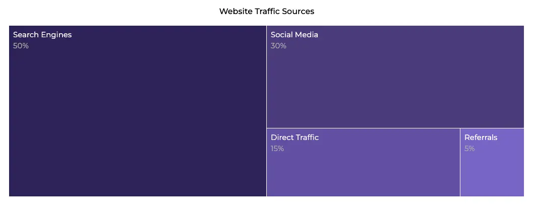
This treemap clearly visualizes the primary sources of website traffic and their respective proportions.
- Search engines: The biggest rectangle, taking up 50% of the space.
- Social media: A solid 30%, not far behind.
- Direct traffic: A smaller 15% chunk.
- Referrals: A tiny 5% sliver.
No overlapping circles or confusing lines – just neat, nested boxes showing the big picture.
When Can We Use a Treemap Chart to Its Full Potential?
Showing Hierarchical Data
Treemaps thrive when you’ve got layers – like categories with subcategories. Think sales regions broken into individual stores or a company org chart.
Comparing Proportions in a Tight Space
Got a lot of data but not much room? Treemaps pack everything into one compact view, making proportions pop without wasting pixels.
Highlighting Patterns with Color
Use color to show a second metric (e.g., profit margins alongside sales volume) and watch patterns emerge like leaves in spring.
Other prime scenarios for treemaps include:
- Visualizing Market Share: Compare companies or products in a crowded field.
- Analyzing File Sizes: See what’s hogging your hard drive in one glance.
- Spotting Outliers: Big or tiny rectangles stand out fast.
- Breaking Down Complex Surveys: Show how responses are split across multiple levels.
Want to know how it’s built? Don’t trim this next part – it’s the good stuff.
The Anatomy of a Treemap Chart
Think of a treemap like a treehouse: every branch (rectangle) has its place, and the size of each room matters. Here’s the breakdown:
- Rectangle size: Proportional to the value it represents—bigger means more, simple as that.
- Color coding: Often tied to a secondary metric (e.g., green for high profit, red for low).
- Nesting: Subcategories sit inside their parent category, like twigs on a branch.
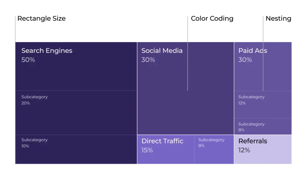
You can tweak things, too. Some charting tools let you adjust the padding between rectangles for clarity or mess with the layout algorithm (squarified, slice-and-dice, etc.) to control how the boxes stack up.
No axes here – just pure, space-filling geometry. But before you go wild, let’s talk about when treemaps might leave you stumped.
When You Shouldn’t Use It
Yeah, treemaps aren’t perfect for every job. Here’s when they might not take root:
Too Many Categories
If you’ve got dozens of tiny rectangles, it’s like a forest with no paths—confusing and cluttered. Try a bar chart instead.
Tracking Trends Over Time
Treemaps show a snapshot, not a timeline. Want to see growth? Line charts are your friend.
Subtle Differences
If values are super close (say, 49% vs. 51%), the size difference might be too small to spot.
Negative Values
Debt or losses? Treemaps don’t play nice with negatives—stick to something like a waterfall chart.
Plenty more pitfalls exist, but these are the biggies. Now, let’s grow a treemap that actually works.
Treemap Chart Best Practices
Ready to craft a treemap masterpiece? It’s easier than planting a forest. Here’s the recipe, with some extra seasoning:
Keep Categories Manageable
Stick to a reasonable number – say, 6-12 main categories. Too many, and it’s a jungle out there.
Pick a Clear Focus
What’s your story? Let’s say it’s “Which departments use the most budget?” Keep it simple and let the treemap shine.
Balance Rectangle Sizes
Tiny slivers are hard to read. Group small categories into an “Other” bucket if needed.
Use a Smart Color Palette
Ditch the default rainbow mess. Try a tool like [Coolors](https://coolors.co/) for a cohesive, eye-friendly scheme.
Add Labels Wisely
Label big rectangles directly, but don’t cram text into tiny ones—use a legend or tooltip instead.
Here’s a quick before-and-after:
Before:
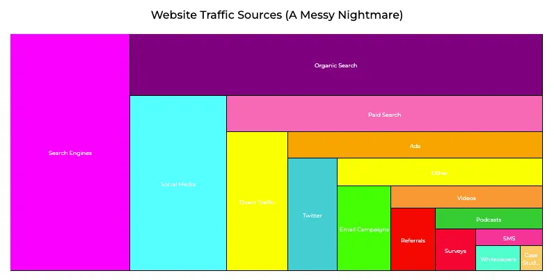
This chaotic eye-sore of a treemap chart makes website traffic source analysis a confusing endeavor.
Bad: 16 categories, clashing colors, unreadable labels.
After:
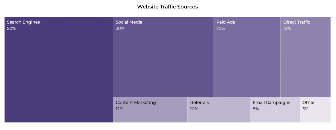
Peace and harmony has returned to the forest. This treemap provides a clear and proportional view of various website traffic sources.
Good: 8 categories, smooth purplish palette, clear labels on the big players.
Boom – your treemap’s ready to bloom.
Treemap Chart Overview
A treemap chart is a rectangular, nested visualization for hierarchical data, using size and color to show proportions and patterns.
It’s best for comparing parts of a whole across layers, like sales by region and product.
You should use it for:
- Hierarchical data: Show nested categories clearly.
- Proportions in tight spaces: Fit a lot into a little.
- Pattern spotting: Use color to highlight trends.
You shouldn’t use it for:
- Subtle differences: Hard to see small size gaps.
- Time trends: No motion here – try a line chart.
- Too many categories: Clutter kills clarity.
4 Pro Tips for Smart Creation
1. Limit your categories – less means more.
2. Balance sizes for readability.
3. Paint it with a polished palette.
4. Label smart, not hard.
The Bottom Line
There you go, your data’s now thriving in a well-crafted treemap chart. It’s perfect for showing hierarchies and proportions, but don’t force it into trend-tracking or overcrowded messes. For those, check out bar or line charts instead.
Keep rectangle sizes balanced, colors stylish, and labels clean. Your audience will thank you, and your data will feel like it’s finally found its roots.
Thanks for digging in!