Have you ever been to Egypt?
Even if you haven’t, I’m pretty sure you’ve at least seen a photo of one of the great pyramids. What you might not know is that inside each of these ancient wonders the pyramid is divided into several levels, very much like a modern apartment building.
Farmers and slaves lived on the ground floor of the pyramid. Craftsmen lived on the first floor, with priests and nobles above them. At the very top, you’d find the pharaoh in his penthouse suite. It was a simple social hierarchy. The most important people lived at the top, and those representing the lower social classes were at the bottom.
I assume you didn’t know that right?
That might have something to do with the fact that I just made it up.
However, this multi-level pyramid schematic is exactly how pyramid charts work and are divided. So, sorry for pulling your chain, but now that you understand the basic structure, it’ll be much easier to reveal the ancient secrets the pyramid chart has locked inside.
Table of Contents:
- What is a pyramid chart?
- When should you use a pyramid chart?
- Types of Pyramid Charts
- Examples of Pyramid Charts
PRO TIP: Pyramid charts should be your go to chart of choice for data visualization if you have a small amount of data focused on one specific topic.
What Is A Pyramid Chart?
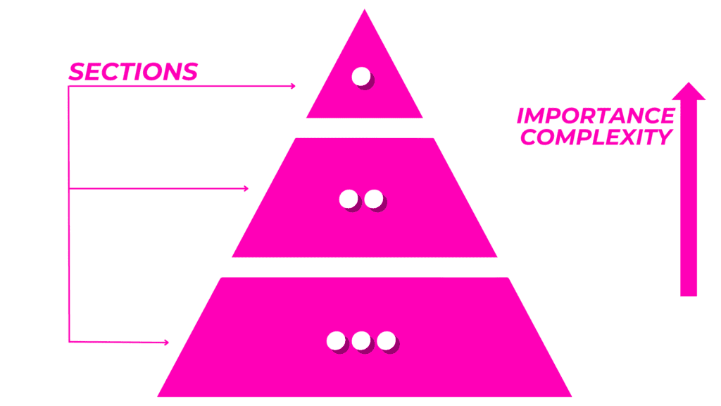
A pyramid chart is a triangle divided into horizontal sections (levels or categories). Each pyramid section typically varies in size and follows the natural rules of hierarchy. At the top we find the category that’s the most important or most complex, while at the bottom we find the category that’s the least important or most basic.
A pyramid chart can be a great option for all kinds of datasets both large and small. The topics you can present on a pyramid chart range from what makes up a healthy diet to population distribution.
It’s good to remember that when dealing with larger datasets (such as demographic data) first you need to:
- Collect all your data.
- Separate your data into several categories.
- Assign each category a place in the hierarchy.
Then you can begin building your pyramid. This advice comes in handy for smaller datasets as well.
Consider using a pyramid chart when you have data that you want to group into a relatively simple hierarchy. Think along the lines of Maslow’s Hierarchy of Needs or perhaps a simple topic like “3 Mistakes to Avoid When Creating a Chart.”
In most cases, you’ll find the most common or largest data subset at the bottom of the pyramid, while at the top, you’ll find the rarest occurrence or smallest subset.
Pretty straightforward, right?
Personally, I find this type of chart particularly useful when studying various societal groups from the past, such as kings, knights and the like.
But let me get back to explaining pyramid charts and trying to answer the all important question – when should you use a pyramid chart?
Presenting societal groups on a pyramid chart is great, but there are also some other important use cases. Let’s take a look at some of them.
When Should You Use A Pyramid Chart?
Pyramid charts are highly effective tools for representing data visually. Especially when you need to arrange items in a hierarchical structure and want to convey information about their size and quantity in a clear and engaging manner.
There are two specific areas that I think are worth highlighting in terms of pyramid chart usage. These include business and education.
Using a Pyramid Chart for Business
In business, pyramid charts can serve many purposes. You can show how the sales of a specific product is going, dividing the data into categories such as sales techniques or channels to make it easier to identify what’s most effective.
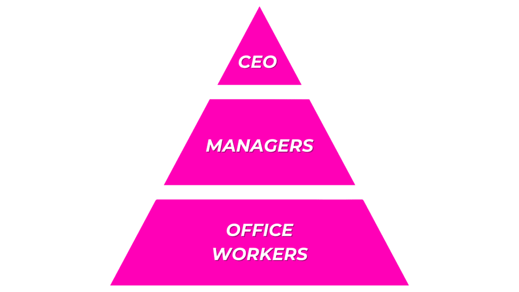
Another approach could be to create an organizational hierarchy chart or org chart.
You can show what your team looks like and divide it into as many levels as you need. At the top you’d place the CEO, followed by middle management and regular employees. Of course few org charts resemble perfect pyramids.
Looking for a team that provides rich data visualizations? Then you should definitely check out our Services page.
Using a Pyramid Chart for Science & Education Purposes
Pyramid charts are extremely useful in education and the sciences, especially when there’s a lot of research involved. Remember, pyramid charts effectively visualize large datasets by categorizing them into several smaller groups or categories before organizing them into the final hierarchical chart.
Here’s an example of real-life situations where a pyramid chart is the ideal visual representation for a particular dataset:
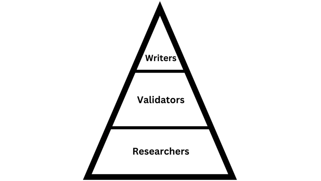
- Group tasks and responsibilities in an academic project:
- Writers – Images of those responsible for writing the text for a presentation, article, etc.
- Validators – Images of people who are responsible for checking whether the material gathered by the researchers is valid.
- Researchers – Images of people whose responsibility it is to conduct the research.
You could also use pyramid charts to visually present data regarding a variety of other scientific and educational topics. Here are three such examples:
- Population Demographics
- Historical Trends
- Income Disparities
Pyramid Chart Golden Rules
There are two golden rules for using pyramid charts to make them easy for your viewers or readers to remember:
- The chart structure should be clear and easily understandable, especially for small datasets (up to let’s say 5-8 categories).
- The entire dataset should be focused on only one topic. Don’t mix topics or contexts as this might confuse your readers.
3 Types Of Pyramid Charts for Data Visualization
There are a couple of pyramid chart types that are popular and I’m pretty confident you’re gonna use one of the ones below.
Note that if you’re a business person, the last example is probably the best choice.
The Classic Pyramid Chart
This type of pyramid chart typically displays hierarchical data in a pyramid shape. The broader, basic, or relatively less important categories are located at the base. The more complex or relatively more important categories are at the top (depending on the predefined hierarchical structure).
Classic pyramid charts are great for showing categorized and hierarchical lists such as the aforementioned Maslow’s Hierarchy of Needs, business org charts, and general data distribution.
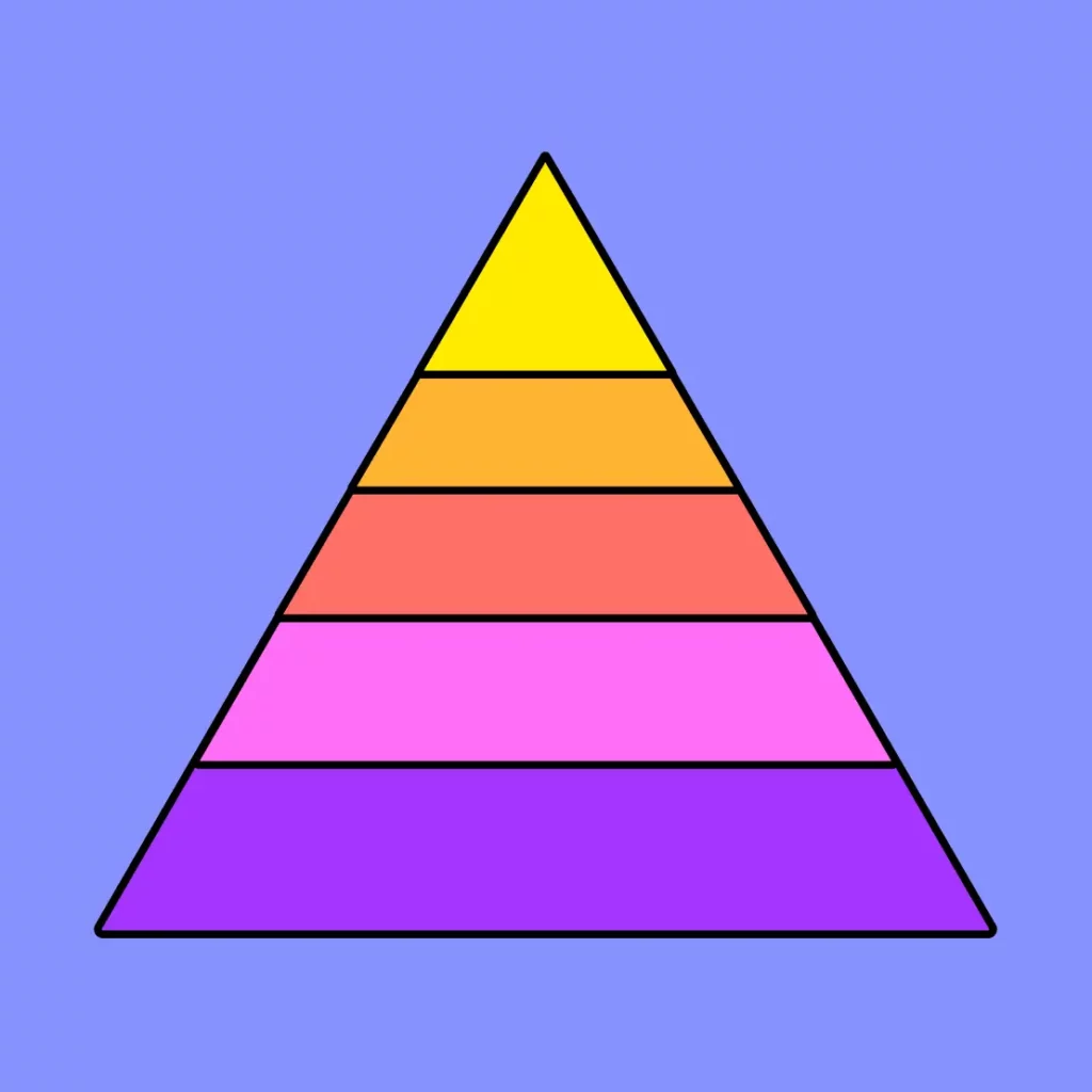
a color palette can help to differentiate data subsets at each level of a pyramid chart
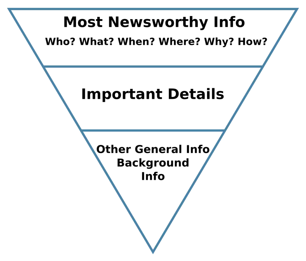
The Inverted Pyramid Chart
An “inverted pyramid chart” is wider at the top and is progressively narrower until it reaches the point at the bottom. It’s often used in journalism and data representation to draw additional attention to the information at the top.
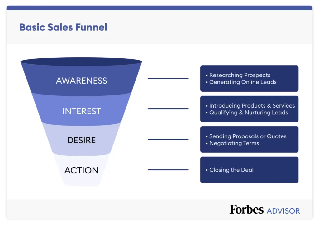
The Funnel Pyramid Chart
The funnel pyramid chart looks quite similar to the inverted pyramid, but shows a reduction of data in terms of stages. It’s often used for sales and conversion tracking. An excellent illustration of a funnel chart from Forbes awaits you in the following paragraph.
PRO TIP: If you’re looking to create a funnel chart from scratch, I have a great recommendation for you – check out the Funnel Chart created by Highsoft. Highsoft is a company located in Vik i Sogn, Norway. They are the creators of Highcharts, the best charting javascript library in the world, in our opinion.
3 Examples Of Pyramid Charts
So, now that we’ve explored various types of pyramid charts, can you think of any charts you’ve seen that fit the descriptions above? I’m sure you’re familiar with at least one type of pyramid chart listed below. Let’s see.
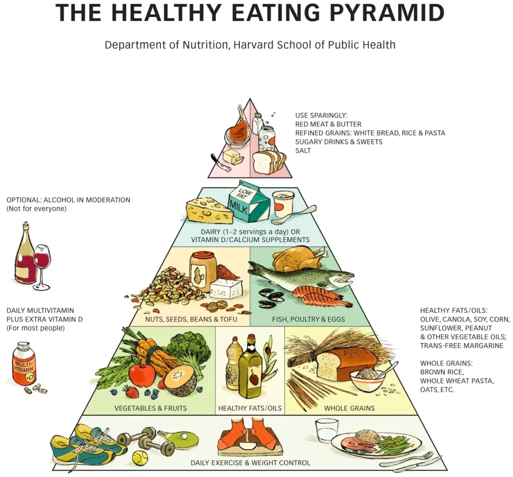
The Food Pyramid Chart
A food pyramid chart is a simple way to show healthy eating habits. Grains and vegetables are at the bottom, and fats and sweets are at the top. The food pyramid helps guide balanced eating and is the basis of a healthy diet.
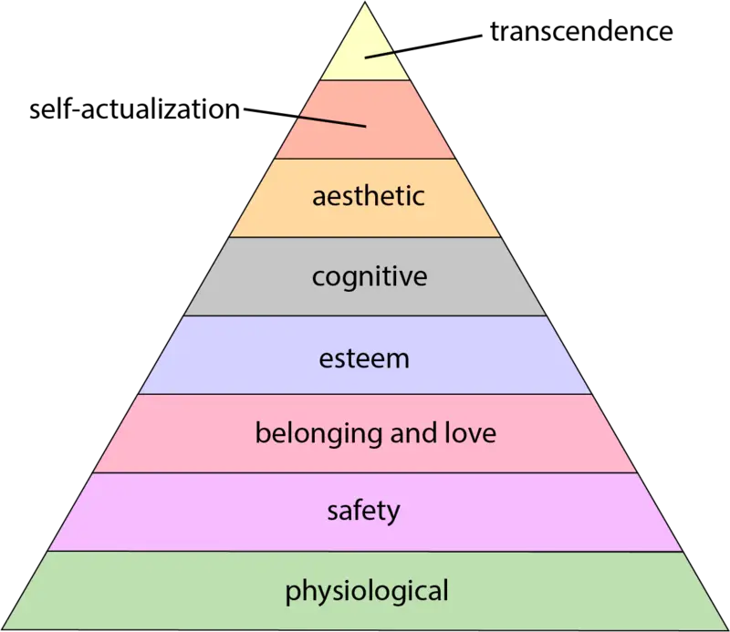
Maslow’s Pyramid Chart
Maslow’s Hierarchy of Needs is a psychological theory that places human needs in a pyramid chart, with survival needs at the bottom and self-fulfillment at the top. It helps us understand what’s behind human drives and self-growth.
Sales Funnel Chart
A Sales Funnel pyramid chart is a visual guide that shows how potential customers move towards making a purchase. Creating a sales funnel helps businesses improve their sales and marketing strategies. This is crucial for turning leads into customers.
Best Practices For Creating Pyramid Charts
- Decide on the topic of your chart: Select a subject, ensuring it aligns with your communication goals.
- Choose a suitable title: Pick a title that’s representative of your chart’s content.
- Clearly define the pyramid levels with partitions and different colors: To increase readability and enhance visual clarity, try using creative solutions for separating your pyramid sections. That can include selecting different colors for each level or using a gradient.
- Be selective with your subcategories to avoid clutter: Choose categories or data subsets carefully, ensuring they’re valuable and necessary. Remember that too many subsets can make the chart unreadable.
- Label each level accordingly: Provide context for each level.
PRO TIP: If you’re uncertain about whether a pyramid chart is the right choice for your dataset, check out the Chart Chooser tool created by the Highcharts team. After filling out a quick survey, this tool helps you discover the most suitable chart type for your data. With a database featuring 43 different charts, the Chart Chooser tool intelligently selects the optimal chart type based on whether your data is categorical or continuous.
Pyramid Chart Overview
In case you’re strapped for time, I’ve simplified the key points of this article and presented the best insights about when, how, and why you should use a pyramid chart:
- Pyramid charts are great options for all kinds of datasets as long as you are focusing on a single topic.
Short Disclaimer: Remember to collect your data first. Next, group it into several categories and prepare it for chart placement. It’s especially important when you’re handling big datasets such as statistical data.
- Pyramid charts are also a great option whenever you have hierarchical data.
- There are three main types of pyramid charts:
- Classic
- Inverted
- Funnel
- Pyramid charts are best used for:
- Data Rankings
- Statistical Data (E.g., Population Distribution)
- Organizational Hierarchy (E.g., Org Charts)
- Top hot tips for using pyramid charts:
- Be selective with categories to avoid clutter.
- Stick to one topic per chart.
The Bottom Line
Remember that if you work in business, the sales funnel pyramid chart is probably your go-to chart type. That’s because you can easily show how potential customers move towards making a purchase.
Don’t forget that pyramid charts are the best choice for arranging items in a hierarchical structure. They effectively convey information about size and quantity in a clear and engaging manner.
So, if you’re working with small datasets of a hierarchical nature, pyramid charts are the best choice for you. They will help you visualize your data in a simple, easy way that conveys what you want to your audience within seconds.