
Data can be compared to the sand – endless, messy, slipping through your fingers. AI is the sieve that filters out the useless grains, finding the pieces that matter. But even then, it’s just a pile.
Dataviz is the builder that takes that pile and shapes it into a castle worth looking at. Alone, neither works. Together, they turn sand into something solid, clear, and impressive.
Why Dataviz Needs AI
There are plenty of reasons, but I’ve spotted three major ones that I’ve actually seen in action in different use cases.
- Amount of data – think of an e-commerce platform tracking millions of daily transactions. It takes a village to research all of them and display them on a dashboard. AI helps you avoid getting lost. In the use case section, I’ll demonstrate how to use AI to do some data research and prepare visualizations without manually breaking through tables, filters, and complex data-related operations.
- Patterns humans can’t see – In healthcare, tiny anomalies in patient data could signal early disease risks. These patterns are sometimes invisible on a chart but detectable by AI models. Researchers at Imperial College London and the University of Edinburgh have developed brain-scanning AI software that demonstrates this potential.
- Calculate predictions – Stock market trends or energy consumption curves can be projected into the future. AI analyzes past behavior and feeds predictions into visualizations, showing not only what was, but what might be.
However, when it comes to stock market forecasts, it can be quite unpredictable. According to recent research by Erfan Radfar at Sharif University of Technology, AI models often give misleading results in stock market predictions. Even smarter models struggle with real-world stock chaos, and a small set of tickers just won’t cut it when it comes to reliable forecasts.
It’s striking how fast AI is advancing – its output is now often indistinguishable from human financial advisors. Both often give misleading results.
But don’t be afraid, it’s a stock market thing. For other fields it works much better, for example for energy consumption forecasting.
Why AI Needs Dataviz
Taking a look from the AI perspective, it quickly becomes clear that the complex conclusions that AI makes might not be that easy to understand. But with a chart? With a good chart, you can conquer the world.
- Language for the people – AI speaks in complex models, but most people don’t. Dataviz acts as the translator, turning probability curves and weight matrices into shapes, colors, and trends that anyone – from a CEO to a student – can grasp in seconds.
- Credibility and trust – Seeing is believing. A table of outputs feels abstract, but a clear visualization makes the AI’s reasoning visible. A chart showing churn rising month by month is far easier to trust than a black-box percentage.
Where Does This Duo shine? – Use Case
Let’s start with something small.
Dataviz Without AI
We have this dataset:
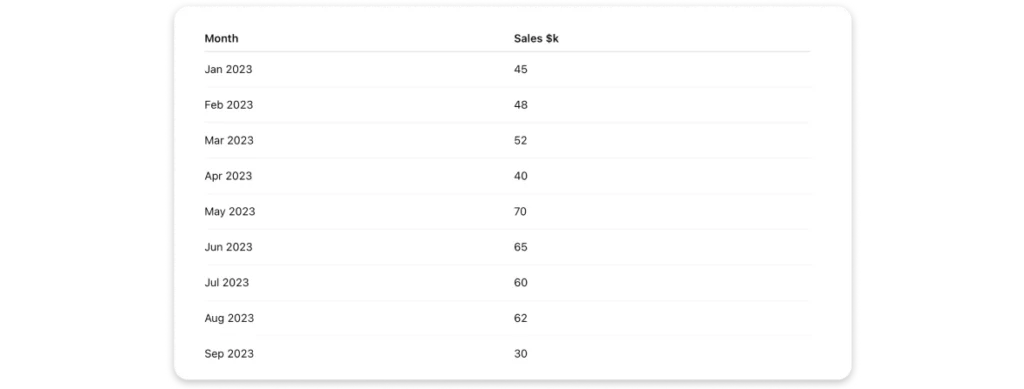
To draw conclusions from this dataset, we could start by skimming through it and noting any numbers that stand out. Still, the most effective way to understand the data is to visualize it on a chart. This makes it easier to read and interpret.
In order to do that, we need a .csv file; once exported, we can load it into a charting tool. Depending on the tool, some data cleaning or formatting might be required. I’ll use Highcharts along with its data module, which allows me to import .csv data.
Here it is:

Scaling to new heights! The chart shows a resilient climb of a SaaS company.
Great, now it’s time to draw conclusions. In April 2023, there was a significant drop, in September 2023, we saw a crash, and from Nov 2023 to Apr 2024, there has been steady growth. Put on a chart, the numbers have started talking.
It required some work, but it wasn’t too bad, right?
Dataviz With AI
Let’s tackle something more complex. I found this Kaggle dataset showing GDP per Country 2020-2025. Take a look.
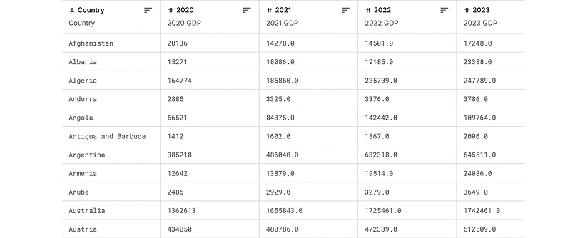
Our previous approach certainly won’t work here. We need to dive deep into this data, and we definitely won’t notice numbers that stand out. The quickest way to find out what data says is to ask an LLM about it. It’ll quickly process it and give us some insights about what the data is about, what the trends are, etc.
Still, the best thing is that it can no-problematico convert the data into a clear and readable Highcharts chart.
Let’s ask GPT to analyze this dataset and draw some initial conclusions. Then, let’s visualize the data it considers most relevant to those conclusions using Highcharts.
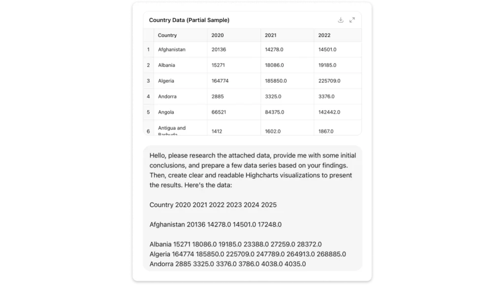
Just wanted to let you know that this is a very basic example with ChatGPT 5.0 – for more advanced development, there are better LLM models that can seamlessly collaborate with you in your code editor.
Now, let the AI handle the job that would otherwise be pretty time-consuming for us.
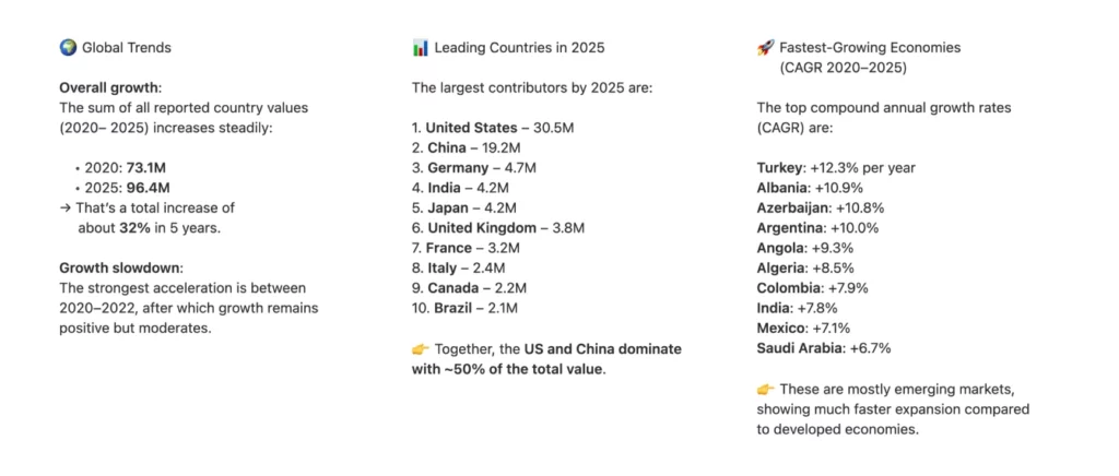
Here we go. We have initial conclusions coming from the data according to GPT. What about the charts? Will they show more than the raw data table that we saw on the Kaggle first?
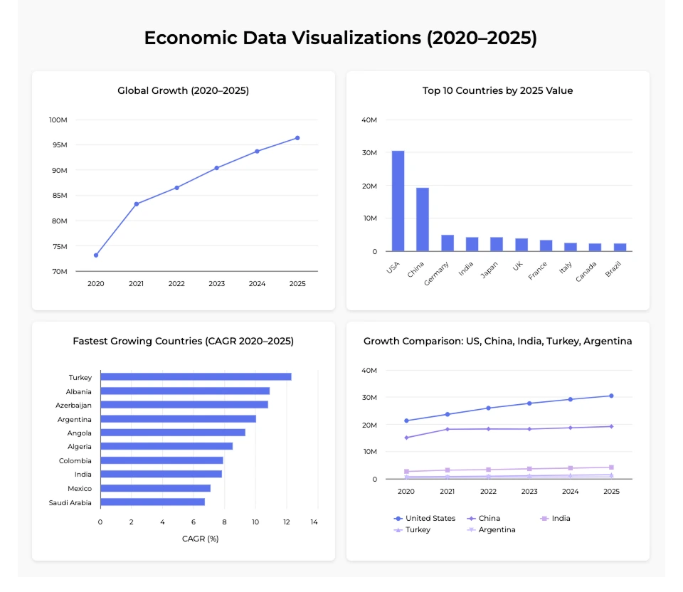
In my humble opinion, the answer is – yes. It’s a good starting point to continue working on this dataset and further visualizations.
At this stage, we have a few very basic charts that display the data with AI-suggested conclusions coming from. It doesn’t look impressive yet, but everything is fully customizable and ready to be upgraded. I’ve already shown how to take a simple, rough chart and turn it into a polished, insightful dataviz in my article How to Write Better Prompts to Improve AI Chart Results – feel free to jump over there if you’d like to level up your charting work.
So…
When Does AI Help Dataviz?
In this article, I want to underline four main fields in which AI helps Dataviz.
- Research big and complex amounts of data – AI can scan thousands of records in seconds, spotting clusters, anomalies, and hidden relationships that wouldn’t be so easy to find for humans.
- Draw first conclusions based on raw data – Before we even clean or format, AI can suggest what’s interesting: sudden drops, unusual spikes, or emerging correlations.
- Convert it to a data format required by a charting tool – Instead of manually converting, AI can restructure messy logs, spreadsheets, or JSON into the neat .csv or array your charting library needs.
- Create a basic chart on solid researched data – Once prepared, AI can even auto-generate a first draft visualization. It won’t be perfect, but it’s a fast way to move from a data swamp to something visual and understandable.
FAQ
1. Why do we need both AI and data visualization?
On their own, neither AI nor dataviz is enough. AI can find patterns, trends, and predictions in massive datasets, but the results are often abstract and difficult to interpret. Dataviz creates charts and visuals that are easy to understand, but without well-prepared data it’s just decoration. Together, they make insights both discoverable and actionable.
2. How does AI help data visualization?
AI can:
- Process huge amounts of data far faster than humans.
- Spot hidden anomalies and relationships invisible to the human eye.
- Generate first conclusions from raw datasets.
- Convert messy data into neat formats for charting tools.
- Even create draft charts to speed up analysis.
3. How does dataviz help AI?
AI often speaks a language of models, probabilities, and weight matrices — which isn’t easy for people to grasp. Dataviz translates these outputs into intuitive visuals like trends, clusters, and forecasts. Charts also build credibility: people trust visuals more than abstract tables or percentages.
4. Can AI really make accurate predictions?
It depends on the field. In energy forecasting or healthcare, AI models have shown strong results. But in areas like stock markets, predictions are less reliable because of real-world chaos and limited training data. Research shows that AI can be misleading in finance, but it works much better in more stable domains.
5. What’s an example of AI and dataviz working together?
One example is using AI to analyze a Kaggle dataset on GDP by country. AI can quickly summarize the key trends, then generate a Highcharts visualization that highlights the most relevant insights. This workflow saves hours of manual filtering, formatting, and chart building.
6. Why is this combination important now?
We’re buried in endless sand – data everywhere. AI is the sieve that finds the grains that matter. Dataviz is the builder that shapes them into something solid. Together, they turn shifting piles into castles of insight that guide real decisions.
Bottom Line – the Harmony of AI and Dataviz
AI and dataviz complement each other in many ways: scanning massive datasets, spotting hidden medical patterns, or projecting future trends. AI is the sieve that strains mountains of sand, catching the grains with meaning. Dataviz is the builder that takes those grains and stacks them into towers, walls, and bridges we can actually understand.
Alone, each has its limits. A sieve without a builder just leaves piles. A builder without good grains is stuck with dust. Together, they turn shifting sand into a solid castle of insight – something we can trust, explore, and act on.