
We all hate boring charts, diagrams, and infographics. The truth is it’s not easy to present data in an engaging way, but from my experience, there’s a solution to that: infographic storytelling.
Sure a stand-alone chart can tell a story on its own, but there are all kinds of data visualizations that can do a much better job. Personally, I think that any kind of data visualization which tells a story is both more fun for us to create and better for our recipients to read.
This introductory article will take you step by step through what I’ve learned from creating engaging, data-driven infographics that tell compelling stories. I’ll start with a simple but fair question….
What Is Infographic Storytelling?
Infographic storytelling is a method of telling a story with the help of data and various visualizations and visual aids. Well-chosen charts or diagrams, along with text annotations, allow us to illustrate the key points of a story. They also help intuitively communicate key messages.
You might use infographic storytelling for:
- simplifying complex data
- educational purposes
- business presentations
- research findings
and many other use cases…
Infographic storytelling = infographics + storytelling. Makes sense, right? But how to execute this equation well? In this article I’ll make sure you understand the building blocks and fundamentals of this equation but in my follow up piece, “How to Master Infographic Storytelling”, I’ll help you solve the equation so you can make your own stunning data-rich infographics. So let’s begin then by diving into the infographic and storytelling worlds separately as it is super important to understand the basics of both.
What Exactly is an Infographic?
An infographic is a visual representation of information or data. It uses a combination of text, graphics, and design to present details in a clear and efficient way. The main goal of an infographic is to make information both easy to understand and memorable.
Infographics often include different types of visuals including:
- charts
- graphs
- diagrams
- maps
- timelines
They are often used in presentations, reports, websites, and on social media to share information in a more interesting and clearer way than regular text.
Infographics are powerful visual tools. They integrate seamlessly with data-driven infographic creation. Let’s now delve into the art of storytelling and understand how it works!
What You Should Know About Storytelling
We use storytelling to share stories. It helps us communicate messages, share values, and connect with an audience. To do this effectively, in my experience, we must create the story to relate to the subject or goals.
PRO TIP: Before creating your data-driven infographic storytelling, define your objectives and know your audience. This has always been my starting point.
The Role Of Data Visualization in Storytelling with Infographics
Infographic storytelling relies on data visualization and this is often done by integrating charts. These graphs not only enhance the visual appeal but also serve as invaluable tools for effectively presenting data, as I’ve often seen in successful campaigns.
Charts are important in showing data by confirming information, making it more believable and giving readers a clear view of the data. Whether showing the success of a marketing campaign or the impact of a social initiative, charts are a reliable source that make a story more convincing.
5 Benefits Of Using Data-Driven Infographics
1. Visual Clarity
Infographics that tell a story use charts and graphs to simplify complex data, making it easy to see important trends. I’ve always appreciated how this approach can transform an overwhelming mass of data into something much easier to grasp and process.
2. Effective Communication
Infographic storytelling helps to guide the audience. It does this by highlighting important data. This makes the information more engaging and memorable.
3. Memorization and understanding
Data-driven infographics use text and images to tell a story visually. They help people understand better and remember more.
4. Efficient Key Insights
Data-driven infographics simplify complex data into visual elements. They help the audience grasp the main points quickly, even with limited time or attention.
5. Increased Shareability
People’s attention can be easily caught and spread on digital platforms through infographics and storytelling. They reach more people and share important messages.
Now that we’ve grasped the concepts and advantages of infographic storytelling, let’s move on to see how we can develop engaging infographic narratives in practice.
Tools & Resources for Creating Data-Driven Infographics
Making an interesting infographic storytelling requires careful planning. Let’s explore the tools and resources for crafting data-driven infographics, based on what usually works for me starting with…
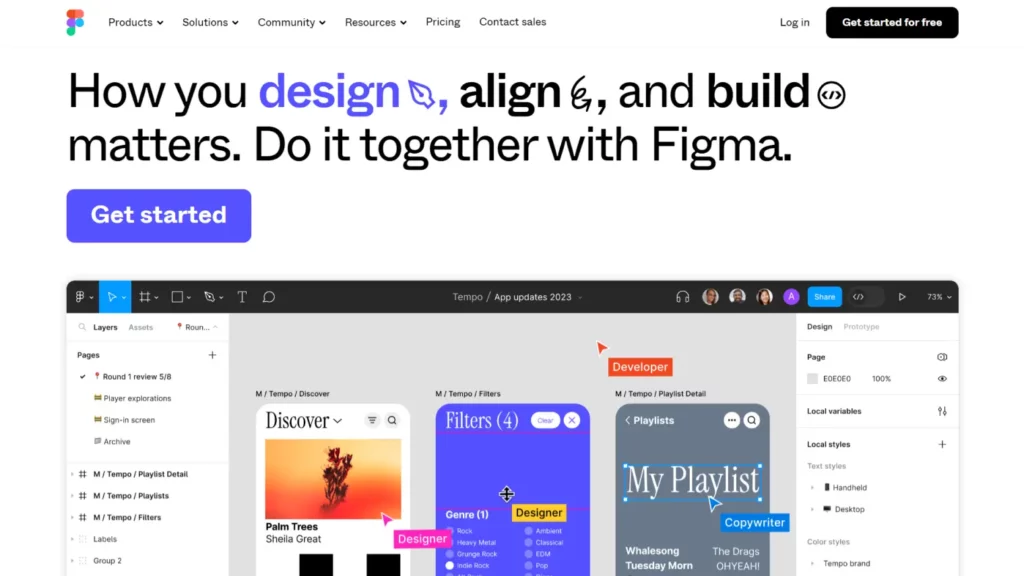
Figma: More Than Just a Web Design Tool
You can use any graphic design program to combine visuals and narrative. It’s best to choose one that supports vector graphics, especially for web content, as you can scale the images without losing quality. This makes it easy to adapt them for online and print formats.
Personally, I recommend Figma because it has a user-friendly interface and supports vector graphics, making it a go-to tool in my design toolkit. This tool is a first choice for web design, but I think it is also perfect for smaller, graphic design projects. In addition, it supports plugins for creating charts, making it easy to create basic graphs.
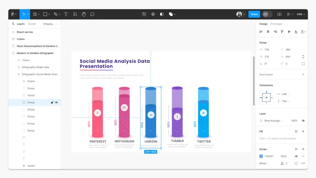
Additionally, Figma features live collaboration, allowing real-time teamwork and seamless creativity with your whole team!
Figma offers free tutorials on how to use it. Let’s check out the Figma YouTube channel.
Advanced Chart Creation With Highcharts
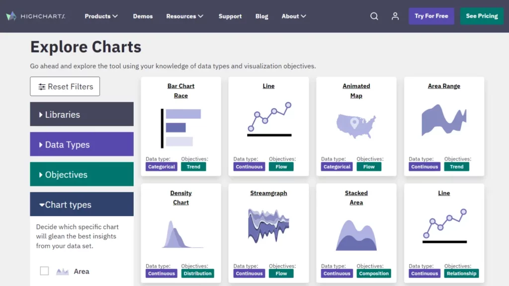
If you need more developed charts and graphs, or need to create interactive ones, using only plugins might not be enough. In those cases, you need to use a dedicated chart library. Highcharts is a perfect choice because it has a wide range of charts that work well for different types of data.
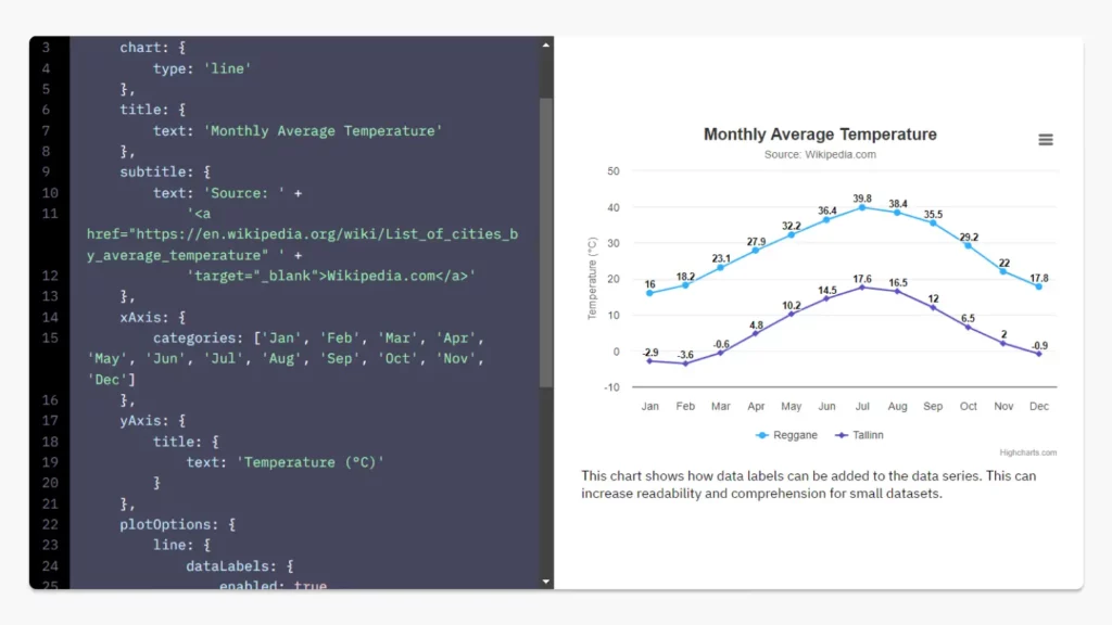
Highcharts is a JavaScript library which seamlessly combines programming with design, generating visually appealing and accurate charts from the data. While it is a more advanced tool that requires a basic understanding of programming, this option is perfect for web infographic storytelling and Highcharts has got your back on the documentation front. It details how to create your first chart and various types of charts – why not check it out and make your first chart? They also have a blog with loads of step-by-step guides on chart creation.
PRO TIP: Charts are better than images for data-driven content as you can easily update them in the future. However, keep in mind that customizing them can be more difficult.
Best Data Sources
If you don’t have specific data, you can find free sources for your infographic storytelling. Several websites provide data in almost every field you need. I recommend exploring the options listed in this article: These Are The Best Free Open Data Sources Anyone Can Use
Let’s Wrap It Up
n a nutshell, infographic storytelling merges data and narratives for engaging communication. It blends visuals and storytelling for a memorable experience.
Here are the key points that we have discussed:
- Infographic Storytelling: Uses data, visuals, and narrative for engaging content.
- Benefits of Data-Driven Infographics: Clear visuals, enhanced understanding, effective communication.
- Tools and Resources: Figma for design, Highcharts for interactive charts.
- Importance of Data Sources: Reliable sources for accurate infographics.
I encourage you to begin exploring creating your own data-driven stories. In my follow-up piece “How to Master Infographic Storytelling” I’ll dig in a bit deeper about how you can use tools like Figma, Highcharts to create stunning and impactful storytelling infographics.