

Did you know that almost 9 out of 10 customers are heavily influenced by the color of a product? And almost 70% of people won’t buy a product unless it comes in their favorite color?
Colors play an important role in our life, since each color can have a different association and emotional connotation. Knowing that, it shouldn’t come as a surprise that choosing the right color palette for your data visualization is a must.
If that’s what brings you here, stay and find out how to choose the best colors for graphs.
What Is Color?
Simply put, color is a specific wavelength of light that is visible to the human eye. But first of all, we have to ask another question: what is light? Light is a form of energy that moves through space in waves. It’s a small part of a wider range, including radio waves, ultraviolet, X-rays and many more.
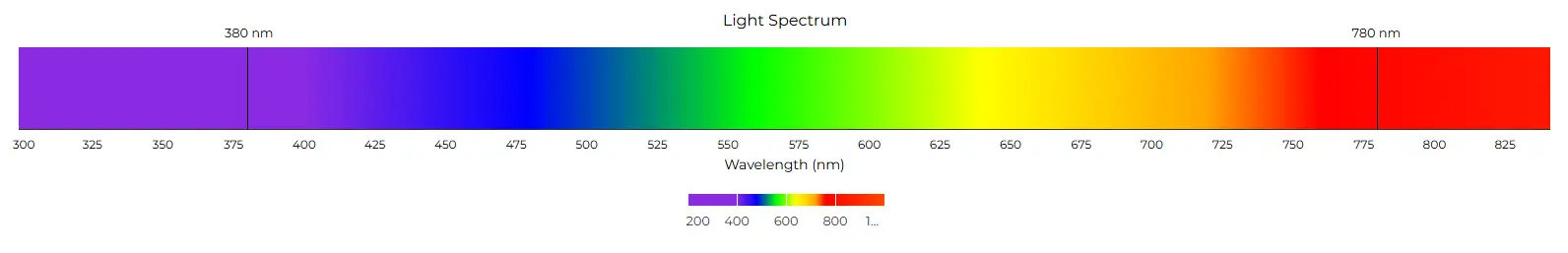
Explore the rainbow: a visual journey through the wavelengths of visible light.
When light “hits” an object, certain wavelengths are absorbed by the object, while others are reflected back, thus reflected light is the color that we perceive as it is. For example, when looking at grass, it looks green because all other colors are being absorbed, except the green light which is reflected back. Now, knowing the basics of the visible color spectrum, we can dive deeper into color theory and get to know how it’s strictly related to achieving powerful data visualizations.
Color Theory
Color theory is an intersection of science and art that focuses on how colors interact, mix and evoke emotion. The basics of color theory include a color wheel, which was first developed by Sir Issac Newton in 1666.
It consists of three primary colors:red, yellow and blue, three secondary colors: green, orange, purple and six tertiary colors which are made from primary and secondary colors.

Over the years, the color wheel has been perfected, resulting in the image you’re probably most familiar with. Although the final form witnessed some adjustments, the basic concepts of mixing colors remained the same.
Imagine drawing a vertical line exactly in the middle of the wheel: now you’ve successfully separated the warm and cool colors. Usually, warmer colors symbolize energy, excitement and positivity, while cooler colors are associated with calmness, trust and harmony.

Dive into the spectrum: this modern color wheel showcases the seamless transition and harmony of colors from warm reds to cool blues.
You’re probably wondering what all of this has to do with data visualization? Since colors have symbolism and can have different associations depending on the region of the world, it is important to choose them carefully to ensure clarity in what you’re trying to visualize.
Fun fact: did you know that in Japan, the traffic lights are rather blue rather than green? Well, technically they’re still green, but their shade has been chosen to almost completely resemble the color blue.
PRO TIP: Consider doing research before choosing a color palette, as in different parts of the world, color can have entirely opposite meaning. For example, in China, red means prosperity and happiness, whereas in the western world, it can be associated with impulsiveness and violence.
If you don’t have a color palette yet, think about your target audience, as it can have a tremendous impact on the overall perception of your brand and product. Symbolism is a deeply rooted factor when it comes to marketing and attracting people to your product.
Now that we’ve wrapped up the basics of color theory, let’s dive into the world of color palettes, so that you can fully unlock your data visualization potential and get to know how to choose the best colors for graphs.
3 Types of Color Palettes
A color palette is a set of colors chosen and arranged to be used together. Within the color palettes, we can distinguish three major types:
- Qualitative palettes
- Sequential palettes
- Diverging palettes
Each color palette has its unique application depending on the type of your data and how it can be associated with chosen colors.
Qualitative palette
A qualitative palette is the right choice when the variable falls into the categorical domain. Each possible value should only be assigned one color from the qualitative palette.
Colors assigned to values need to be distinct and it’s best to keep the number of colors lower than ten for the readability of the graph, as it can become illeligible if more colors are introduced to the chart.

A snapshot of the global smartphone market share distribution in the first quarter of 2024. Is your phone pink or blue?
Sequential palette
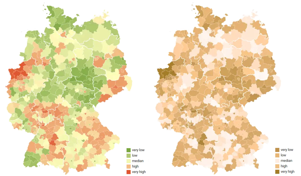
A sequential palette is basically the opposite of a qualitative color palette. It uses one chosen hue with different saturation levels, meaning that the lower values are associated with lighter colors and the higher values with darker colors.
This kind of palette is best suited for highlighting continuous data, e.g. company revenue over the time period or GDP per capita. An additional advantage of using a sequential palette is that it doesn’t require any legend or a color key in most cases.

Visualizing population density: Poland’s population mapped by density per square kilometer.
Diverging palette
A diverging palette is a perfect choice for data sets with a midpoint or a meaningful central value like zero. Essentially, a diverging palette is a combination of two sequential palettes laid out on opposite sides of the axis, with a very bright color in the middle.
Values on both sides of the central point are assigned to colors. When using this kind of color palette, a color key legend is needed, so readers can easily understand negative and positive values.

A state-by-state snapshot of economic growth: Real GDP percent change across the U.S. in 2023. How many pink states can you count?
Since you already know which color combinations you should use to get the best colors for graphs, I’d like to share some tips & tricks with you on how you can take your data visualization to the next level!
3 Tips for Creating the Best Colors For Graphs
Avoid using too many colors
As tempting as it might be to use the whole color palette in your data visualization, in most cases the best application of color is a minimal one. If there are too many colors in your graph, the readers might get confused and miss the main point of the data.
Using a limited color set will improve your speed to insight, unless it is absolutely necessary to introduce more colors e.g. a pie chart depicting market share of phone brands.
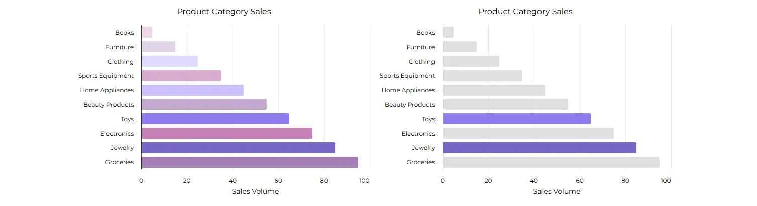
Less is more: Highlighting key categories with minimal color usage to ensure clarity and focus in sales comparisons.
Use contrasting colors to highlight key information
Let’s say you are preparing a company revenue report and need to compare data with similar competitors. Instead of spending hours on choosing the right color set to emphasize your company, choose one color to distinguish it from the other data visible in your chart.
Doing so can be helpful when you want to highlight data in comparison to other competitors.
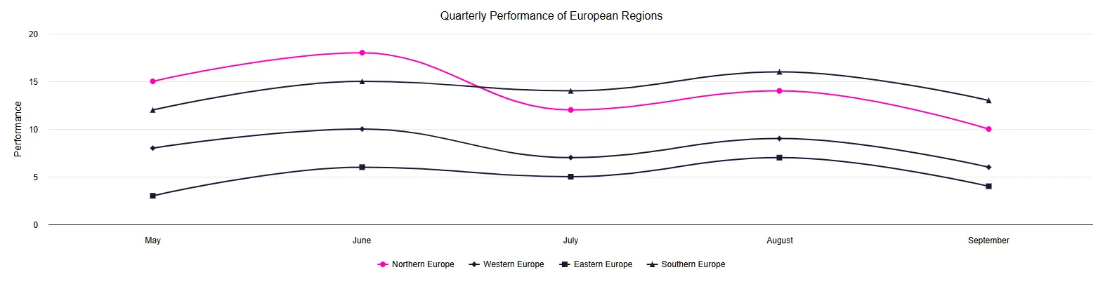
Standing out in the crowd: Using contrasting colors to highlight Northern Europe’s performance against other regions.
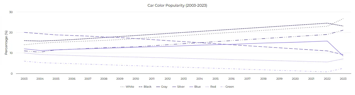
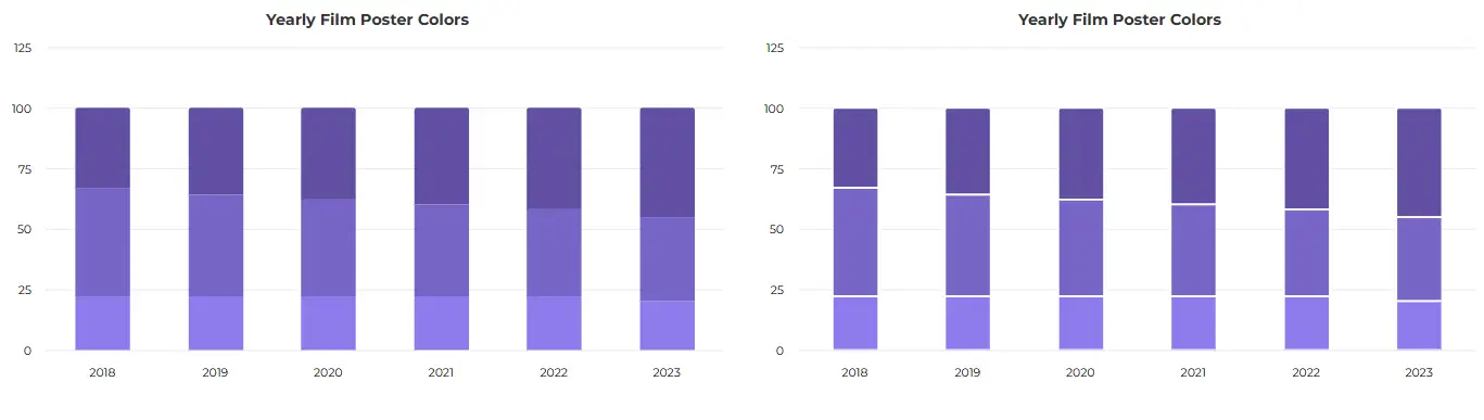
Use consistent colors across your graphs
If you’re presenting multiple charts on your website, try to come up with a color palette before and apply it to all of your graphs. Doing so will not only increase the readability of your data, but it can also draw attention to the main point of your data visualization.
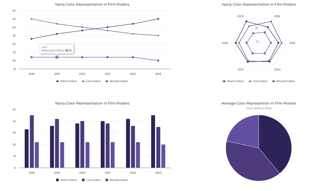
Consistency is key: Using a uniform color scheme to clearly track trends in film poster design over the years using multiple charts.
Enhancing Chart Visibility for Everyone
We have already covered color theory and how to choose the best colors for graphs. Now, we’re going to talk about making our data visualization accessible for everyone. It’s worth acknowledging that some people can perceive colors differently, so if you want to craft charts that shine for everyone, even those who perceive colors differently, stay along within the article.
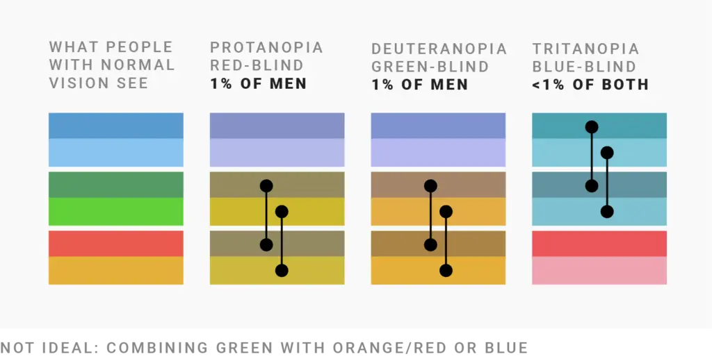
How do color blind people perceive colors?
Approximately, around 4.5% of the world’s population perceive colors differently, with 1 in 12 men and 1 in 200 women affected. This means that making your charts color proof is a key consideration.
An average person sees a full color spectrum, ranging from bright red to violet. When a wavelength hits our retina, the cones in our eye translate that information into the brain perception of a color.
With color blindness, depending on which cones don’t work, some color range will be distorted. We can distinguish three main types: protanopia, deuteranopia and tritanopia. To better understand how it can affect vision, take a look at illustration below:
5 Tips For Color-Blind Friendly Visualizations
1. Red and green colors in most cases are the hardest to distinguish for people with CVD (Colour Vision Deficiency). Avoid using them, unless it is easily distinguishable between the negative and positive values in your chart:
2. On certain types of chart, color keys (colors associated to data variables) aren’t the only way of differentiating values. On line and spline charts, you can consider adding dashed lines into your graph, which makes them distinguishable even on a black and white print.
Trends in motion: How dashed lines help color trends stand out, even when the color fades away.
3. Increase spacing between data elements. This way, even if the colors look the same, the values can be easily distinguished
Mind the gap: Increasing spacing between elements to make even similar colors and values easily distinguishable.
Pro tip: Highcharts library is strongly optimized for accessibility concerns, with a separate module dedicated to providing the best experience for each user. It’s worth mentioning that the default color palette for all charts is optimized, in order to make it easily distinguishable for people with color blindness https://www.highcharts.com/docs/accessibility/patterns-and-contrast
4. Add a pattern to your charts
What if you can’t change the colors of your chart, as they are strictly related to your data or color branding? Simply incorporate lines over your data points, making it readable for everyone.

Making data stand out: Using patterns in charts to differentiate segments when color choices are fixed. Which slice would you try first?
5. Convert your charts to black and white
Try converting your graphs to grayscale: if you can differentiate between the values and the chart is readable, then it means that your chart should be readable for people with impaired color vision.
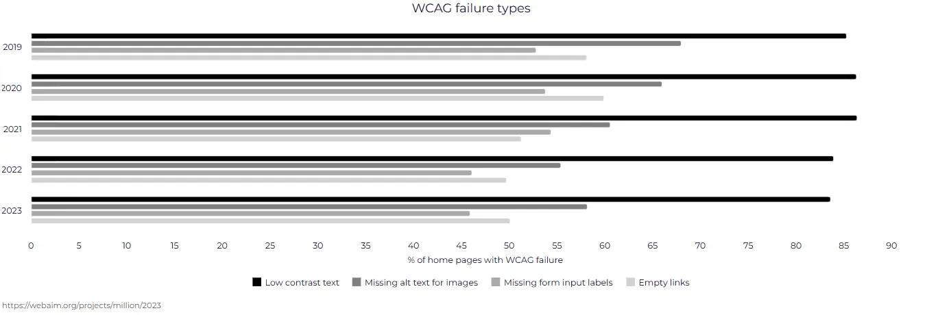
Accessibility in focus: Converting charts to black and white to ensure clarity without relying on color.
Summary
In summary, throughout the article we have highlighted the importance of colors and how color theory can affect our choices and emotions. Deciding on a correct color palette is also aligned with the type of data that we’d like to present to our audience, and shouldn’t be overlooked.
We’ve also covered some pro tips for choosing the best colors for graphs, and extended that knowledge with live examples to attract users to a pinpoint in your data visualization. Also, you have learnt that with simple steps, you can create your data visualization accessible to everyone, making sure that it captures the attention of all observers.
Thanks for diving into the colorful world of data visualization with us! We hope this article has shed some light on the significance of colors in making data more understandable and engaging. For more insights and tips on effective visualization techniques, be sure to check out the other articles on our blog. Happy visualizing!


