

Financial dashboards are one of the key tools supporting financial analytics and business decision-making. We discussed them in detail in the previous article, where we explained their purpose, structure, and value. Dashboards help interpret data, monitor key indicators, and identify problems before they become costly. In this article, we’ll explore financial dashboard design in practice — how to build one that actually delivers insights.
In this second part, we move from theory to practice. We’ll show you, step by step, how to design and build an effective financial dashboard – from defining the objective and gathering data, to selecting tools and designing clear visualizations. This article is your guide to navigating the world of insights with greater clarity and confidence.
What Have We Learned So Far?
So far, we’ve learned that financial dashboards act like maps – displaying key information in one place and shortening the path from data to decisions. They are effective only when thoughtfully designed: well-structured, visually clear, and tailored to the needs of a specific audience. That knowledge is the starting point for planning what a financial dashboard design should look like. Even the best data loses its value if not presented in the right form. If you haven’t had a chance yet, check out the first part of the article on financial dashboards.
Principles of Effective Financial Dashboard Design
Designing a dashboard is not just about placing charts on a screen. It’s a process where data, business goals, and user understanding are combined into a coherent and intuitive structure. The key question isn’t “Does it look good?” but rather “Does it deliver immediate insight into what matters most?”
In practice, this means your financial dashboard design should be simple to use and easily readable, even for users without an analytical background. Aesthetics are helpful, but they don’t replace content – colors should guide the eye, not distract it; chart types should be selected for usefulness, not visual effect. A good rule of thumb is: less is more. Instead of building an infographic packed with data, focus on a few well-chosen indicators that drive meaningful conclusions.
A well-designed financial dashboard doesn’t begin with charts – it starts with the question: “What should this dashboard enable?”
Financial Dashboard Design: Step-by-Step Process
Step 1: Define the Purpose and Audience
The first and most important step is understanding why you’re creating a dashboard. Is it for daily liquidity monitoring, quarterly performance reporting, or perhaps board presentations or investor updates? Each purpose calls for a different set of data and visuals. Equally important is identifying the target audience. A financial dashboard design for the CFO will differ greatly from one for an operations team or external stakeholders. Understanding user expectations is the foundation of good design.
Step 2: Collect and Prepare the Data
Once you know what and for whom you’re building your dashboard, it’s time to work with the data. This step often brings the first real challenges. Data may come from many sources—Excel sheets, ERP or CRM systems, or external APIs. The key is ensuring the data is consistent, up to date, and well-structured. It’s not just about gathering numbers, but organizing them in a way that supports efficient reporting – that is, a well-thought-out data model.
Step 3: Choose Your Dashboard Tool
With data in place, it’s time to select the right technology. For basic needs, Excel may suffice, offering simple panels and charts. For more advanced uses, consider tools like Highcharts, Power BI, Tableau, or Looker Studio. Your choice should reflect your budget, integration needs, and your team’s technical skills. A crucial consideration: Can the tool handle data automation and real-time updates effectively?
Step 4: Select Key Metrics (KPIs)
Not every available metric is worth displaying. The power of a financial dashboard design lies in its selectiveness. Choose only the indicators that directly support the dashboard’s purpose. Are you tracking revenue, profitability, operational costs, inventory turnover, or cash flow? More data doesn’t mean more insight. It’s the quality of the information that drives value, not the quantity.
Step 5: Design Layout and Visuals
Now comes the part users see first – the layout and visual form of your data. A best practice is placing the most important insights at the top, with more detail as you scroll down. For example, line charts are great for showing trends, and column charts for comparisons. A well-designed dashboard works across screen sizes, from large monitors to mobile devices. Usability must always come before the “wow factor.”
Step 6 (Optional): Work with a Specialist
If you’re lacking experience in UX, data visualization, or BI tools, consider involving a professional. A UX designer, BI developer, or data analyst can significantly speed up development and elevate the final product. An external expert brings a fresh perspective and helps catch details often overlooked by internal teams.
Our Preferred Tool for Financial Dashboard Development
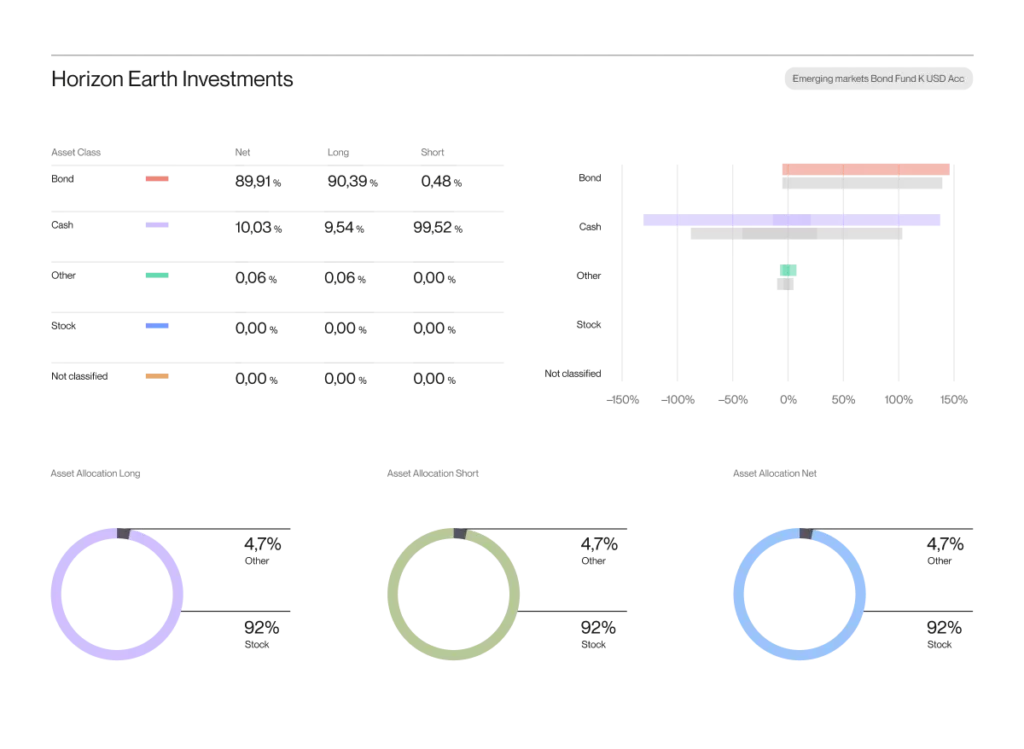
While many excellent tools exist for building financial dashboards, we prefer Highcharts for its full control over design, behavior, and performance. It enables the creation of fully customized, lightweight, and responsive visualizations that embed seamlessly across various platforms. Unlike drag-and-drop tools, Highcharts imposes no design or interaction limits, allowing precise tailoring to business needs. Especially valuable for projects demanding performance, branding consistency, and flexibility, it gives development teams the freedom to build dashboards that are both effective and elegant. Below is an example demonstrating its capabilities in creating tailored financial dashboards:
A financial dashboard made using Highcharts and tailored for decision-makers. You can see the big picture of the financial health of your business in just a quick glance.
Dashboard as an Analytical Tool
A financial dashboard isn’t just a visual layer – it’s also an analytical instrument. With a well-designed layout, you can detect trends, track historical performance, and even forecast future outcomes. Increasingly, dashboards integrate with predictive models and AI-based alerts. It’s at this intersection – between data, tools, and analysis – that dashboards generate real value.
Common Mistakes to Avoid
- Information Overload – Too much data on one screen dilutes key insights and makes the dashboard harder to read.
- Lack of Narrative – Without context, interpretation, or clearly stated conclusions, the dashboard becomes a pretty set of numbers and nothing more.
- Poorly Chosen KPIs – Showing metrics that don’t align with business objectives can be misleading and unhelpful.
- Low-quality Data – Outdated, incomplete, or inconsistent data undermines the dashboard’s credibility.
- Not Tailored to the User – A finance team, executive board, and external partners all need different levels and types of information.
A well-designed dashboard doesn’t just present data – it understands its user.
What’s Next? The Future of Dashboards
The dashboards of the future will be increasingly interactive, operate in real-time, and become deeply integrated with company systems. Automation and AI are already in play – and will soon become the norm. Personalizing dashboards for specific users and connecting them closely with business workflows (e.g., action recommendations or workflow integration) will be equally important.
Conclusion – Time for a Masterpiece Dashboards
A well-designed financial dashboard is no longer a luxury – it’s a necessity. Leading Fortune 500 companies treat data visualization as standard practice, and that trend is spreading fast. Dashboards empower companies to move faster, act more precisely, and make better decisions.
But an effective dashboard doesn’t build itself – it requires planning, clean data, the right tools, and empathy for the user. Fortunately, every step can be tackled with the right approach.
Want to build your own financial dashboard or improve an existing one? Get in touch with us – we’ll help turn your data into decisions.