

Imagine two companies in the same industry, similar in size, costs, and capabilities. One makes decisions from lengthy Excel sheets, PDF reports, and weekly meetings ending in frustration. The other uses interactive dashboards that show key metrics in real time, detect anomalies, and simplify revenue, cost, and efficiency analysis.
The difference? Not the data itself — but how you see it.
What Is Data-Driven Decision Making?
Data-driven decision making (DDDM) is the practice of using facts, metrics, and data to guide business decisions aligned with goals and objectives. Instead of relying solely on intuition or experience, organizations leverage data analysis and visualization to make smarter, faster, and highly strategic choices.
Connecting the Dots: Data Visualization & Business Intelligence
Data visualization is not decoration. It’s the interface between raw data and real decisions. In the context of business intelligence, well-designed visualization helps managers, investors, and operational teams connect the dots rapidly and accurately. It also reveals what raw tables cannot – from customer behavior patterns to financial risks.
In today’s world, where every second of competitive advantage matters, data visualization becomes a strategic asset, not just a presentation add-on.
Why Should You Support Your Decisions with Data Visualization?
A chart doesn’t say more — it says faster. It’s the speed of reaction and precision of analysis that decide market winners today. Good visualizations reveal patterns, anomalies, and relationships before they’re even verbalized. This “aha” effect is an informational advantage. Remember, people process images 6–600 times quicker than text.
Let’s illustrate this with an example that shows how the perception changes depending on the form of data presentation. Here is a table presenting the raw data on research and development spending in France, Germany, and Poland in 2011-2021.
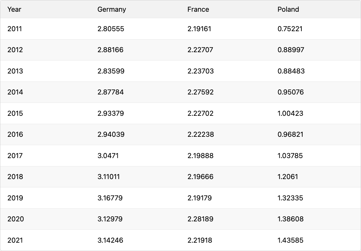
Raw data – a substantial dataset but quite unattractive for the eyes and difficult to see any trends or insights.
Instead of a table, we visualize the data with a bar chart, making the figures easier to read and the spending levels more intuitive.
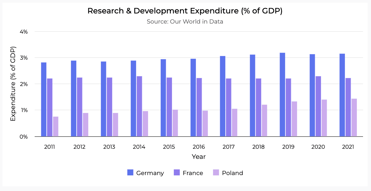
What do you think about this way of presenting the data? In our opinion, a bar chart is a huge upgrade for visualizing this dataset.
And here is the final form of our data presentation – a spline chart, which is not only smoother and highly visually appealing, but also makes it easier to understand the trends.
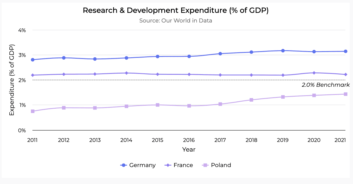
A spline chart is the final version of the original data table? Now it looks astonishing!
You may have wondered whether there are any studies showing the impact of data visualization across different areas. The internet is full of misinformation, but in our case, we relied on solid research. And here are the results that will change your point of view.
According to TDWI research on the adoption of data visualization and user interaction with business intelligence tools
- 74% of respondents rated the impact of data visualization on business insight as very high or high.
- 67% stated that visualization had a significant impact on user productivity.
- 70% confirmed that data visualization played an important role in past purchasing decisions related to dashboards.
- 79% anticipate that visualization will have a similarly strong influence on future purchasing decisions.
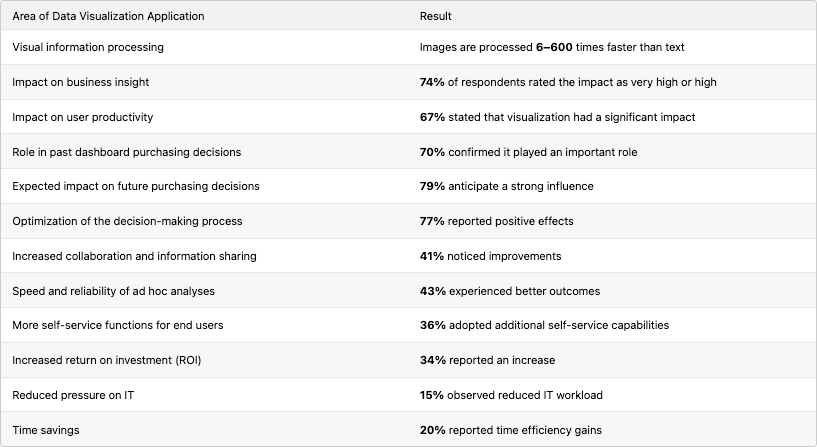
Referring to another study conducted by IDG focused on the business context, leveraging data visualization brings tangible benefits such as:
- Optimization of the decisional process – 77%.
- More collaboration and sharing of information – 41%.
- Increase in ROI – 34%.
- Less pressure on IT – 15%.
- Speed and reliability of ad hoc analyses – 43%.
- More self-service functions for end users – 36%.
- Time saving – 20%.
These findings clearly demonstrate that data visualization is more than just a visual layer – it is a powerful business tool that supports smarter decision-making, increases efficiency, and delivers real, measurable value.
The power of data visualization, broken down by the numbers. This is not just any old data, the future of your business just might depend on these stats.
„Above all else, show the data.”— Edward R. Tufte, The Visual Display of Quantitative Information (1983)
Can Data Visualization Help in Every Industry?
Data visualization becomes necessary sooner than you might think – especially as a company grows. When more data, channels, customers, or reports for management appear, making decisions just “by gut feeling” stops working. A well-designed chart can make a difference both in a large retail chain analyzing sales across dozens of locations and in an agricultural company monitoring crops and weather in real time. Regardless of the industry, when time, precision, and understanding matter. Data visualization provides an advantage that intuition alone cannot replace.
Check out How Dataviz Influenced the AgTech Company
Farmable is a Norwegian Agtech startup providing digital tools for farm management – from field mapping to analyzing data on fertilizers and harvests. As the web platform evolved, the team needed a better way to present complex data to support farmers in daily decision-making. Through collaboration with Black Label, a new frontend architecture and tailored data visualizations were introduced. These changes improved data clarity, made insights extra accessible, and enabled faster, more informed responses in the field – both literally and figuratively. Intuitive dashboards, smarter data organization, and real-time synchronization helped users make highly effective decisions. Discover the full story of our collaboration with Farmable here.
The data-driven decision-making process doesn’t start with a dashboard. It starts with the question: what do I need to understand? Here is a practical guide for anyone who wants to handle data in a way that’s clear to everyone:
- Define your goal
Start by clearly setting what you want to achieve – for example, increase the profitability of a specific product by 10% within the next six months. A clear goal helps focus efforts and choose the right data to analyze. - Collect data
Gather all relevant information: sales data from your CRM, production and distribution costs from ERP, and marketing and user behavior data from web analytics. The more comprehensive the data, the better the insights. - Organize and clean the data
Prepare the data for analysis – remove duplicates, correct errors, fill in missing values, and standardize formats. Clean data is essential to ensure your conclusions are reliable. - Visualize it appropriately
Choose visualization methods that best highlight insights related to your goal. For profitability, this might include gross margin trends over time, heatmaps showing sales by region, or bar charts illustrating production costs. Effective visuals make it easier to spot opportunities and issues. - Interpret and make decisions
Analyze the visualizations to identify which products are profitable and which are costly. Based on this, decide whether to increase the marketing budget for high-potential products or optimize production processes where costs are excessive. - Test and learn
Monitor the impact of your changes continuously, collect new data, and analyze whether results meet expectations. Repeat this process iteratively, adjusting actions based on findings and market conditions. This approach enables continuous improvement and real profitability growth.
Don’t Make Decisions Blindly – When You Can Actually See Them
Think of visualization as explanation, not presentation – it’s the language of decision-making. In an age of information overload, winners are not those who have data, but those who know how to extract its meaning and act on it.
Data visualization is not a trend. It’s a decision-making advantage. Thoughtful design, proper context, and the right form directly impact the quality of decisions.
Companies that can see the data understand it quicker. Those who understand act smarter. And those who act smarter — win.
Need Better Decisions? Let’s Visualize!
Data visualization changes the way businesses think and act – turning raw numbers into insights that drive smarter, faster decisions. Well-designed charts and dashboards reveal trends, highlight risks, and make complex information easy to understand for everyone in the organization. Companies that see their data clearly gain a lasting competitive advantage.
Ready to make better decisions? Let’s turn your data into a strategic asset – contact us to start.