Data Visualization for Life Sciences

Make complex research data understandable and explorable by designing the right visualization solution on top of your existing pipelines.

Book free scoping call
parts
parts

Let's connect!

Dedicated Solutions for Your Life Science Products

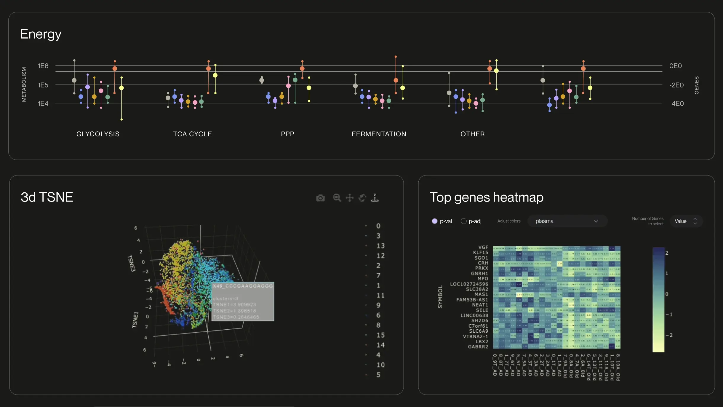
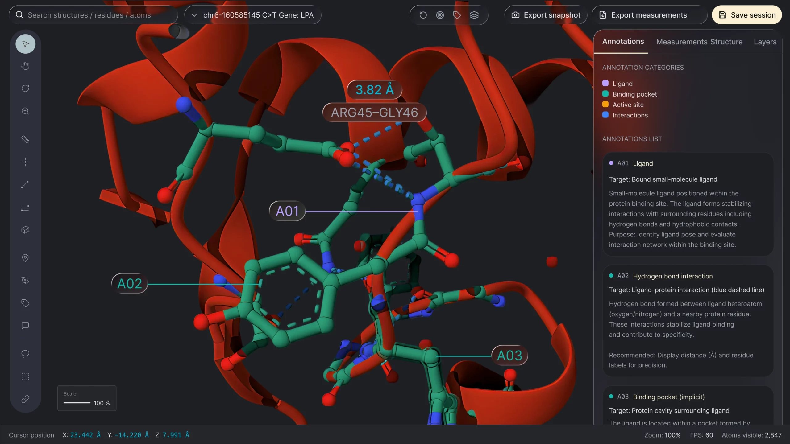
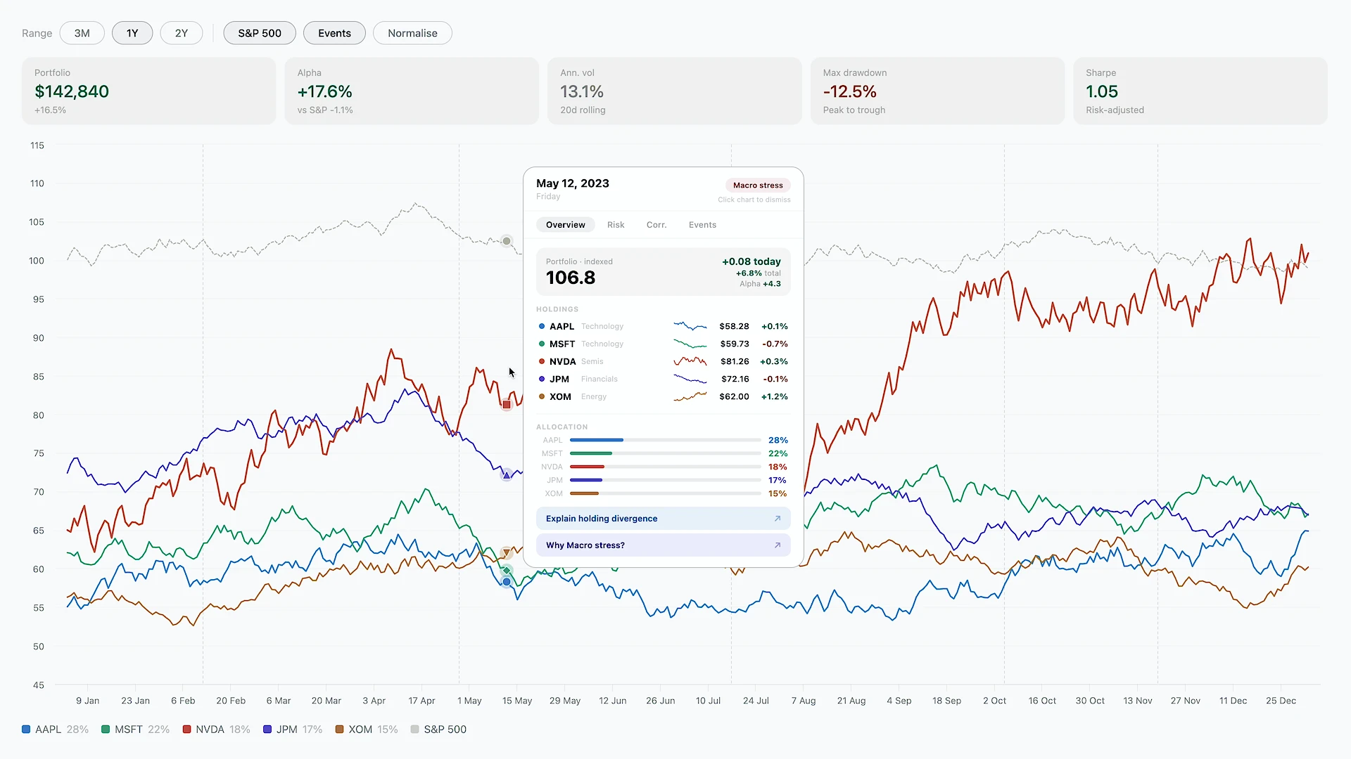
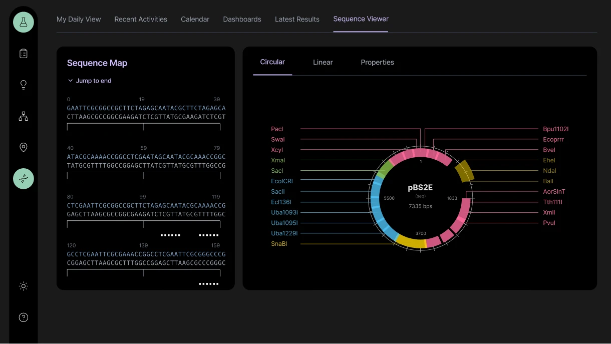
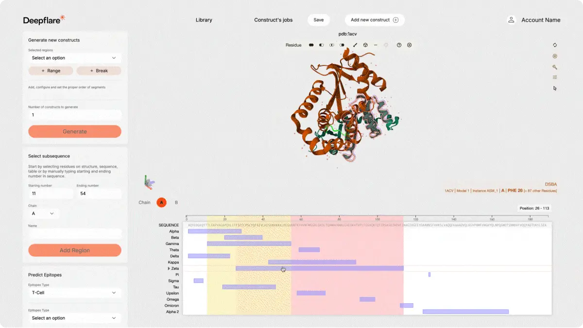
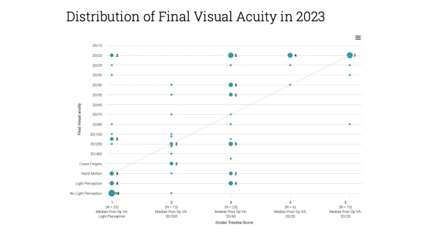
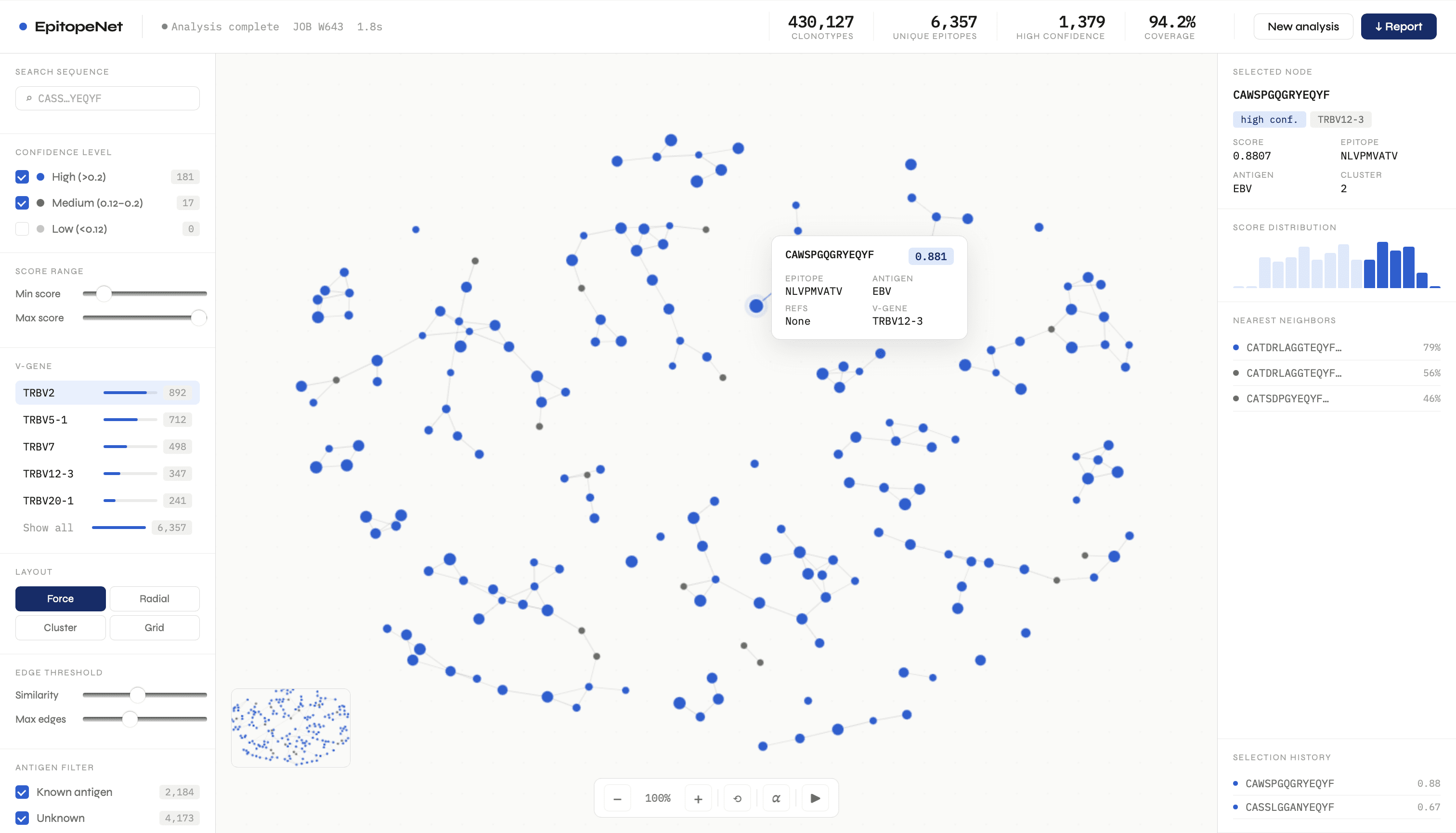
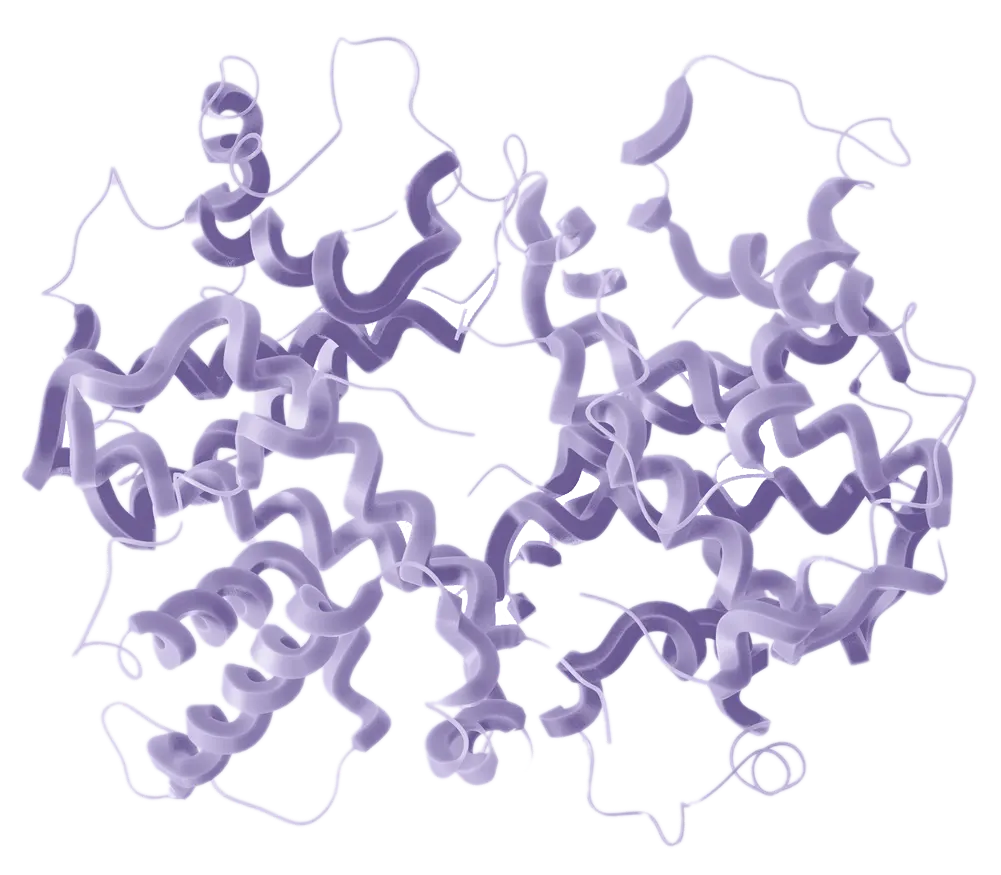
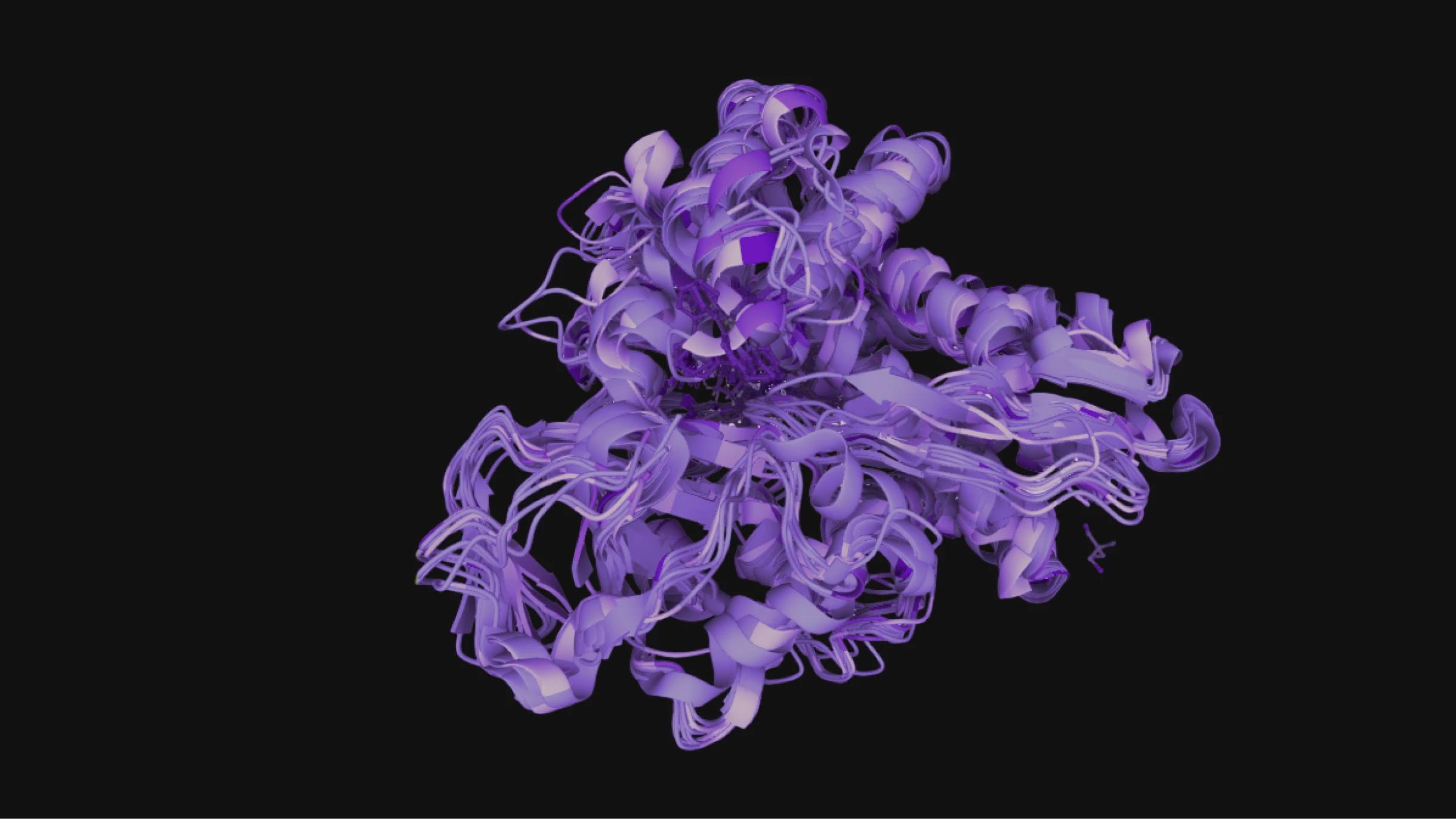
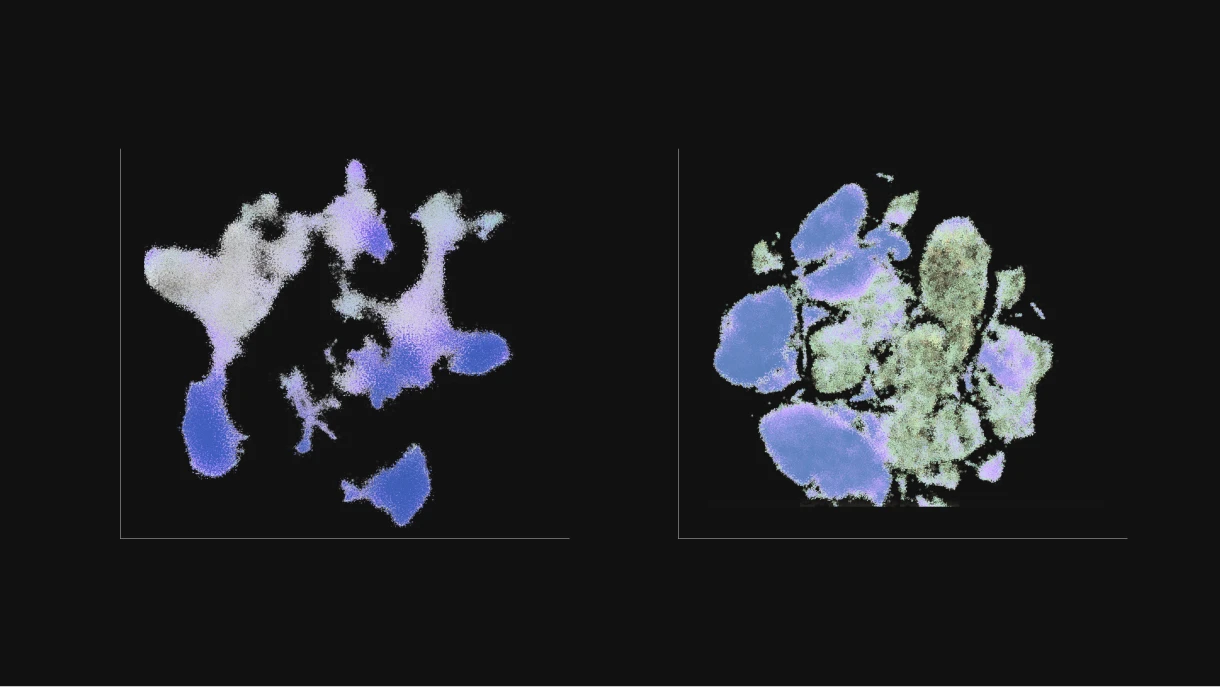
Create specialized analysis views for omics and molecular data. Combine high-dimensional datasets, experimental results, and comparative analyses into interactive interfaces that support deep biological interpretation.

Examples:

1/2

Provide clear insights that drive better decisions with dashboards that bring together key metrics, trends, and comparisons across experiments and datasets, enabling users to monitor results, explore patterns, and navigate complex data.

Examples:

1/2

Build interactive visual components to explore science data in real time. Enable dynamic filtering, zooming, comparison, and annotation to help users quickly understand patterns, relationships, and experimental outcomes.

Examples:

Integrate laboratory information management systems and electronic lab notebooks with analytical and visualization platforms to reduce manual handling and improve traceability.

Examples:

1/2

Iteratively build web applications that connect every stage of the scientific workflow. Use access management, role-based views, and collaboration tools to direct the right people to the right interfaces supporting research and clinical use.

Examples:

1/1
charts

Our Recent Work in Action

See how we've helped life sciences companies overcome complex data visualization and workflow challenges

AI-Powered 3D Protein Visualization Platform

Deepflare 2025

Researchers needed access to powerful AI protein prediction models. We help build a complete frontend platform that integrates AI predictions with interactive 3D protein visualization, enabling scientists to work independently without coding.

AI-Powered 3D Protein Visualization Platform
Piotr Grzegorczyk

Piotr Grzegorczyk

CEO at Deepflare

“The interactive interface from Black Label shortened our path to product-market fit and has helped to speed up our client conversion cycle. The interface helped clients to finally see the value of our models and could easily understand the potential benefits for their own use cases. It’s been the best GTM force-multiplier we’ve deployed to date.”

Interactive Medical Outcomes Platform

Harvard Medical School 2019

As part of Harvard Medical School’s ongoing cooperation with Mass Eye & Ear Institute, they needed help modernizing the Ophthalmology Outcomes Book – a comprehensive annual report highlighting patient outcomes, quality of care, and research metrics. We helped transform what was originally published as a PDF into digital-first, interactive charts to improve accessibility, usability, and ongoing maintainability.

Interactive Medical Outcomes Platform
A Command-Line Bioinformatics Tool

A Command-Line Bioinformatics Tool

A biotech company had a command-line tool for analyzing clonotype data—powerful but inaccessible to most users. As a Proof of Concept, we built a modern web demo that transforms uploaded data into interactive clusters, confidence-scored hits, and downloadable results, making it ready to present to investors, partners, and regulators.

Make Your Data Easy to Understand - and Easier to Trust

When insights are visible and interactive, not buried in files, your solution is easier to explore, explain, and trust, and faster to commit to by prospects and investors.

1

Faster decision-making through interactivity

Dynamic calculations, filtering, drill-downs, and comparisons let prospects explore the data themselves, removing doubt, reducing follow-up questions, and saving hours of looking at tables.

2

Performance at scale

Smooth zooming and instant responses, even with large scientific datasets, maintain credibility and momentum during demos.

3

Less friction across roles

Scientists, bioinformatics teams, and decision-makers can each access the level of detail they need through a dedicated user flow.

waves

A Delivery Process Built Around Your Workflow

Our process adapts to yours. It’s built around your pipelines, data, and workflows, not a template that forces you to adapt.

01

Discovery & Context

We align on your scientific goals, business objectives, current tooling, and workflows. You share data sources, usage patterns, and key requirements, so our solution fits your reality from day one.

02

Assessment & Risk Mapping

You receive an audit of complexity drivers, architectural risks, performance bottlenecks, and technical and data-related constraints. This precise impact analysis gives you the clarity to make informed decisions about your priorities.

03

Targeted Proof of Concept

If the feasibility, UX, performance, or integration is uncertain, we validate it under real conditions using your data and workflows. This can include genome browsers, molecular viewers, heatmaps, omics dashboards, and other scientific visual components

04

Tailored Delivery Plan

You get decision-ready options with pricing, trade-offs, and expected impact, along with a roadmap that includes scope, priorities, timelines, and effort estimates.

05

Execution & Collaboration

We deliver iteratively without disrupting your research operations, giving you hands-on collaboration and flexibility to adjust scope as requirements evolve.

06

Validation, Testing & Monitoring

We validate performance, reliability, and maintainability under realistic data volumes and usage patterns. Automated checks keep your platform stable over time.

07

Maintenance & Independence

Support is available when you need it. You receive clear documentation and a maintainable handover, so your team stays in full control.

Best-in-Class Visualization on Top of Your Existing Pipelines

We build custom solutions on top of proven visualization technologies that handle scientific-scale data, while keeping your models and analysis pipelines intact.

Highcharts (Scientific Dashboards & Analytics)

Interactive charts, dashboards, and real-time analysis. Ideal for data-heavy scientific products where performance and UX matter.

Mol* (Structural Biology Visualization)

High-performance 3D molecular visualization for large-scale structural data. Supports complex use cases like multi-structure comparison, trajectories, and high-atom-count models.

Check our scientific demos

Let's Discuss Your Highcharts Project

Frequently Asked Questions